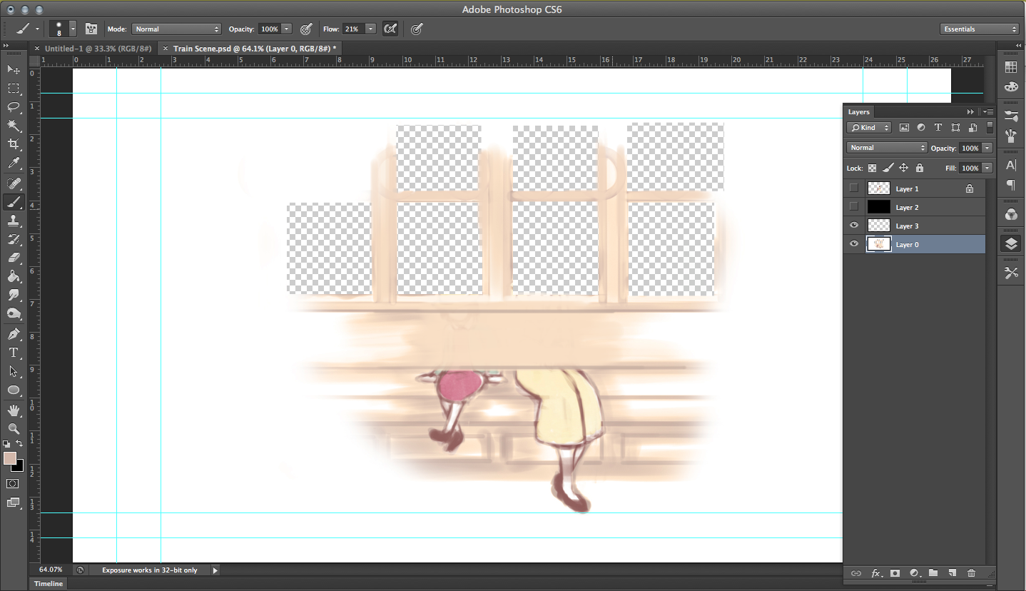
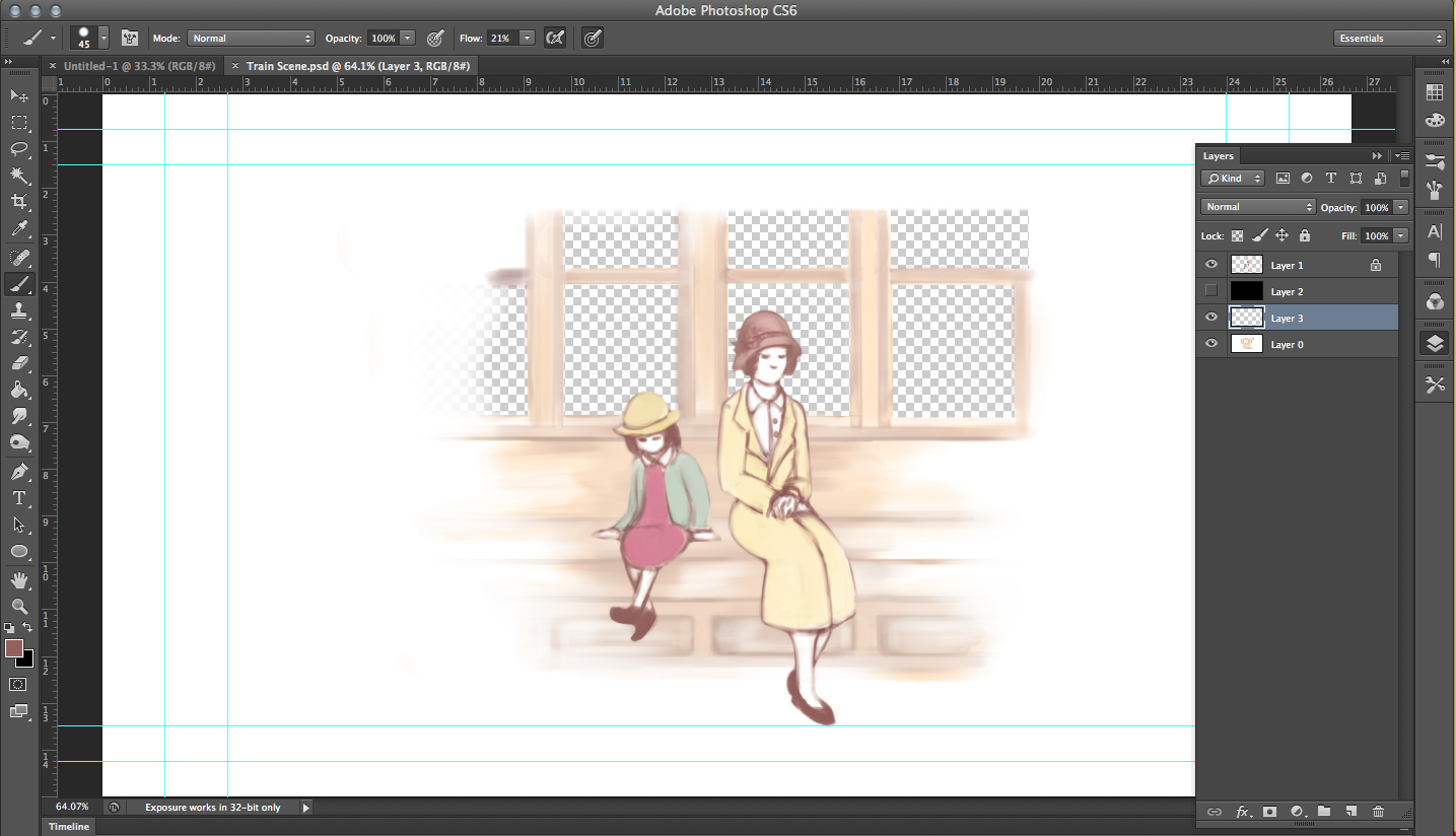
After drawing in the background and the characters, the next thing I did for this scene was separate their lower halves from their top halves, figuring that their bottom halves wouldn't move at all throughout this scene (I soon realized I was wrong…), I wouldn't have to waste time drawing the same thing over and over and so I that it was alright to simply reuse the same layer throughout for their bottom halves.
 |
| W-WHERE ARE TH-- |
 |
| Oh, phew... |
 |
It seemed easy enough…
|
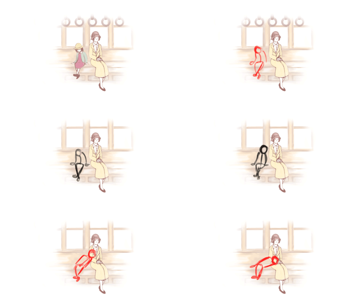
But I realized soon enough there I did have to redraw Totto-Chan's entire body a couple of seconds in, as it was not possible for her legs to stay in that pose as she redirected her upper body to the right before laying her head in her mother's lap (I mean, have you tried lying your head down while keeping your legs neatly crossed and pointing in the opposite direction?), her legs definitely have to move along and direct themselves in the same direction with her upper body. So this late realization sat me back just a little bit, just a little (At least I didn't have as much of an issue with her mother)…
Once the character animation was finally done, the next thing I needed to work on was the animation of the train's rather subtle movements, so I went back to my Studio Ghibli references and restudied them...
The most notable movement seen within the train carriages are the handles themselves (Well, aside from the entire carriage shaking back and forth that is), each handle however does not simply swing back and forth as one whole object. Studying carefully, you will see that each handle is separated into two sections (That being the strap and the round handle itself), with the top half only responding to the large bottom half's movement about a second or so later, instead of immediately moving along with it.
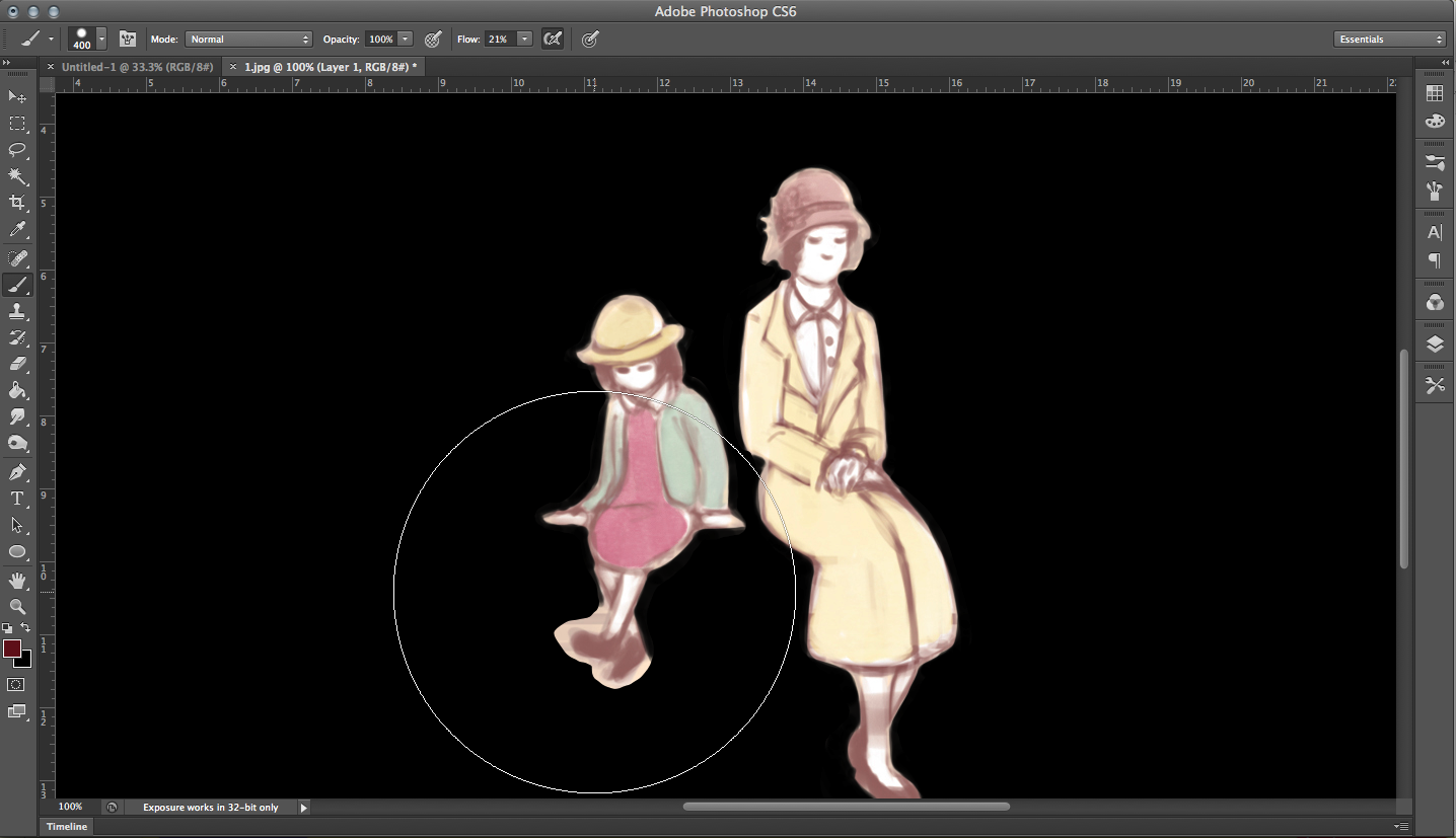 |
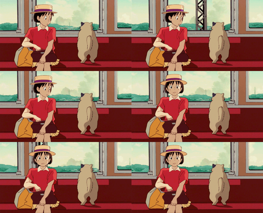
| Once again I created a black layer beneath before I started coloring in the characters. |
 |
| And finally there's the background itself. |
 |
| BEHOLD |
Much like the window scenes, I had also quickly designed a background that would be inserted later on with Adobe After Effects, only this one was MUCH longer, and MUCH more cruddy looking, hehehe. I also realized the size limits for the things you can import into After Effects, and so after several tries, I realize that I really had to downsize the quality of the image before I was finally able to use it.
There has to be another way however to reuse a shorter background for an extended amount of time in After Effects, instead of simply throwing in a super long one like I had done for this one… I definitely have to research a little more into this when I have the time.
e
currentVote
noRating
noWeight


No comments:
Post a Comment