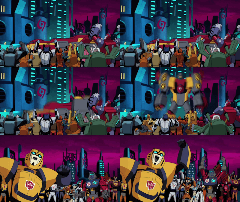
"Transformers: Animated" unfortunately didn't receive a particularly positive response when the previews first came out, as compared to "Transformers: Prime", possibly due to the fact that it came out alongside the first Michael Bay movie (While the first one turned out to be pretty decent, fans still disliked the somewhat ugly and overly complicated designs of the bots)... One thing that immediately turned off most fans was its incredibly cartoony and rather exaggerated design of the characters.
It is not just the humans that look noticeably different in this style, but also the bots themselves, they just looked childish, silly... and just far too kiddy when compared to the first series. It was however a considerably unique direction for them to take in terms of their character design, especially after sticking to a more 'realistic' style in the original 80s series as well as the Armada trilogy (Yeurgh...), and well, I suppose one issue about the designs is the fact that some of them... didn't really look like robots.
 |
| There are just some parts of him that don't look very robotic. But he's still an awesome character nonetheless. |
The art style definitely gave the animators more opportunities to exaggerate and mess around with the characters a whole lot more... and again, it is just so unexpected to see these normally blocky mechanical aliens being so... malleable when it came to their faces and bodies (And again, that makes them even less mechanical looking than ever).
 |
| This is not really one of them... so go watch the show to see what I mean. |
It wasn't surprising to see that there were some anime elements added into the show (Some scenes bore similarities to transformation or action sequences from various mahou shoujo and shonen animes), considering how the art style already resembles one to some degree. While it probably makes some scenes more appealing or entertaining, I can't really say that it contributes all that much to the overall animation (But of the Armada trilogy was anything like this, I might have actually give them a chance).
And they definitely took the easier way out most of the time when it came to animating their transformations (Either they reuse one sequence a couple of times or simply turn it into a huge blur, which I thought was a smart choice), these supposedly simpler designs of the characters made transformation scenes a lot less tedious and more straight forward, but all the same still pretty appealing and entertaining to watch.
I soon began to think that the childish style was just a way to attract a larger audience of kids before they got to the nitty gritty, to fool their parents into thinking that this was a friendly, silly, kiddy show with no death or torture whatsoever... While they will most definitely have the old fans to watch it, they needed to get more people to watch this show somehow if they wanted to continue for a couple more seasons.
As the show also progressed, I also felt that the designs for new characters got even better, and it is just a pity to know that we won't get the chance to see them again as season 4 never came to be (Characters such as Perceptor, Wheeljack, Hot Rod were all positively received despite their brief appearances throughout seasons 2 and 3 and are just only some of many fun redesigns shown throughout the show)...
 |
| There are some absolutely amazing character designs used merely as background characters alone here. |
After the unfortunate end to this series, fans were definitely more welcome and open to other "Transformers" series that were released later on. Because from what we have learnt, the cartoons and comics will always be leagues above the movies themselves, and that fans need not fear that they will ever be like them.


No comments:
Post a Comment