Friday 28 February 2014

Ceramics Workshop Induction - Session 1

This week starts our first of four 3D Workshop Inductions, aside from this being quite a change of pace from our usual work, I find it all strangely relaxing and therapeutic (And by therapeutic I mean smashing things with a hammer and yelling at the little wire skeleton I worked on…).


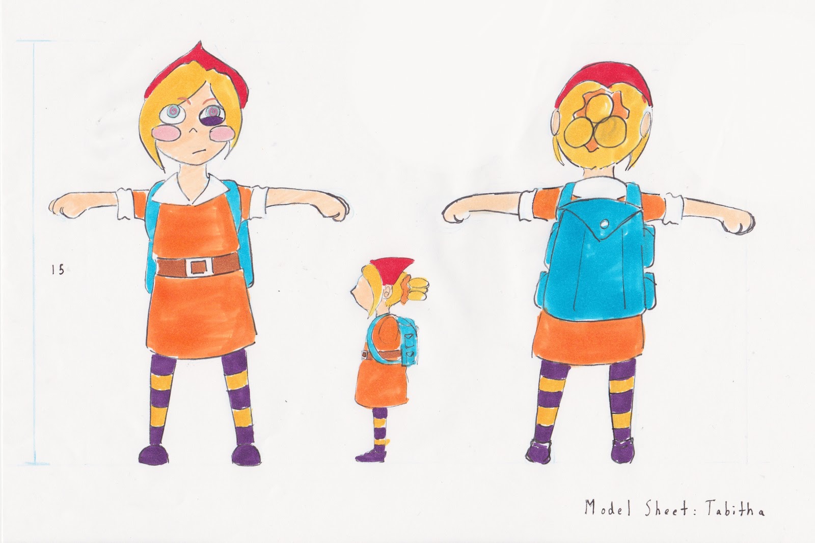
Before starting on the armatures themselves, we each quickly designed a character sheet (Not pictured here) with rather specific dimensions (Well, at least a specific height), I had initially done a much more detailed character design before deciding to go with something simpler (Which was a really wise choice). While coloring it in wasn't actually necessary, I do hope to paint my armatures and clay head once they are done.

Elliot, stop appearing in all of my shots!
I still find myself rather taken back by how different the atmosphere and environment of the Fine Arts block was as compared to where my classmates and I normally reside in the past months. It just all felt so pleasant, seeing students and ex-students making use of these workshops to work on all sorts of interesting projects (Like moldings of loaves of bread and baguettes… I really need to ask that guy what he is planning to do with those). This is really one of those times where I feel sad that I am not actually a UK resident (Otherwise I could just come here for all of my plaster and ceramic needs, even after I graduate).


Safety protocols were of course expected in such an area, especially when we are handling, saws, drills files and many other potential instruments of destruction (See what I did there?) most of the time, the only protective equipment we have used so far are surgical gloves, and even those weren't truly required as long as we properly washed our hands after handling the milliput we were provided with (Though my skin is itching a little right now… I might have to take another bath after this).

Speaking of the milliput, today we immediately went straight into designing a simple character and created a wire skeletal form for it. Initially I had decided to use one of my more realistic looking character designs, before changing my mind and quickly switching to something easier and quirkier (Which you will get a chance to see soon enough), seeing that I am not at all familiar in handling such mediums, I believe it would be wiser to stick to something easier.

While I was incredibly cautious in using the saw while cutting out a little iron bar that would be used as a hold and form of support for the model, I instead ended up hurting (Just a little) myself when twisting a few wires. So I learnt my lesson there, never let my guard down around wires.

Drilling a hole into a wooden board was a really short and simple task, but I enjoyed it so much that I ended up offering to do Samantha's too.


Once all of that was done, we then got down to work and started creating the skeletal form for our characters, much finger pricking occurred throughout the next few hours… We followed the guide Donald (Yet another sweetheart of a lecturer) provided us on the board, endlessly twisting and cutting away at wires while sharing the wire cutters and pliers with one another (It really wasn't too much of an issue that each of us did not get a set of our own, which reminds me, I have to buy a proper set one day).


The first mistake I made was making its head a little too big, but after awhile I believed that it could still work and so carried on. What was perhaps much more important was making sure that I did not use too much wires that it would make it impossible to move any of my character's joints.

First arm.
Tying my character to the support rod.

Evenly putting on the milliput took ages, I had to try and leave a decent amount of spacing for where the joints should be (Which proved quite difficult considering how small my model was) and to use just the right amount of it for my character's rather tiny limbs. I goofed up then by mixing all of my milliput, and so tried to make other little things out of it before it hardened and went completely to waste.

The next mistake I made was not tying the model tightly enough to the supporting rod (I kept messing around with it since it was a tad too high and reached the mid back of my character's form, hence getting in the way of me being able to properly apply the milliput in that area), I will have to fix that next week.


Nearing the end of the day, Donald shared with us a little on plasticine (Which we will also be using on our models for next week once the milliput has dried and hardened completely) and allowed us to familiarize ourselves with it for the remaining hour. Sizing is an incredibly important aspect to consider before model making, many of us have faced many issues today because of the fact that our models were a tad too small to work on, and so I will most definitely keep that in mind when I work on other character models in the future.
Wednesday 26 February 2014

You Spin Me Right Round Babeh! - Animation

Whoa slow down there, friend!
The first thing I did was take photos of my chosen object, which wasn't too much of an issue, though I ended up retaking a few when I noticed that it was not properly facing its front… and back to me (Something tells me that I would still have had the same problem even if I had used a rotation stand, unless I had found some way to measure the angles somehow), also its unfortunately jaw broke off halfway through and so I had to make a few changes, though I believe it was for the best since there were less details to draw in.

I knew this was going to be a challenge from the very start, I could have picked something simpler, butI ended up picking this item for sentimental reasons (That and almost everything else was too simple or dull in comparison… and just wouldn't stay up straight). At least it has a simple color scheme (Though I tried to add in a bit of shading as well). 

I messed up the first time when I drew the first image of it facing the side right in the centre of the paper, instead of positioning it more to the left as I should have (Why did you leave me, common sense?!), and by the time I realized that, I had already drawn 6 images, I had only noticed when there was not enough space for the 6th image. Thankfully though, after getting some new paper, all I had to do was position them properly beneath each new sheet of paper and just trace over them before carrying on.

The next issue unfortunately was much, much worse, even though I had tried my hardest to keep its pivot point and size in check, I later on had to get a lot of adjusting done for it after scanning in all the completed drawings, seeing as it grew in size near the end. After much frustration (The video timeline mode for Photoshop refused to cooperate with me for most of the night when it came to reposition and resizing the layers), I had managed to create an adequate enough looking animation.

This probably wasn't too bad for my first try, especially with such a complexly designed object, still, I really need to be more careful when it comes to its sizing next time.

The only comment I really got about this was to clean up the lines a bit more (Though I suppose I can't actually say that it was a form of stylization, can I?).

You Spin Me Right Round Babeh! - Research

Warning, post will include numerous considerably random gifs that actually relate to the topic at hand.

Yes, this is indeed related.
For our forth Visual Language Study Task, we were required to draw any object of our choosing (Though we obviously shouldn't pick anything too basically shaped), 12 times, through 360 degrees, as a way to practice drawing the same object from multiple viewpoints or angles for future animation projects.

Sorry, I couldn't find one without the words.
Honestly I had never thought too much of the usage of 360 degree spins in animations (Though I guess the first example that actually came to mind when it was mentioned was that one Simpsons scene as shown above), but it has proven to be quite useful in enhancing scenes, dramatically and/or humorously. 


Wait… does this count? I mean at least one part of him is still spinning
around, and look at the way his head, neck and right shoulder seems to move,
as if affected by the weight change from the constant rotation.
Aside from that, a spin animation is also able to create a more breathtaking effect for certain scenes (Such as during the dancing scene in "Beauty and the Beast" when the entirety of the ballroom was shown as Belle and the Beast (His name is Adam, but no one really cares I guess) danced), and Disney has many times now made full use of that aspect, especially when there is a need to accentuate the beauty of a certain character or the atmosphere itself, which most of us have probably seen quite often in most of their Disney Princess films.

I really like the slight delay in her reaction (Considering the normal human reaction
time ranges from 0.15 to 0.30 seconds) to the paper plane as it flies around her,
instead of her immediately quickly spinning around to match its movements.


A classic spin that is seen in quite a number of Disney Princess films (Sorry for repeating myself), in beautifully showing how physics works when it comes to their long, flowing clothing.

… well, that's still a pretty good spin, especially considering the way her puffy hair
and dress moves along with her.
We can't exclude the Disney Princes too now can we?
I believe there are less than 12 frames for that little spin she did considering
the speed of it, at least her hair is still shown to have made a realistic enough turn
to go with it (There was one scene in "Cowboy Bebop" where they apparently just
gave up in animating Spike's hair properly when he turned his head to the side).
Again, spin animations can be used to create more dramatic or dynamic scenes… though I'm sure not all of them has to be like the one below, as amazing as it is…

I haven't even watched this yet but land sakes!
While not exactly a full spin, that brief close up of her as her face is seen is
just fantastic, there is always the challenge of making sure the subject is solidly drawn
while also exaggerated enough to create those desired movements of them (Or of the 'camera').

Even if the subject has a rather simple design, a spin animation still remains challenging when considering the speed that one wishes to give it (Though I suppose you could just draw out the frames first and take out a few of them later on), or more importantly, how the character actually responds to it. 

Obviously when one is suddenly spun about, they would be taken by surprise and will perhaps even feel queazy in the end, and so there is no way that their entire body would stay still during the entire animation, for example, limbs should be waved about and heads should be tilted as show above.


Secondary Action
This last example will give you a little hint on what object I picked out for my
own 12 drawings, which you will see soon enough in the next post.
Also, despite how many have said that the animation quality of most 80s cartoons are awful,
I have to say this looks pretty good, especially when these characters are so incredibly detailed.

Sunday 23 February 2014

A Tale in the Sting - Pre Production - Storyboard and Animatic

This is a little off-topic (Or maybe not), but I nearly had a heart attack when I thought that a movie had already been made for this book, but all I have found so far are trailers for the book itself and documentaries (Which should prove helpful!)

I was worried that I didn't have enough scenes for the entire title as I first wrote down a list of possible scenes, I also started worrying about biting off more than I can chew as I roughly drew out the dog and musician scenes, but I suppose as long as I know how to manage my time, I should be able to get it done.
By the time I started on the animatic, I had come to a sad (Though I was relieved too I suppose) realization that I had to cut out some scenes as it all could not fit into a duration of 40 seconds without me having to shorten or speed each scene immensely. I now hope to get some advice from my peers on which scene to keep in and which to take out during my Interim Critique tomorrow. For the animatic however, I decided to cut out the teacher scene, seeing that it doesn't fit quite as well as the other scenes, though it is a pity since I still find it cute (And also quite simple to animate).


For some reason I couldn't upload the video here, so I had to upload to youtube instead, and expected, due to copyright infringement, the music has been muted. My choice of song by the way is "Always With Me" by Yumi Kimura (Made famous in "Spirited Away), awhile back I had sent in a request to be given permission to use it, so I will just have to wait for a response until then. I also have a backup song "Love Letter" by Ai Otsuka (To which I also sent an email about), and if worse comes to worse, I also believe that I found a somewhat fitting royalty free song to use instead!


Chances are that I might simplify the style further as I continue into the Production stage, it is a pretty last minute thought, but something "Okami-ish" might work pretty well for this animation… well, we will just have to wait and see.

A Tale in the Sting - Pre Production - Development 2

Art Style
With Iwasaki Chihiro and Hayao Miyazaki being my main inspirations for this project, I was very intent on using watercolors (Or at least an effect similar to it), be it for coloring in the characters or for the outlines themselves (Though I think basic lines work just as well), I also liked the idea of using a different color for the outline, this was more of an accident as I tend to use color pencils for sketching in the initial stages, and as I continued sketching, I just liked what I saw, the question though is which color to use.

Concept Piece
Note to Self: Don't be a lazy butt and just do watercolors on watercolor paper next time.
Ditto.
A copy of the last concept piece, this time with a colorless background.
Honestly I'm kind of starting to like the idea of coloring the backgrounds
instead of the characters...
Coloring Style
A friend had advised me to pick the very first one, seeing it actually works pretty well on it's own for the animation (Not simply because it would be the easiest to do), so if I was to discard the idea of coloring the characters' clothes in watercolors, perhaps it could instead be applied to their outlines or the setting designs.

A Tale in the Sting - Pre Production - Development 1

I took a pretty different route this time round when I first started concept sketching, seeing that I had to choose the actors for the 'film', I figured that this would be the best way to warm up first before I started on any real ideas.

Mana Ashida as Totto-Chan
For the role of the titular character, not many japanese child actresses came to mind, I remembered Mana Ashida to be pretty decent (If not adorable) as young Mako in "Pacific Rim", also she just oozes that adorable cheekiness (Have you seen her in those game shows and charity events?) I am going for in Totto-Chan, so aside from the two being pretty close in age, Mana would make a suitable candidate for that role (Shame though that I will have to simplify the art style immensely until she is near unrecognizable).

Koyuki as Totto-Chan's Mother
This choice was a bit more random (I really, really don't know my japanese actresses and actors, eurgh), I decided to just look through one random list of "The Hottest Japanese Actresses", and I thought Koyuki would be great for the role (It's also a plus side that she acted in "The Last Samurai"), considering how old Totto-Chan is, it would make sense for her parents to still be in their early 30s, and seeing Koyuki pull those worried and wary looking glances just makes her seem perfect for the role (At least I didn't pick some random Jpop singer… I could have picked Hikaru Utada you know).


Rocky
The girl had a german shepherd named Rocky, there's nothing else to say really except that I might have to simplify him immensely too (Something tells me that he will be one of the most difficult characters to animate, the stupid cutie…).


Inhabitants/BG Characters
This is just to get a rough feel of how people dressed and the lifestyles they lived at the time, I doubt any of them will be in the final product though, still it was fun. Originally I was going to use them as background characters in certain scenes, but I feel that there wouldn't be enough time and the animation is already complex enough as it is.

Musicians
Going back to that research post I did, I had to make a wild guess and just pick out various types of musicians throughout the ages to form that eccentric band that Totto-Chan (Let's see how many times I say her name before it drives you nuts) had called into her classroom just before her expulsion. As long as they stay in place, their actions might also be quite limited (Such as the Shamisen player simply flicking her hand back and forth over the strings), so aside from their more complex costume designs, I just might be able to animate them without driving myself completely nuts.


Train
Another concept that sadly won't be included in the final product (Save for one very small scene I suppose), I believe the trains in the book was a very important element, to me it represented the short but nevertheless amazing journey the girl takes in her young life. 


Soon enough I was fortunately able to generate a few ideas for the title animation… some a lot simpler than others in terms of the animating technique but far more detailed in terms of design and vice versa. I still need to look into more title examples, and perhaps make a few more changes as I go along, in the meantime, I believe I have made my choice, which will be continued onto the next blog post.

A Tale in the Sting - Pre Production - References and Research 3

Here are some more visual research and references for my attempt to make this animation more historically accurate in terms of setting and fashion:

Trains

By the end of World War II, the railways throughout Japan were severely destroyed, it was over the next few years that they began the electrification of their new railway lines. It was particularly difficult finding references of train models that were used or built in an exact year, though one can safely assume that these few models should have been used from the late 1930s to 1940s (Still not entirely sure if they frequently updated their models during that period like they do today), I also feel that it is safe to refer back to the train scene in "Grave of the Fireflies" (And even "Spirited Away) when comparing the models.


Lifestyle

I decided to at least get a rough idea of the family lifestyles in Japan during that period, and see which one bears the closest similarity to that of Totto-Chan's own lifestyle. Never was it ever mentioned that she and her family would ever stick to their more traditional roots, though I am most certain that they were of the middle class (Things only truly went downhill for them once the war officially commenced, and even then she and her family were one of the few fortunate people to evacuate to safer place by the end of the book).


Music

For the band of eccentric musicians that are only briefly mentioned at the very beginning of the book (I still find them to be a great highlight to Totto-Chan's ever excitable and fun nature), I decided to simply mix together various references I got of traditional japanese musicians throughout the decade before, even going all the way back to the feudal period. I especially had to find instruments that were portable enough to be carried around by traveling musicians (Such as Shamisen, Tambourines, Bankos and Flutes), and so Taiko drums are out of the question.

While it was said that the genre Ryukoka was a genre that referred to popular music from the late 1920s to early 1960s, with some of the roots developed from Western classical music, ultimately it was split into two genres: Enka (That became popular from 1950s onwards) and Poppusu.

In terms of their attire, it is not much later that musicians would drab themselves in more modern clothing, and a way more traditional attire (With perhaps a few minor alterations in terms of colors and accessories) seems more suiting, especially when studying various references, while Totto-Chan and other average citizens have begun to dress in slightly more westernized clothing, these musicians will be able to give off a more ethnic feel to that time period (Especially since many at the time still tend to dress in kimonos be it during casual or formal events).


Fashion

I decided to look more into this aspect when it came to designing Totto-Chan's mother, the fashion at the time aside from their more traditional attire did not seem too different to that of the westerners in the 30s and 40s, though perhaps their coats and suits were a little less decorated and more conventional (Which probably makes things easier for me, simpler is always better after all when animating).