Showing posts with label Visual Language. Show all posts

Monday, 17 March 2014

Endling

Lilith, one of his original characters sporting
a "Dark Souls" get up.
Not much is known about the comic artist Endling (Seeing that he is really good at keeping his personal details a secret, even his real name), aside from the fact that he is perhaps best known for the webcomic "Ever After", a dark (Well darker) parody of sorts centering around a variety of fairytale characters (With Red Riding Hood as the leading lady). While it has been years since it has been updated, there might be some rare chance that he might continue it someday (His confirmation of this was after all dated about two years back…).


Endling tears apart one of his earlier character concepts
for a recent tutorial about character design.
Aside from character designs (And he is definitely chock full of them!), Endling also keeps himself in top notch drawing shape by doing quick practices of poses, expressions, etc, almost daily. Now and then he also doodles in some visual diary entries, that gives us a much more personal insight into the artist himself (What? Who doesn't enjoy these type of things from artists they admire?).

I always admire how he is always able to produce hoards and hoards of practice and concept sketches almost daily before he gets down to other things, even if he does mix a little digital media to it (And only just to do a little shading), it doesn't matter, Endling has always managed to stay disciplined when it comes to his art, always making sure that his skills never waver by continuing to practice each day (The guy doesn't do much fan art though… a part of me is a little disappointed while another part of me wishes I could be just like him).


Facial practice

Poses


A wonderful variety of character designs, with different
features, body shapes, postures, etc.
More facial practice

Angi Pauly

It was not too long ago that I chanced upon this talented artist and her adorable works (Thank you once again Tumblr). 'Angi' Angela Pauly Llobet is a freelancer specializing in illustrations and visual development (Eg, color scripts, environment and prop design) works, that and she also has some pretty amazing animating skills to boot which helps give her work just that extra little bit of magic when needed.

I couldn't resist showing at least one of them.
Almost daily, Angi tends to do watercolor sketches of any ideas that pops in her head (Or as she likes to call them, "Sketch Dailies"), while pencils might be a familiar medium for most of us to use for our sketches/leisure drawings, apparently watercolors would be hers (You can see very, very light pencil lines as well in these sketches, but other than that, most of the other shapes or details are simply painted out). 

Angela notably does focuses more on character designs (Possibly to use them in her own future works), both human and anthropomorphic, aside from having a beautifully soft look to them (Actually all of her works tend to focus on the themes of gentleness of kindness, it is even stated in her blog that "The world needs more gentleness and kindness", bless her), I can see that her style is influenced from retro japanese animations.

It is awe-inspiring to see someone create such lovely and heartfelt water color sketches whenever she has the time to. Aside from getting a chance to just showcase more of her works (I have actually seen quite a number of people posting up sketches from their sketchbooks on their portfolio sites aside from her, though of course they have made sure to make them look halfway decent enough before doing so, I haven't really seen anyone daring enough to post up really simplistic doodles) on her site alongside her more professional and refined stuff, it is always enjoyable to see someone's more personal works, to see what it is they particularly enjoy, and in a way, it is also a sneak peek of sorts into their thought process (There is a difference after all from commissioned work and one's own personal works).
I really like the textures and patterns that are created here,
and of course the usage of colors are simply sublime.
A variety of interesting elements are added to her characters. 

Really nice composition.
I also find the body shapes that she normally draws
for her characters to be pretty cute and unique. 
Almost distinct really.
And might I remind you that these aren't even the works she uses for her professional portfolio? She just uses these to record down her ideas and concepts, so just imagine her more refined works (If you haven't already seen them that is).

Wednesday, 12 March 2014

Avatar: The Last Airbender

Even my dad liked this show, and that man hates everything.
If there is one quality animation series that will continue to be praised over the coming years, it is this series. Known for its near-to-flawless storytelling and character development, art direction, music and of course animation, this series has been hailed by the majority of the world as an animation masterpiece in its own right (It might sound like I'm being bias and am exaggerating 'a little' but no, this show was that good).

The series is especially well known for borrowing extensively from East Asian art and mythology in the creation of its universe, such influences include Chinese art and history, Hinduism, Taoism and Buddhism, and even Yoga. A variety of traditional chinese calligraphy styles are used for most of the writing shown in the series, ranging from seal script to clerical script. Consultants were also employed for the series' cultural influences (If you want to get it done right, go all out and hire cultural experts)


Initially, it is no surprise that this show was also inspirited from the creators' love of Japanese animation (While there are notable influences, this show is NOT considered an anime), Hong Kong action, kung fu cinema, yoga and Eastern philosophies.

Air Nomads - The Monasteries of Tibet
Water Tribe - The Inuit
Earth Kingdom - Imperial China
Fire Nation - Pre-Meiji Japan
But it is not the art direction in which we are looking at in this blog post, instead, we will be focusing more on the human form and its movements, and so let us move on…

Seeing as the show is considered to be of the fantasy martial arts genre, it is no surprise that a lot of research was put into the characters' fighting styles. Much like the experts that were hired for the cultural aspects of the show, a martial artist expert was also hired during the development of the fighting styles seen throughout the show. A huge variety of stances and movements were used for each character animation, which probably sounds pretty complicated (Aside from character designs, each one had their own unique movements, so that are twice as much details to make note of when animating) but nonetheless worthwhile, especially when such an awe-inspiring piece of work is produced from it all.


The characters have always managed to stay realistically drawn and anatomically accurate, which comes as another surprise since animators tend to take the opportunity to exaggerate (Even deform) their characters more during action sequences, and another surprise is that how the impact can nonetheless still be brought out in these characters' movements and strikes, which I find to be quite challenging without the use of some exaggerating.

And there is most definitely a notable difference between each style used when it comes to the amount of weight and speed put into their movements (Such as the water benders being more graceful in contrast to the earth benders, that are more rooted to the ground and more firm with their strikes).


And as a bonus trivia, while each elemental group was given a distinct fighting style, Toph Bei Fong (Known to be the most powerful earth bender in the series) was the only exception, being given her own unique fighting style to set her apart from the other earth benders, while their fighting style is based on the Hung Gar fighting style, Toph's is based more on the Southern Praying Mantis style which was developed during the Han dynasty.

Below you will see the fighting styles that were associated with each element in the show, badass, I know:


Many animations I have watched with quality character animation have always used references, so it pretty much shows that taking the time to get some proper research and referencing done will be worthwhile if you want to create something as amazing as this, don't you ever take live-action referencing for granted.

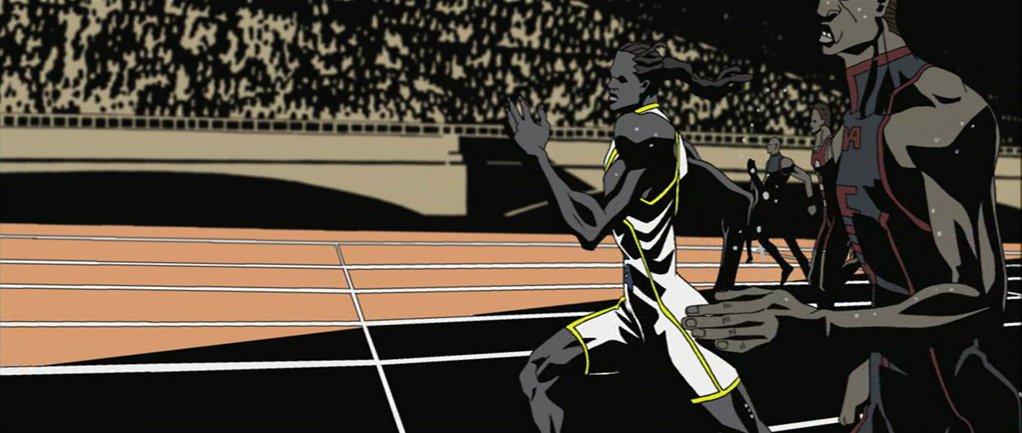
Animatrix - World Record


While not one of favorite shorts from the Animatrix series (The art style isn't really my cup of tea as much as I hate to say it and I couldn't help but cringe every few seconds, thinking that the guy's calf muscles would burst at any time, though I suppose that was what the animator was aiming for in the first place), I found the animation style for World Record to be considerably unique and distinct (I repeat, the animation style).


Takeshi Koike is notable for having a very surreal (If not fluid) and almost deformed style of animating, and is never afraid to completely exaggerate any part of a character to further enhance whatever action it is they are carrying out or how they are affected by their own surroundings. This especially works for this short considering it focuses on an athlete taking part in a 100 meter sprint.

World Record, like the Animatrix shorts, had its own way of creating some unbelievable tension (The type of tension that causes you to hold your breath every once in awhile), aside from the slow motion scenes, the black shadows and background silhouettes used creates a very heavy atmosphere (And oh gosh the sounds, I just need to add this in, Dane Davis was wise in creating sounds that would exaggerate the physical parts of the character's body, it was no wonder I was feeling so uncomfortable throughout the running scenes, thinking a part of his body was going to erupt (And I'm still surprised that didn't happen), it definitely brought out the tension tenfold).


Throughout the short, the character can be seen running in fast and slow motion, allowing viewers to probably take him the entirety of his form and how it moves during the race, further creating that tension. Perhaps the interesting part is how the characters still manages to remain realistic enough (Something tells me that Koike decided to hold back a little on the deforming aspect this time round), creating a form of balance for the movement of the muscles in a subtly deformed style, realism of the human form seeming absolutely necessary for this story in particular.

Koike had actually studied further into the way people ran in slow motion (Which I believe must have been one of the more challenging parts to animate) before going directly into the animation itself, finding that making the hands rather than the legs swing with a stronger impact have a more realistic feel to the animation.


While it was definitely the running scenes that were the main focus points of the short, it was nice seeing other little details such as how other characters contrasted so differently to the main character in terms of personality (Such as his whacky, overactive trainer… whom most of the audience giggled at when I was watching it for the first time with my family in the theaters , I will also admit that I liked the more muted color scheme (Almost monochromatic even, especially when it comes to the characters) that was used.

And now I suddenly appreciate this short more after writing this up… go figure.

Sleeping Beauty

I know, I know, another Sleeping Beauty post… just be thankful that this is only the second time I chose this film to write about for a Visual Language blog post (I could have written about it in my spinning animation blog post, but I didn't, did I?)

Live Action models Helene Stanley and Ed Kemmer during the production
of Sleeping Beauty
Disney films throughout the years have always been known for their quality animations, especially when it came to the fluid movements of their characters, regardless of whether they were more realistically or exaggeratedly designed, or whether they carried out actions that might seem impossible in real life, this is all thanks to the fact that the animators were always made to do their research before dishing out such quality works (Going all the way back to Snow White, while the more realistic characters were rotoscoped, animators still carefully studied various other aspects before drawing them out, such as the way clothes moved, the way leaves blew in the wind, and how shadows would look on different surfaces), and Sleeping Beauty is shining example to all of that.

Live action references were still shot before animation production began, with the live actors also being made to wear costumes for further referencing (Though notably some changes were made to the costumes for the end product, perhaps to further bring out the characters' already stylized shape and design, particularly Aurora).

Aurora's model Helene Stanley had also provided live-action references for Cinderella and Anita from 101 Dalmatians. Interestingly, two models were used for Maleficent, that being her voice actress Eleanor Audley (Who also performed as Cinderella's wicked stepmother, Lady Tremaine) and dancer Jane Fowler for live-action scenes. The reference shots of Eleanor Audley was used more so as a form for inspiration for the animators when they worked on her character, stating that her alluringly fierce and dominating voice proved challenging to animate for. Other actresses were also used for the reference footage, such as Spring Byington and Frances Bavier.

All of the performances were screened for the animators' reference (Which to me, definitely makes things easier, even if they were not rotoscoping directly from them), as Walt Disney insisted that most of the character animation should stay as closely as possible to the live-action reference.


I always remembered the times when the Disney channel would show behind the scenes footage (Normally it was the footage of Prince Phillip's model Ed Kemmer that was shown, where he is acting out the epic battle scene with Maleficent) for Sleeping Beauty, even as a child, I found it amazing how much was put into this animation (Remember how long it took them to design and paint out each background as well? It made sense why this was the most expensive Disney film up to that point, and it is such a pity that it underperformed during its initial release), so much effort was honestly put into every single aspect of the film, and that especially included the character animation.

Tuesday, 11 March 2014

Flow, Form and Force Study Task

I was originally much more worried about not being able to finish such a large bulk of work, especially with the submission deadline for all Visual Language assignments being just around the corner (And there is still just so much to organize and label!). In the end however, I was honestly really surprised how enjoyable this exercise turned out to be (Plus being made to time ourselves for each pose actually made time management so much easier for us all), there was so much laughter as we attempted to scribble out each pose within 10 seconds, as well as the silly poses that we all managed to pull (I have to say this session has also given us some sense of confidence…).


Rhythm is a Dancer
I believe that I should try to create cleaner, more singular strokes for such works in the future, though then again my works have always been sketchy, especially when I begin to rush. I still think that I haven't actually done such a bad job for my first try, I believe a strong sense of motion can be seen from my works, despite how sketchy they are. I also had fun drawing the outline of different body shapes.

Like a Puppet on a String
Ah, Push it!
While 10 minutes does not sound all that long, my friends needed to take a break or two in between, despite how comfortable their poses seemed. By this time, we started playing some 80s songs to keep our models distracted (And while it was amusing I can't say it actually worked…). I found the arms in the forth one absolutely terrifying, so I quickly did up a tiny pencil sketch in the corner before time ran out.


Strike a Pose
For this one, we ended up using one of the tables as a form of support for most of the models' poses, of course they were given a few short breaks in between as usual so that they could stretch their stiff joints, half an hour seemed much too long to me, so I tried my best in drawing each one out within 20 minutes instead.

I had fun playing around with a variety of mediums, while pencils (And perhaps ink) will obviously be the easiest to handle, I must say crayons actually came in a close second during that session, and while I absolutely enjoyed using charcoal, I still need to better familiarize myself with it.