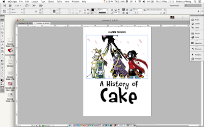
And seeing that I have pretty much saved most of the works that we shared with one another through Facebook and Tumblr, it didn't take too long to quickly design up something. There wasn't any need for any text either aside from a few headings and the page numbers, so I only needed to focus on the layouts of the images as well as figure out a simple little decorative element that could be added to each page (I decided to use a black version of the border that has been used for our title cards and presentations).
Unfortunately, I did not have any of the fonts that Cara had used for the DVD cover and biography page, and so, at least for title, I simply saved a png of the title from the DVD cover file and used that for the cover of the booklet. I tried finding a close enough font for the rest that was similar enough to the font used for the body text in the biography page.
 |
| Again, kept it really simple. |
The only changes I made was for Cara's page spread, the colours turned out strange, so I was given some new images to replace them, I also had to crop up most of the template as I felt that the school template would ruin the overall look of the booklet.


No comments:
Post a Comment