Sunday 24 April 2016

The Bond of Four - Backgrounds 2


   Whilst the original illustration had a much more 'golden' colour scheme than what I presently went for, I felt that a darker look would be more suited for such a private room, the meeting place for which Date (The assassin) meets with his Lord for whatever orders he decides to throw at him. A gold palette would have worked better for the throne room itself, and also, that palette was pretty much already taken for the forest design (Which can be seen in the previous post).

   After doing up a really quick sketch of the layout (Whilst also incorporating the two characters in there), I mainly used the shape tool for this background design and did some quick brush overs for the shading and textures. There was a little warping too, that still doesn't look all that great to me, but it's definitely better than keeping the walls completely flat. In the final version, there is a very slight arc if you look closely. I then finished up this background design with some torches on the side... nearly everyone has said that this background looks incredibly cozy, and I can live with that.


The Bond of Four - Backgrounds 1

   I started on this background ages back and wasted a lot of time messing around with it, but I suppose it also gave me the time to figure out how I should actually separate certain elements into their respective layers (Such as the tree at the very front). And in term of the style I am using, a painted look will still work, if I try to keep the line art for the animated characters as thinly done as possible (And perhaps even use other colours aside from black), I believe they will blend well together.

  Another extra little tidbit is the fact that I am trying to base the colour schemes of each background on my old illustrations (Such as using a green colour scheme for the palace gardens and a brown one for the town). In this case however, seeing as this is a completely new setting that was never in any of the original illustrations, I simply kept to the golden forest look as I had envisioned from the beginning whilst storyboarding, though it could be said that the look is also based on the one illustration I did for the author's note section as shown below, I was also hoping incorporate some petals as well into the scene. 


   The other day, Annabeth showed me a couple of features in After Effects. I can't really remember what it's called now (Thank goodness I took a screenshot and scribbled down some unreadable notes that day whilst she showed them to me) but several of these features were able to incorporate things such as rain or snow in there. Unfortunately, CS4 lacks many features that the new version has (Such as being able to rotate falling 'leaves', which can't be done as shown below), and so I will be planning to install my student trial version in hopes of getting more out of it.


The Bond of Four - Some Animation Progress 2

    I spent the last few days working on Scene 1, it should be finished by Thursday for the presentation. It was pretty late in when I realised that it would be weird to not to animate her bangs seeing as the rest of her hair was already moving with the wind. So much like what I did with Scene 8 and Ohana, I couldn't leave those bangs as it is and had to animate them too... this would have been a more noticeable detail however, so it was worth it. Lighting and colouring once again proved to be a huge pain, while I was tempted to leave her hair as a simple colour block, I eventually added in some lighting and outlined the shape of it (Mainly because all the examples I referred to made sure to outline every single thing when it came to their characters), I did however decided to take out the lighting for her bangs as I didn't think that the moonlight would really reach it.

   ... And no, I'm not going to animate her blinking, she doesn't stare down at her adversary in that pose for that long, anyway. I cannot begin to tell you how long it took me to resketch the animation for the second part, her eyes just were not cooperating with me and looked so incredibly creepy if I started at them for too long (Though it was my fault for doodling a little smile behind the fan in one frame...). I kept the fan plain without any shading or details... simply because there was really no time left to figure out how to include those details in effectively (And not just because I didn't want to).

   I had a tough time figuring out many layers of shading I needed to use, but tried my best to keep it to around 3 (The references I looked appeared to stick to that number from what I can see, particularly for more complex shading that is required in night scenes, or at least more dramatically lit ones), it was already a nightmare colouring that small bit of clothing (With its tiny bit of unnecessary lighting around the edges). 


   Overall, I couldn't help but feel that she looked incredibly... derpy in a lot of frames, no matter how many times I resketched them. But knowing I didn't have much time left, I just carried on and just started colouring and shading everything. If my peers and tutor feel that something is off with her face on Thursday, I will just try my best to fix it up some more after the deadline... And I suppose this is what I get for hating on Sailor Moon Crystal Seasons 1 and 2 when I can't even do decent close ups myself.

Don't worry, there's a rooftop there.

The Bond of Four - Production Values

   As I started colouring a couple of scenes whilst still animating (You know, multi-tasking as usual), I started putting together several references and inspirations to refer to in terms of how I should do the colouring, shading and lighting on each frame (The night scenes especially proved to be incredibly challenging for me). There were several shows that I have watched in the past months that were successfully able to blend in flatly coloured characters into any sort of environment of their choosing (I am especially talking about The Beast and the Boy, 2015), just by using the right sort of colour palette, which of course is actually quite complicated when you consider how many differently lit environments they would actually be put in (And so you would have to do more than one character colour palette if you were to use this technique, very much like what Steven Universe does). 

   But in my case, I was already set from the very beginning to go for a visual style that would have at least some shading and so looked into various animations (Particularly Japanese ones) that were known for their high production values.

   Below are not just the usual inspirations (Eg, Cannonbusters, Legend of Korra, Seirei no Moribito, etc.) that I have used from the very beginning of this project, but other works that I have come across whilst working on my animation (Eg, Soul Eater, Sailor Moon Crystal Season 3, Berserk, etc.). This also included examples for me to refer to for when I was colouring and shading armour, which proved to be quite a struggle for me, especially when I am rushing at this stage. 


The Bond of Four - Scene 8

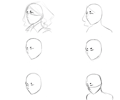
   About more than a week back I decided to work on this scene first as I figured that it wouldn't take too long to animate it (After all, it's just her closing her eyes and lowering her head, or so I had initially thought...). You will probably also notice that this scene has now been changed to its original side angle shot (That I horribly doodled out in posted storyboards) to show more of her face. This entire thing took long than it should have as I began inserting in more frames upon realising that 2-3 frames just did not cut it to create a fluid enough movement for her head. 

   And no, the nightmare (It's not as bad as I am making it out to be, but I am just in one of those moods by this point as I am writing this) didn't necessarily end there, I realise after awhile that it would seem a little odd keeping her clothing (Particularly her hood) so incredibly still, especially when considering that she is sitting in a breezy little area. And so, I drew some little squiggly lines over her hood and collar to show the presence of wind, especially for the first few seconds, which I will still have to clean up before I commence colouring... and speaking of that.


If this was to be inserted into After Effects, it should consist of at least 6-7 layers.
1-2. Clouds, 3. Skies, 4. Tree, 5. The character herself, 6-7 Rays of Light
   This is also my first try out to see how the shading and lighting will be done for the overall animation, it took some time figuring out what would be the easiest and least time consuming style to use without cheating and going back on my goal to create an animation with a decent level of production values in terms of not just animation, but the colouring, shading and lighting itself. While I am rushing by this point and will not be able to finish the entire thing for my submission, the least I can do is at least finish a few scenes to my desired standard and hopefully get most if not all of the animation decently lined for colouring before the end year show.

Friday 15 April 2016

The Bond of Four - Some Animation Progress

   Just some animation progress for several different scenes.


The Bond of Four - Scene 1-2 - Progress

   A part of me really wishes that I actually owned one of those Hannya masks so that I could actually get the perspective right on this thing. For the majority of yesterday, I spent most of my time trying to get the perspective of that mask right, his right arm to look right and figuring out what style of colouring, shading and lighting to use (I based it on references from the Legend of Korra, Berserk and Claymore). But either, way, I say give this one more day before I am finally done with this scene, it was meant to be one of the simpler scenes (Aside from the amount of detail) and I really do need to hurry up and move onto the next scene. I just need to do a few more touch ups on his figure and work on the background (Which I will probably be separating into two separate layers (Cloud and night sky) to give a tiny but more depth for a seemingly still looking scene.