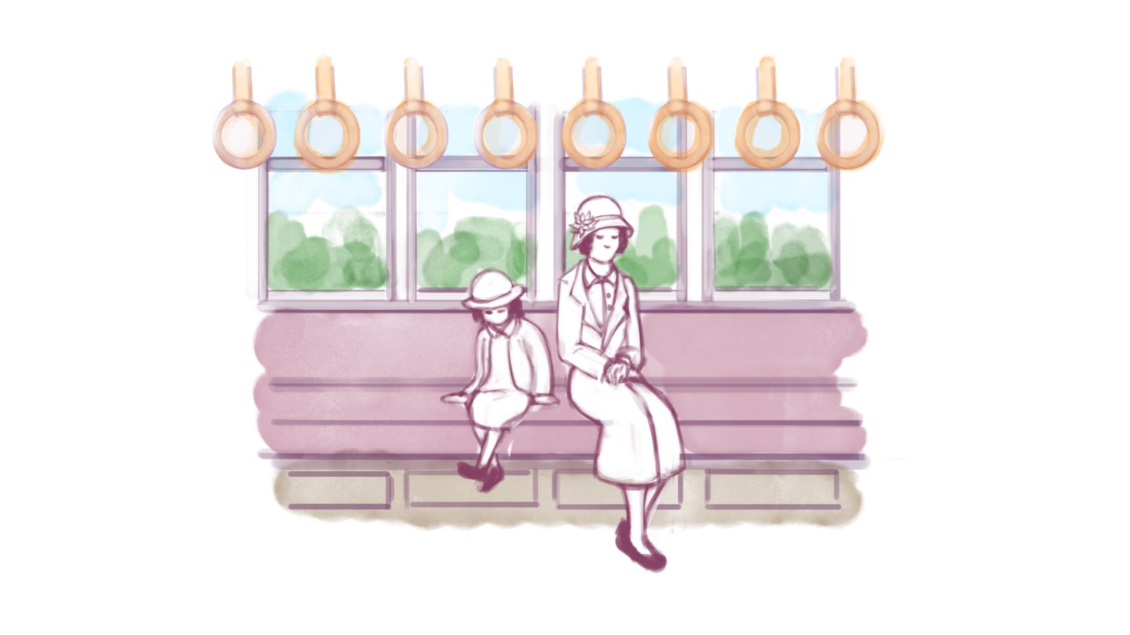
Process has been slow since I have been rushing to finish up some other assignments, but at least I finally finished these up.
While some suggestions have already been made by my classmates and lecturer during the first critique session, I thought it would be best to quickly do up a few versions for comparison before finally making my choice (Obviously I didn't bother doing a version where everything is colored seeing that it would not be possible to use such a coloring style within the time given):
Line art


Definitely the simplest, but will the focus point be unclear?
Line art and Colored Characters
I might not go with this choice, it's going to take ages coloring each frame, even if some might be repeated.
Colored Background
There is sill the issue of having to color/white out these characters, but it will be faster than the previous one I suppose, also, not all scenes have backgrounds anyway.
Washed background
Much like the previous one, but instead of actually coloring the background, shading is used instead.
Washed background and Colored Characters:
Update:
There is no time to lose as I have to start animating as soon as I can, in the end my lecturer believed that the style he found to be the most suitable was the one with the red/burgundy washed background with the colored characters, the only changes he suggested to me was to give the background a more sepia tone. I find myself worrying yet again that there won't be enough time to color each character, but… maybe I could try and work something out…
Yet another update, my lecturer suggested that the animation should have an even softer looking sepia background, which I actually find myself agreeing with, it has a much nicer atmosphere to it now and seems to better connote a feeling of memory and reminisce (Sorry Mat, had to steal that little bit from you, ehehe…).


No comments:
Post a Comment