Friday 18 April 2014

The Pink Panther (1963) Opening Title


While we are all probably familiar with the shortened version seen in the animated series that only shows about the first ten seconds of this sequence before quickly carrying onto the title card of the featured episode, many of us actually do not realize that the character was first introduced in this opening title sequence of the first Pink Panther film in 1963 featuring David Niven and Peter Sellers.

An American comedy film directed by Blake Edwards and co-written by Edwards and Maurice Richlin, the film centers around an inept French police detective known as Inspector Jacques Clouseau as he attempts to stop the theft of a precious pink diamond known as the Pink Panther (That has an unusual int discoloration deep within it resembling a leaping panther).

What is entertaining about this opening is the fact that the titular character interacts most of the time with the opening credits, playing and messing around with them or vice versa (Even his own name bullies him for some reason). He would also do something of relation to the name displayed and what it is they are credited for (Such as dressing up as a conductor when music composer Henri Mancini's name is displayed)

Honestly though, while entertaining, this opening sequence does not give much insight to the main film itself, the main character Inspector Jacques Clouseau barely appears in it too, and all we truly know is the names of the people who are involved in it. Many would also question the point of creating a personification of sorts for an inanimate object such as the Pink Panther jewel (Not that we have anything against though since it brought about such a beloved character).

You could say that this opening is one of the most random film opening sequences out there, seeing that it doesn't really have anything to do with the film, save for the credits that are shown, the Pink Panther character does not truly relate to the pink diamond featured in the film either save for sharing the same name.

Interestingly, the Pink Panther was only created for the opening credits because Blake Edwards felt that the credits would benefit from some kind of cartoon character. David H. DePatie and Friz Freleng then decided to personify the film's eponymous jewel, and the Pink Panther character was chosen by Edwards from over hundreds of alternative panther sketches, and from then on history was made.

The backgrounds remain simple and plainly colored (Though there are a few with gentle gradients to them), the text is clearly hand drawn and aside from the title itself, tends to use a simple sans serif sort of font. Overall, the minimal look (With almost everything being flatly colored, with no sort of depth shading given when possible) gives off a very stylish feel to it, which matches the famous theme song. The Pink Panther is the main center of attention, and they made that humorously clear in his first ever debut, even if he he is not actually part of the film's actual plot.

Cloudy with a Chance of Meatballs Ending Title


Client: Sony Pictures Animation
Production Studio: DUCK studios
Executive Producer: Mark Medernach
Producer: Daniel Ridgers
Directors: Yellowshed (Comprised of designers Soyeon Kim and Todd Hemker)
Designers: Justin K. Thompson, Paul Rudish, Soyeon Kim, Michael Kurinsky and Chris Mitchell 
Lead Animators: Morgan Williams, Soyeon Kim and Todd Hemker 
Animators: Hsin-Ping Pan, Hsin-I Tseng
Effects Artist: Jesse Gregg
Image Prep Artist: Jinna Kim
Compositors: Todd Hemker, Erik Tillmans, Richard Ramazinski, Jesse Gregg
Technical Directors: Blake Robertson, Erik Tillmans, Richard Ramazinski

While I suppose I should focus specifically more on opening titles (Since it just makes things easier that way), I have to admit that the amount of effort put into Cloudy with a Chance of Meatball's end credits/titles really caught my attention. And hence it deserves a little write up of its own (I mean… I found myself watching it on someone else's tiny little screen, and she was sitting two rows ahead of me in the plane! If that doesn't say anything about it being attention getting, then I don't know what will).

Cloudy with a Chance of Meatballs is a 2009 American science fiction comedy film produced by Sony Pictures Animation, based loosely (The loosest of the loose might I unhelpfully add) on the children's book of the same name by Judi and Ron Barrett. While the book focuses on an elderly man as he tells his grandchildren a bedtime story about food raining down upon the town of Chewandswallow, the film instead focuses on an enthusiastic wannabe scientist who builds (Or accidentally messes around with) a machine to create such a miraculous phenomenon. A sequel was released on September 27 2013 just last year, focusing an original plot instead of basing it on the second book.

While the main film is animated in 3D, the end titles are instead done in a stylized 2D animation (Though then again this is a practice carried on by a lot of 3D animated films, it just depends on how elaborate they can be) with huge amounts of details, textures, colors and designs put into it, giving it a pretty cut-out sort of look (Albeit with much more fluid movements from the characters).


Practically all the characters featured throughout the film are shown in a cheerful, fun and happy sort of 'after party'. Notably a variety of different fonts are used for the credits, which works fine for this case considering how so much has already been put into the designs of the characters and settings, suitable fonts are chosen for the medium in which they are displayed on, such as when Benjamin Bratt's name is displayed on a heart rate monitor, a more digital-looking sort of font will hence be used.

The animators' aim was to end the film on an absurdly happy note, set in a zany, crazy, positively colorful wonderland made of food (Even more so than Wreck-It Ralph's Sugar Rush world). Contents in the ending sequence were based from story ideas that could then provide some sort of resolution with the storytelling of the film itself.

A few inspirations used for the sequence include The Muppets, the film Twice Upon a Time, illustrator Miroslav Sasek, Yellow Submarine, Monty Python, Schoolhouse Rock and Xanadu (For e.g,  the quality of the character animation was influenced by The Muppets and Twice Upon a Time while the FX were inspired by Xanadu).


From left to right: The Muppets, Twice Upon a Dream, Miroslav Sasek (One of his Illustrations),
Yellow SubmarineMonty Python (One of the Opening Sequences), Schoolhouse Rock and Xanadu
It took close to two months to get a somewhat 'locked' animatic done, seeing that there were so many wonderful ideas being thrown about among the teams that worked on it. There was however the issue of also going over the strict duration of 2 minutes and 30 seconds that was given to them, and trimming back to that length proved incredibly difficult (Consider that almost everything was built with a continuous camera move).

Worked on by several groups of artists, most of the designs are handled by several teams of artists at Sony. One that was led by Justin Thompson worked on the background designs, another one led by Paul Rudish designed all the main characters for animation. While incidental characters designs and FX are handled DUCK studios, as well as the preps and rigs for animation once all the designs done by the Sony teams were handed over to them.

The project was done entirely with Photoshop and After Effects. The scenes were built in 3D space and done multi plane to give the environments some diminution for the final 3D stereoscopic output (A feature I myself am interested in using for future projects). No plug-ins or third party applications were used as they were aiming to give the overall animation a much more traditional and hand made look.


Plants Layout Design
All title cards needed to be on screen for an equal and set amount of time, it was extremely difficult for the animators to get as much out of the character performances due to the considerably limited amount of time given to them. Another challenge was to hold back on some of the character animation (Despite there obviously being so much potential to animate these characters at their zaniest), so that it would not take too much attention away from the credit text.

A number of details that the animators that were particularly proud of were sadly lost in the camera movement of this sequence's transition (Such as a goat animation by their lead animator Morgan Williams and some beautiful plant designs by Soyeon). It's sad making these sacrifices for the finished product… though thankfully in this day and age, these cut out/missed out details can be shown to us animation enthusiasts online or on Blue-Ray and DVD extras. (And if I was them, I would probably bug my entire family to look at them, even if they weren't interested LOOK MAMA).

While my title sequence will not be as colorful as Cloudy with a Chance of Meatball's, I find this to still be a really helpful reference to look to. It can work as complete contrast to my own work (That uses limited colors and is quite simplified in terms of details and will possibly use only one type of font if possible) and of course gives me some ideas for the 2D character animating (Seeing that I will also be using Photoshop and After Effects).

Saturday 5 April 2014

Wolf Children

Warning: Oodles of spoilers that will make you want to punch the wall next to you.
Wolf Children (Alternatively titled Wolf Children Ame and Yuki) is a 2012 Japanese animated film directed and co-written by Mamoru Hosoda (Perhaps best known for The Girl Who Leapt Through Time and Summer Wars, this would be his sixth work to be theatrically released) and animated by Studio Chizu (Which was established upon the production of this film) and and good ol' Madhouse.

The film tells the story of a young woman named Hana who falls in love with a Wolf Man named Ookami (Hehehe…), who is revealed to be the only surviving descendant of the extinct Japanese wolf. And while this may all already seem pretty cliche (Especially when she so easily accepts and embraces his secret), this werewolf is thankfully not a complete dullard of a character and so a rather heartwarming development of their relationship is shown for the first part of the film.

Ohohohohohoho~

Buuut… as the title of the film suggests, the story actually focuses on these two little cuties.


It is after this really strange and heartbreaking death scene where the real story begins.
It seems that Hana has one problem after another to deal with once Yuki and Ame comes into her life, seeing that they are definitely not going to be normal little kids, many precautions had to be taken in raising them properly (And seeing that they are practically freaks of nature of most of the human race, she obviously couldn't give birth to them at the hospital when she was pregnant with them, or take them for their shots or vaccinations).

It's worse than taking care of a litter of puppies on your own.

After having to deal with annoyed neighbors and pushy social workers, Hana soon enough decides to move to the countryside with her children, purchasing an abandoned house that is rent free but requires tons of work (And once again she is more than willing to do it all on her own). While Hana no longer needs to worry about her kids disturbing the neighbors with their howling and crying or social workers suddenly dropping by unexpectedly, other problems soon come into play, particularly the raising of her children…


… Sorry if I made it sound like these three are suffering all their lives, because they are clearly not, like any normal family, despite the struggles they face, they still have their moments, and clearly, they deeply love one another.

I say Hana wins mother of the year.

While this is definitely no fairytale, the struggles we see Hana go through for the sake of her children is heartwarming and all the same inspiring, from such a young age, she really was able to deal with an awful lot on her own (And again I feel contradicted since it also makes her a tad unrealistic). Never throughout the entire film did I actually see Hana ever blow up at anyone, not even her kids when they got out of line…

I always found the main character of the story of be a rather curious individual. While I do like her, for one who has to deal with so much in her life, she is an amazingly strong person who never breaks down no matter how hopeless the situation seems, especially once she is left on her own to deal with everything, which I find almost unrealistic in a way. 

Another humorous aspect pointed out by someone is the fact that Hana is a nineteen-year-old university student with a good part-time job and has a nice apartment all to herself, which might seem unrealistic to a lot of us.


This is definitely a pretty unique take on the human falls in love with what is considered a mythological creature formula, there are just so many realistic elements put into the story that it makes one believe that this could all really take place in real life if werewolves secretly existed among us. While they are gifted with the ability to transform into wolves, they behave very much like humans, they don't try to act like these higher-than-thou outcasts that are seen in so many awful fantasy-romance novels these days.


Anime fans may find themselves familiar with the style used for this film, seeing as Mamoru Hosoda is also known for the first two Digimon Adventure films (That clearly use a very similar art style for its characters), and while I do like the characters designs… sometimes… however… at certain angles...

… those eyes and...
… those muppet mouths bug me… but oh hey look at that gorgeous background.
I mean, I don't think I saw such weird features designs from Summer Wars and The Girl Who Leapt Through Time.


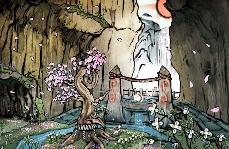
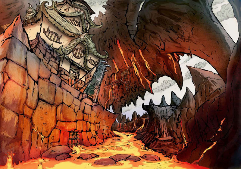
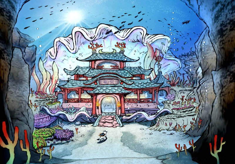
Anyway, the background designs are nothing short of stunning, as seen above, the same designs can be effectively reused for the change of the seasons without having to draw that detailed house all over again (It's alright, really). The colors used are absolutely wonderful, with the right amount of vibrancy to still makes it all seem believable.

The recurring scene of Hana resting in a glowing field of flowers whenever she dreams (Though I think she was knocked out during one incident…) in my opinion remains one of the most beautiful and emotional moments in the film (It was perhaps her own brief form of escapism for when she needed some time to further strengthen herself before going back to deal with all the heart wrenching problems she faces in the real world).


If you hadn't noticed by now, this film seems to specialize in more nature/country-related environment designs (I mean the city designs are really nice too but… look, look at these).


It's obvious that most Japanese animated films these days are of the utmost quality, but its only right to still share with you all parts that especially caught my attention. Some of the best bits of animation in this film were its fluid if not discreet transformation sequences, their wolf  transformations never truly do come off as dramatic as they should, even during Ookami's big revelation to Hana (It was more… romantic?).


And not only that, seeing as I am one to appreciate the little things, the animations for smaller details definitely did not escape me, I adore how delicately done their movements seem to be, they are never truly exaggerated and actually seem quite realistic. I especially like the way Hana's hair moves in the wind.


Even if there isn't any wind around, there's still some bounce seen in her hair!

That wind blown hair is just… perfection. I tend to go all over the place when it comes to animating moving hair or clothing, so someday I hope to animate such details with extreme care in manner simile to this.

That transition...

All I can say is that this film is absolutely beautiful, from start to finish, with absolutely stunning art direction, a heartwarming plot (That has apparently made many cry, from what I have learnt over the past few days researching into it… not me though, I suppose it was just one of those days...) with endearing and rather relatable characters, it is perhaps Hosoda's best work to date, it is no surprise why he has been considered the next Hayao Miyazaki, a must see, even for those that aren't big fans of anime.

Thursday 3 April 2014

Okami


As I was intent on using a more water-color inspired sort of art style for my animation, I found myself immediately going back to this game when looking up for references that uses such an art style, this game remains one of my biggest inspirations to this day for its unique, clever and downright gorgeous style.

Okami is a critically acclaimed action adventure video game developed by Clover Studio (That sadly closed in 2007) and published by Capcom, that was released for the Playstation 2 in 2006 in Japan and North America and 2007 in Europe and Australia. A Nintendo Wii version was developed and produced by Ready at Dawn a few months after its initial release. A HD port of the game was released for the PS3 and PSN in October 2012 and for retail in Japan in November 2012, supporting the use of the Playstation Move motion controller (Which I still can't figure out at times…), a sequel for the Nintendo DS titled Okamiden (AKA, The Chubby Puppy Edition) was also released in Japan in September 2012 and in North America and Europe in March 2011.


Set sometime in feudal Japan, the game combines several different japanese myths, legends and folklores to tell a seemingly simple (At first glance) tale of how the land was saved from darkness by the Shinto sun goddess named Amaterasu (The playable protagonist), who took the form of a white wolf.


Humorously Clover Studio didn't exactly have a solid idea on what it was that they wanted to do when this game was still in process. Originally it was meant to focus mainly around nature (Yeah, it's pretty vague…) but had no central concept or theme. Lead designer Kamiya later on created a minute long demonstration movie (With a far more realistic style as compared to that of the finished product) showing a wolf running about a forest, with flowers blossoming in its wake, but it still lacked any actual gameplay. Many ideas were thrown together before they settled for the final product we see today.

Original realistic style on the left and the final sumi-e style on the right.
What is obviously one of the game's most outstanding aspects is its art (That also connects closely with its gameplay) which is highly inspired by Japanese water color and wood carving art of the Ukiyo-e style. While Okami was originally planned to be rendered in a far more photorealistic 3D style, the studio figured that the more unique look of sumi-e was able to better present the main character Amaterasu's association with nature and the task of restoring it (That and due to the fact that there are some limitations to what the PS2 can actually handle when it comes to its graphics). 

Okami has been a huge influence to many other game titles over the years, such as Ico and Shadow of the Colossus in terms of gameplay and artwork. Capcom's Street Fighter IV also stated that the style of artwork done for their characters are influenced by the game. Epic Mickey also uses  drawing mechanics similar to Okami.

Note the brush-stroke like effects used for the characters, these are also seen in-game,
particularly when more dramatic or powerful movements are performed by the characters.
Anyway, upon switching to this style (Honestly this change in style really turned out to be a major blessing in disguise...), it was then the Celestial Brush was developed.


The Celestial Brush is a unique feature to the game, where players can for a brief moment pause the game and bring up a canvas of sorts over any scene they are currently in, where they will be allowed to draw onto the screen… obviously this works better with the Wii remote or Playstation Move controller (But I'm sure most of us got the hang of using a PS2 controller). While it can be used in combat, it is used more so for puzzles throughout the game, for instance, to revive the sun, a circle must be drawn up in the skies where the sun should be located (And this is one of the simplest tasks given, there's going to be tougher shapes to draw than circles later on…).

Obviously had they stuck to the photo realistic style, this feature probably would not have come about in the first place, and if it did, it just wouldn't blend in as well with such a style.


At first glance, you might think that such an art style would be much simpler to handle as compared to a more realistic one… well you're dead wrong. The details in this game are absolutely immense and clearly much love was put into it all, characters might seem simplified and cartoony, but take a closer look and you will realize how incredibly detailed they actually are (It is also clear how their sumi-e-ish outlines are handled with the most utmost care, with thick and thin lines carefully balanced out).  And the settings…

... oh...
… man...
… these...
… settings...
… UNGFH!
Trust me, the in-game stages aren't all that different to these concept works (And you should see the uncolored pieces too, they are just as lovely to look at).

Needless to say, the style is a lot more challenging to duplicate than one might think, it might help however if they had some experience when it comes to using watercolors and inks traditionally, some unique brushes might also need to be made (Or at least obtained) when this style is to be recreated digitally. I myself am still facing troubles in creating a style halfway close to the game's own beautiful style, though I suppose that's a good thing… I want the game to simply remain as an inspiration to me (I even own the art book, it is one of my most prized possessions, unfortunately the spine is wearing out considerably since I looked into it so many times…), not something to completely rip off from.


There is so much I can say about the game, it is obviously better to play it for yourself if you haven't… but this isn't actually a game review so I suppose I don't have any say in that (Play it). I want to again bring up the fact that this game has a gorgeously unique art style and has made me develop a huger appreciation for traditional painting techniques, deciding which lines should be thickened or thinned out still proves to be a huge challenge to me when done digitally and is sadly very time consuming, and so this will have to be used as a lighter form of reference for my Applied Animation project, I still believe however that it remains a valuable source of referencing for it and future works... 


Until next time!