Monday 12 May 2014

Ceramics Workshop Induction - A Little Research

In sculpture, an armature is a framework around which the sculpture is built. This framework provides structure and stability, especially when a plastic material such as wax, newspaper or clay is being used as the medium. When sculpting the human figure, the armature is analogous to the major skeleton and has essentially the same purpose: to hold the body erect. An armature used in stop-motion animation is an articulated metal, wire, or even wooden figure covered with material to build the character, but can be made to hold poses for extended periods of time.

Laika, LLC

Laika, LLC. is an American stop-motion animation studio specializing in feature films, commercial content for all mediums, music videos and short films. The studio is best known for its stop-motion feature films Coraline and ParaNorman. The studio is composed of filmmakers, designers and animators who produce animated content in all types of animation in most media. The division produces CG, 2D/3D, motion graphics and of course, stop-motion.

Coraline was the studio's first feature film, receiving a nomination for the Academy Award for Best Animated Feature, at the end of 2009, after the departure of Henry Selick, the studio laid off more staff in its computer animation department to focus exclusively on stop-motion.


Laika normally 3D prints most of their models, the puppets made for their film have separate parts for the upper and lower parts of the head, that could be exchanged for different facial expressions. Computer artists would composite separately shot elements together, or add some elements of their own which had to look handcrafted instead of computer generated - for instance in Coraline, the flames were done with traditional animation and painted digitally, and the fog was dry ice. Miniature clothing are normally knitted for the puppet characters, sometimes using knitting needles as thin as human hair. The clothes would also simulate wear using paint and a film.


It normally takes 3 to 4 months to make a new puppet.
Aardman Animations

Aardman Animations, Ltd., also known Aardman Studios is a British animation studio based in Bristol, United Kingdom. The studio is known for films made using stop-motion clay animation techniques. It entered the computer animation market with Flushed Away in 2006, from then on mixing together both traditional and digital medias together.

The studio is especially known for its adorably, unique character designs, Wallace and Gromit being some of their more famous characters, normally taking advantage of the stretchy texture of plasticine in their simplistic but lovable character designs (The character Morph was an inspired by the clay animation segment Greeblies), by exaggerating their features and making them anything but realistic.


Sunday 11 May 2014

Cartoon Cartoons Titles

It was tough deciding between Nickelodeon, Disney and Cartoon Network for this last post, but I decided to go with the channel that I have stuck through with the longest. And so this final post will be analyzing a small (Well, as small as can be) selection of intros from shows featured in Cartoon Network's "Cartoon Cartoons" segment.

You could say that the openings for these cartoon shows are a little more direct than previous examples I have analyzed, normally a basic intro is given about the main characters and as well as a summary of their story or goals (Which is not often considering how episodic in nature most of these shows tend to be, there being a new adventure in nearly every episode, save for a few exceptions…). At most, it is normally only the title and the name of the creator that will be credited in these intros.

Courage the Cowardly Dog


A horror comedy television series created by John R. Dilworth, the plot centers around a somewhat anthropomorphic pink dog named Courage (Yay, ironic names) who lives with an elderly farming couple, Muriel and Eustace Bagge, in the "Middle of Nowhere". Courage and his owners are frequently thrown into bizarre misadventures, often involving the paranormal/supernatural and various other villains. The show is known for its surreal and often disturbing humor and bizarre plot twists.


A TV news reporter introduces to us in the cheesiest manner our main characters and summarizes what the show is actually about. In this brief intro, we are also given a preview of the variety of villains that poor Courage has to deal with (This preview is updated with each new season). Presenting it as a B horror movie is also a pretty clever and cute gimmick, once again giving us an insight to the horror comedy elements that this show tends to focus on.

Ed, Edd n Eddy


Ed, Edd n Eddy is slapstick comedy created by adult cartoonist Danny Antonucci (Who had actually created this series on a dare), the show follows three adolescent boys who live in a suburban cul-de-sac, whom are constantly inventing schemes to make money from their peers to purchase their favorite confectionary, jawbreakers. Their plans usually fail however, leaving them in various predicaments.

The title sequence was created by the late Paul Boyd, the theme song to the show was originally presented alongside the pitch to the series, creator Danny Antonucci thinking that it would be better than simply showing a couple of drawings. It was inspired by the Bob Crosby and The Big Cats song "Big Noise from Winnetka", which was whistled, something Antonucci enjoyed doing when he was young. The theme song was composed by Patrix Caird, who was also the composer for all the jazzy sounding music used in the series, with Antonucci performing the whistling himself.

The aim for this show's opening is to simply introduce its three main characters, while rather simplistic in its presentation, we get a pretty good insight on what their personalities are like as they mess around with the camera during this really short introduction (They might all have really similar names, but they clearly aren't just three peas in a pod). While we aren't necessarily sure about what adventures these characters tend to go on, we are definitely sure that they will be anything but dull.

Time Squad


A science fiction comedy about a trio of rather hapless "time cops" whose job is to keep history maintained and protect the future, the series has been compared to such shows as Sherman and Mister Peabody and has been considered a mediocre copy of sorts. 

In my opinion however, while it definitely was not one of the best shows Cartoon Network had to offer (Ironically, the timing for some of their jokes were pretty off), I still found it to be a decent enough show to watch, much like many other shows and films that tend to twist the accuracy of certain historical events or even mythologies, I feel that it is still able to pique the curiosity of viewers, pushing them to research more into the original sources themselves (And that, to me, is one of the more effective ways to get kids to learn, folks).

Time Squad however definitely follows a more basic format as compared to other cartoon openings, most of the sequence if not all is simply made up of clips from finished episodes (Which changes with each season), and from what I can see has perhaps the shortest opening out of all the shows featured during the Cartoon Cartoons block. Still, despite the fact that there wasn't a more special opening done for the show, this sequence nonetheless does the job it is suppose to, and that is letting us roughly know what the show is about.

Mike, Lu and Og


A comedy and adventure series centering around a young girl from Manhattan that goes by the name of Mike, Mike applies as a foreign exchange student, requesting to be sent to a tropical island. She instead finds herself dumped on a forgotten, scantily mapped island populated by descendants of a British shipwreck, with the castaway having "gone native" and trying to behave like Polynesians, with varying degrees of success. Mike befriends a self-appointed bratty princess named Lu and a boy genius named Og, the trio from then on take part in a variety of adventures as Mike and the island's natives share their customs with one another.

While it is not one of my favorite series, I will admit that props should be given to this show for putting more effort into their title sequence as compared to some other shows. As seen in certain scenes, characters and props are practically separated into scraps of paper instead of being placed together as one whole image, as if the main character had put together a scrapbook of some sort during her stay there. 

The earthy colors do go pretty well with the setting of the show, giving the show a surprisingly relaxing atmosphere, and while it is a comedy, I guess I can't imagine this opening being done in a more energetic and zany manner like other comedies, though this is probably because the theme song that was composed for this show already sounds so darn relaxing.

Whatever Happened to Robot Jones?


Created by Greg Miller, the show centers on the titular character Robot Jones, a teenage robot attending a suburban middle school, it is also the 12th series to fall under the Cartoon Cartoons label. The animation technique for this show is different from most American cartoons from the early to mid-2000s, being instead animated in traditional cel animation (Especially during a time when many cartoons had switched to digital ink and paint), it was one of the last cartoons animated dependently with cels, as well as Ed, Edd n Eddy (That however switched to digital ink and paint by the fifth season, around a year after Robot Jones had ended).

The opening sequence of the show in which the main character is assembled in a factory and then inserted into a school bus is a homage to the opening sequence of the 1980s children show You Can't Do That on Television, which starts with a similar animation of children being assembled in a factory and poured into a school bus. Compared to other openings, the animation is notably fast paced and retro looking in appearance (Even more so than Ed, Edd n Eddy, though clearly the style of that show was down with a modern twist), its style bearing some resemblance to Schoolhouse Rock!

Dexter's Laboratory


Created by Genndy Tartakovsky, Dexter's Laboratory was a comedy science fiction television series that follows the exploits of titular character Dexter, a boy genius who has a secret laboratory filled with unbelievable inventions. He constantly battles his sister Dee Dee, who always manages to gain access into his secret lab despite his best efforts to keep her out, as well as his arch-rival and neighbor, Mandark.

Interestingly, the same opening was used until the very end of the show's run (Though the closing credits were changed a couple of times over the seasons, seeing as a different production team took over by season 3, the one shown in the above video was used for season 3 onwards), despite the fact that there was a noticeable change in art style from Season 3 onwards (Seeing that Genndy Tartakovsky had left after working on the hour-long television special Dexter's Laboratory: Ego Trip, which had originally meant to be a conclusion to the show itself after season 2 had ended).

The intro shows the basic formula of the show, establishing that Dexter and Dee Dee were the main stars of the show as well as what would be their running gag and main plot for most of the episodes. I always found the show's theme to be so unique as compared to other shows, as it sounded so much more dark and dramatic, while Dexter's Laboratory may have some dark elements to it (Like any science-fiction show would), I believe there is another reason as to why such a theme was composed for the show… it definitely however makes Dexter seem like a real badass (And there's no denying the fact that he is).

Powerpuff Girls


A superhero action show created by Craig McCracken, the show centers around three girls with superpowers, as well as their creator and "father", Professor Utonium, who all live in the fictional city of Townsville. The girls are frequently called upon by the city's mayor to help fight crime and the forces of evil (I should have just thrown in the lyrics for the end credits… that would summarize this entire show…).

Another considerably classic intro where a narrator introduces our three heroines and their origins, this obviously follows the format of a superhero title sequence (Much like The Incredibles), where the ominous opening is even done in the style of a comic book, with completely blackened out shadows, thick outlines and dynamic colors. 

The music also plays a pretty huge part in differentiating the characters of the three girls, while it is pretty epic and exciting for most of the part, Bubble's part of the theme is played with what sort of sounds like a xylophone (Making it sound sweeter and softer than the regular part of the theme, matching her title as the cute one), while an electric guitar rev is heard during Buttercup's part, making it sound louder and in a way, angrier (Which obviously presents her as the hot headed tomboy). 

We are then also introduced to the entire cast of villains that the girls all too easily take down within a matter of seconds (And frames), while some of these villains are not as easy to take down in later episodes, it does better establishes that these little girls are most definitely formidable foes that should not be underestimated.

The Grim Adventures of Billy and Mandy


The Grim Adventures of Billy & Mandy is a comedy horror created by Maxwell Atoms that follows the adventures of two children named Billy and Mandy, who after winning a limbo game to save Billy's pet hamster, gains the Grim Reaper as their best friend in eternal servitude and slavery forever and ever.

Billy & Mandy was the more successful spin-off from the two segmented Grim and Evil Show, while Evil Con Carne (The other segment of the original show) had also gotten a separate spin off of its own, it was Billy and Mandy that continued running successfully for seven seasons before finally ending on 2008, while the latter was cancelled, characters from the series would still make guest appearances on the show, with one of them even becoming a recurring character later on.

Being a horror comedy, the sequence expectedly uses a pretty dark and acidic looking color palette (Comprising mainly of shades of green and red) that very well matches the dark tone that the show is obviously aiming for.

Whilst the opening for The Grim and Evil Show had only briefly introduced to us the main characters from both shows (And I mean really briefly), this opening introduces more contents such as the main setting of the show, and its supporting characters and villains (Being presented like animatronics in a scare house). A variety of clips from finished episodes are also thrown into the backgrounds of most scenes, particularly for when character are introduced (Such as Billy and Mandy), giving us a better insight to their personalities. Other than that, the animation for this sequence is notably limited and more graphic-esque in design, with mostly splatter and grainy effects thrown in to create that splatter house look. The camera effects used for this sequence is most possibly done with After Effects and while easy to replicate, does make this opening enjoyable to watch without getting to much animating done for it.

Cow and Chicken


Created by David Feiss, the show follows the surreal adventures of two unlikely yet somehow biological siblings, the sweet-natured but dimwitted anthropomorphic Cow and her cynical elder brother Chicken (Who is unfortunately not all that wise himself), the two are often antagonized by "The Red Guy", who poses as various characters to scam them throughout the show.

Along side a really catchy and upbeat theme song with starting lyrics that don't really make any sense, this show's intro, like many other slapstick cartoons intros, simply introduces the main cast of the show to the audience and well, most definitely the surreal, unbelievably random comedic tone of the show.

I Am Weasel!


Originally a part of the Cow and Chicken show, I Am Weasel became its own successful spin off. Based loosely on the nursery rhyme "Pop Goes the Weasel", the series follows the adventures of I.M. Weasel, an internationally famous, highly intelligent and very talented weasel who is beloved by all, and I.R. Baboon, an ugly and idiotic baboon who is envious about Weasel's success and constantly (And pathetically) attempting to be better than him.

The theme song already gives us a hint as to what the show premise is actually based on, seeing that it is based on the well-known musical version of the rhyme itself. Much like Cow and Chicken's opening, we are once again introduced to the main characters and given a taste of just what this show's humor is going to be like, albeit with more understandable lyrics to go with the scenes that play.

While this series also happens to feature two anthropomorphic creatures, I Am Weasel is surprisingly not as surreal as the show it had originally been a part off (This is perhaps due to the fact that the show actually had an intelligent main character), the plots are actually more comprehensible and in-depth (Yeah, you heard me) as compared to Cow and Chicken, though it definitely still has its moments of randomness and silliness like any good cartoon.

Johnny Bravo


Johnny Bravo was a comedy series created by Van Partible, the show stars a muscular beefcake of a man with a woman-chasing personality, although possessing native cunning, he is intellectually challenged, which in a way makes him represent the male version of the "dumb blonde". Plots normally revolve around him trying to get a woman that he has targeted throughout the episode to fall in love with him, but in the end, he is often beaten up or stunned by his target or companions, or is simply ditched by them.

Another opening that simply focuses on introducing the main character and other important supporting characters, this however remains one of the best and most amusing examples. We are immediately shown how hilariously narcissistic the leading character is, besides throwing himself constantly at the camera (Constantly posing and showing his manly pecs to the audience) his name is presented numerous times in a variety of fonts (Including the one used for the Back to the Future films) throughout the sequence 


While the backgrounds are plain, the colors used are funky and bright, allowing the entire sequence to remain appealing without taking the attention away from the character himself, making this a really enjoyable sequence to watch, and as always, a catchy theme always helps.


Sheep in the Big City


Created by Mo Willems, The bulk of the show follows a runaway sheep named Sheep, who starts a new life in "the Big City" after narrowly escaping a Secret Military Organization who attempts to use him for their Sheep-Powered Ray Gun (With a sheep-shaped hole in it), and so for most of the series, the story follows Sheep as he tries to adjust with his new lifestyle while also attempting to avoid the attentions of a host of unwelcome characters, aside from the Secret Military Organization, there is also Farmer John (His original owner), Lisa Rentel and Lady Richington, the aggressive and hateful owner of Swanky the Poodle, his love interest.

Similar to Courage the Cowardly Dog (By having the main character watch his own show), the intro actually starts off with an unrelated clip, which Sheep, who was watching it all along, soon enough changes with his remote control to the opening sequence. This already hints us in about the show's unique format and unusual characteristics, where the main story is divided into three chapters, with fake commercials being shown in between them. (And don't get me started on how often the forth wall is broken in this show…)

During the opening sequence, the animation has a notably contemporary look to it (To go with the character designs), various blobs and geometric shapes are used throughout the sequence instead of detailed backgrounds, with rather surreal transitions used throughout when introducing other characters or shifting to another setting.

Sheep in the Big City always seemed surprisingly 'classy' as compared to other slapstick cartoons at that time, in terms of humor and style, it was especially more popular with older audiences (For some reason the literal humor apparently wasn't the younger audiences' cup of tea). And if that is not enough, its jazzy score most definitely adds to that sophistication that it already possesses.

Samurai Jack


While Samurai Jack was not a part of the Cartoon Cartoons block, I feel that it deserves a special mention nonetheless, unlike other cartoons, the show had a much more serious tone to it and was definitely less episodic as compared to other Cartoon Network shows, the goal of the main character is already established in this intro (Narrated by the show's antagonist Aku, who is also voiced by the late Mako Iwamatsu).

The intro mixes together a series of really cinematic images (To tell the beginning of the story) as well as a montage of scenes specially done for the intro and existing scenes from finished episodes. Known for focusing on a wide variety of genres, the show was nonetheless able to effectively show just how crazy and alien the future is for the main character, without giving away too much, making it the perfect little sampler to the real show itself.

What is especially interesting are the two contrasting scenes in the sequence, as mentioned before, the beginning that was narrated by Aku is done in a much more traditional manner, paying homage to chanbara films, with traditional instruments playing in the background, and the series of images shown, stylized in a manner similar to japanese and chinese paintings. Later on during the second half of the sequence where Jack has been sent to the future, the scenes become far more action packed, the montages giving us a preview of the epic fighting scenes that are prominent throughout the show, the music as well having switched to a modern rap beat, again showing how widely varied this show was.

Saturday 10 May 2014

Pixar Title Sequences

This post will be analyzing a small selection of Pixar films and their opening and closing sequences (But mostly closing sequences… because there actually aren't many opening titles, and opening scenes don't count).


Much like Studio Ghibli, Pixar pretty much follows the same format when it comes to the presentation of their films (This is so redundant, why am I putting this in…?), after the logos of Walt Disney and of course their own are presented (Animated shorts would also be presented beforehand), they will then carry onto their feature presentation. 


There are a couple of Pixar films that simply place the credits into the closing title instead, most of the time only the title of the film and the name of the studio is presented in the opening scene. It does make sense though, not often do you see films where an equal amount of effort is put into both the opening and closing titles, you should just choose one over the other, if the opening scene is already enough to properly introduce the set up to the audience, then opening title sequences might be a little pointless.

Monsters, Inc. (2001) 


Monsters, Inc. is the forth film to be released by Pixar Animation Studios, the story centers around two monsters named Sulley and Mike, employed at the titular company where its employees generate their city's power by targeting and scaring children, ironically however they themselves are afraid of their targets, believing that they would be contaminated by them if they ever came in contact with them… things take a huge turn then when one child enters their world and it is up to Sulley and Mike to get her back to her world before panic and chaos ensues.


I believe Monsters, Inc. was the first Pixar feature film that actually featured a graphic-esque title sequence for its opening (It might be in fact be the only one so far). It was said that due to the seemingly dark tone of the opening scene that follows, they hence decided to add in something cute and colorful before that scene (It's just a rumor I heard, I'm still trying to search for some proof that this was actually said…).


Throughout the entire sequence, only two elements are actually used to give us an idea on what the film is about, that being monsters and doors (And the screams of children, hah), with the most gorgeous, fun looking color palette I have ever seen used, the quirky music helps too. I absolutely adore the collage-ish style used for this sequence and I think this really was the start of something wonderful for Pixar when it comes to titles sequences.


They also do notably play around a lot with the text, considering how stylishly done the doors and monsters are in this 2D sequence, it only makes sense to get some more unique looking typography designed to go with it (Plain looking white text, such as the ones normally used for Ghibli films definitely won't work for sequences like these). From the very start, we are already shown just how fun and unique this film is going to be, and of course, despite the scary elements (Come on this is a film about monsters), how light hearted they still want it to be.


The Incredibles (2004)


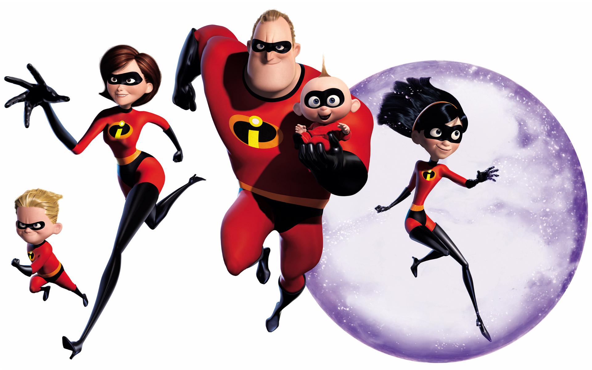
A comedy superhero film written by Brad Bird (Known for directing The Iron Giant), the film focuses on a family of superheroes who are forced to hide their powers and live a quiet suburban life, of course things do not remain as they are when Mr Incredible is one day given the chance to relive his glory days by a mysterious woman known as Mirage.


As the film is a clear homage to 1960s comics and films (It always helps when a film has a pretty fixed setting, or at least a really solid inspiration behind it), it probably wasn't all that difficult figuring out the design for the title sequence, dynamic is one way to put it, awesomely retro is another way to put it. 


While one font seems to be used throughout, it is played around a lot in terms of colors, effects and of course sizing. The style that is used is based on the graphic style that emerged at the beginning of the 50s, it also almost looks pop-artish in a way, with the modern and slick elements used. While the vector style might seem plain to some, it especially works and matches the setting and tone of the film, in fact such a style seems to make it seem all the more dynamic than a more detailed art style would.

The colors used are positively fiery and exciting (While not as colorful as the ones used for Monsters, Inc.), matching well with the retro style that is used throughout the film, really strong shades of red and blue are used to contrast deeply with the solid black used for most of the figures shown in the sequence (The characters tend to be shown as silhouettes most of the time, and if not, only one or two extra colors are added in for details such as the hair or clothing).


Ratatouille (2007)


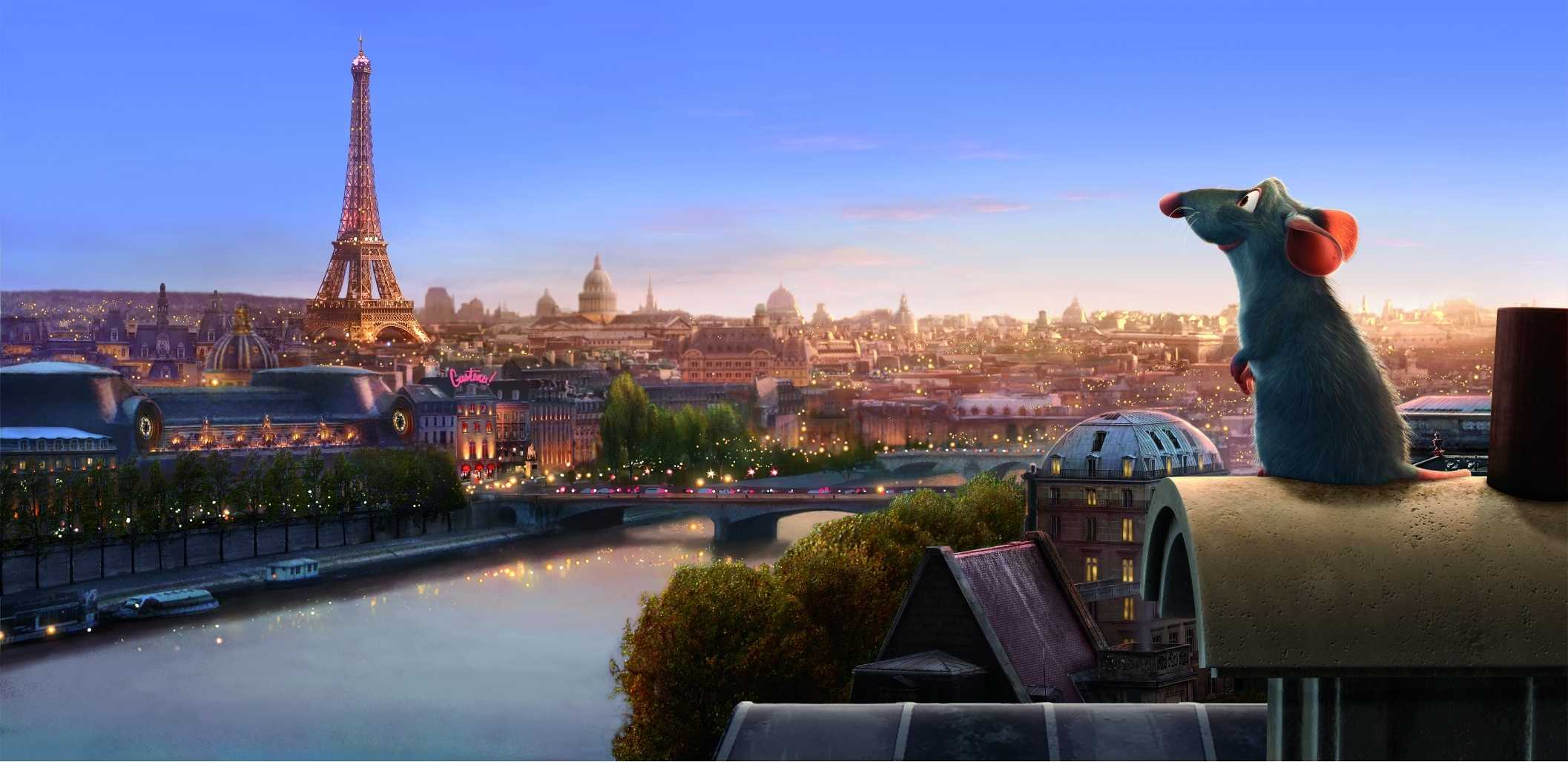
The film centers around an anthropomorphic rat named Remy who happens to have a passion for cooking. Inspired by his idol, the recently decease chef Auguste Gusteau, Remy dreams of becoming a chef himself (Despite the fact that it seems impossible considering what he is), from then on he tries to achieve his goal by forming an alliance with a young garbage boy named Linguini.


While the designs are absolutely gorgeous and it is clear that a lot of thought was put into it (There are 22 considerably detailed scenes done for the sequence before the rest of the credits actually start rolling), it would seem this sequence was merely done for the entertainment of the audience (Not that there's anything wrong with that), we don't exactly get anything particularly important out of the contents we see, only that the rats are now living the life.

What is notable however is that compared to the sequences for Monsters, Inc. and The Incredibles, only two fonts are actually used for the credits with the same color and sizing, this is perhaps due to the lengthier duration of the sequence and the fact that a consistent art style and layout for the scenes is used throughout for the sequence (This sequence really looks like something out of one of those stylish storybook adaptations), this sequence does not need to be as zany as Monsters, Inc.'s, and so it makes sense to use a simpler set of fonts for the credits (Seeing as it already goes so well with the animation).


Wall-E (2008)


There are just some films that need a stronger conclusion, Wall-E just so happens to be one of those films (As quoted by end title sequence director Jim Capobianca: "The main goal of the credits was to finish the story"), the animation is notably done in a variety of styles ranging from stone age cave paintings to impressionists paintings (With 8-bit sprites ironically popping up on the sides of the credits after, seeing that it is considered the most primitive sort of computer graphics), to obviously showcase how human civilization is able to start all over again as they work together to restore Earth and its environment.

While I am well aware of how many people have stated their dislike for the environmental message the film is practically trying to shove into their heads (I kid you not, I have been hearing about this even when the film first came out 6 years back), you cannot deny the warm feeling you will get inside for the optimistically presented title sequence at the end (And it is so clear how much was put into it as well). 

The idea behind the sequence's presentation was to make it seem like one of those enormous art history books, while the starting might have been easy, naturally the issue was what art to show (I remembered dealing with the same issue when working on my Context in Practice animation…), and so a timeline had to be planned since everything expectedly became all over the place, there was also the issue about how certain kinds of art was associated with particular artists.

A lot of consideration was taken into the design of this title as the animation team had also worried about the audience questioning their choices in art styles, especially when it comes to the Renaissance (Jim Capobianca quotes:"Are we saying that the Axiom Humans had another Da Vinci?"), and so they had to start referring to each section as a period and had to find an iconic style to represent that time in art which inevitably became associated with a famous artist of that time.

Reasons for why they decided to use 2D animation instead of 3D for the closing sequence are also quite interesting, aside from the fact that it is apparently cheaper to execute, the graphic nature of the text seemingly works better with more 2D features, and the distinct change from the film's 3D animation to 2D is supposedly able to keep around a few more people in their seats even after the credits are rolling. 

In my opinion however, the switch to a 2D style is able to better present the epilogue (Again with the clever usage of various kinds of art styles we have grown to be familiar with throughout history), it is most certainly more eye catching for the audience as well with the switch in style.


Quite a few questions have been raised from the interview with Jim Capobianca and Alexander Woo, such as why is it that 2D animated titles are so highly regarded even in this day and age. Alexander Woo quotes: "My guess is that it's coming more from a place of a love for the art form and the aesthetic that 2D brings." and thank goodness for that. An interesting thing to note is that titles really tend to be added in at the last minute, as quoted by Jim Capobianca "The titles are such an after thought… It is the nature of the beast, no one wants to think about the titles, they are too involved in getting a film done to attach to the credits."

Friday 9 May 2014

Studio Ghibli Opening Sequences

This post will be analyzing a small selection of Studio Ghibli films and their opening titles.


From Castle in the Sky onwards, Studio Ghibli has a pretty fixed format for their films, their signature logo would be presented just before an opening scene, with a proper opening title sequence following soon after, there are quite a few exceptions (Such as Spirited Away, Howl's Moving Castle and From Up on Poppy Hill) however where the opening title sequence is completely skipped over, with the credits instead being shown only in the end credits.


Nausicaa of the Valley of the Wind (1984)


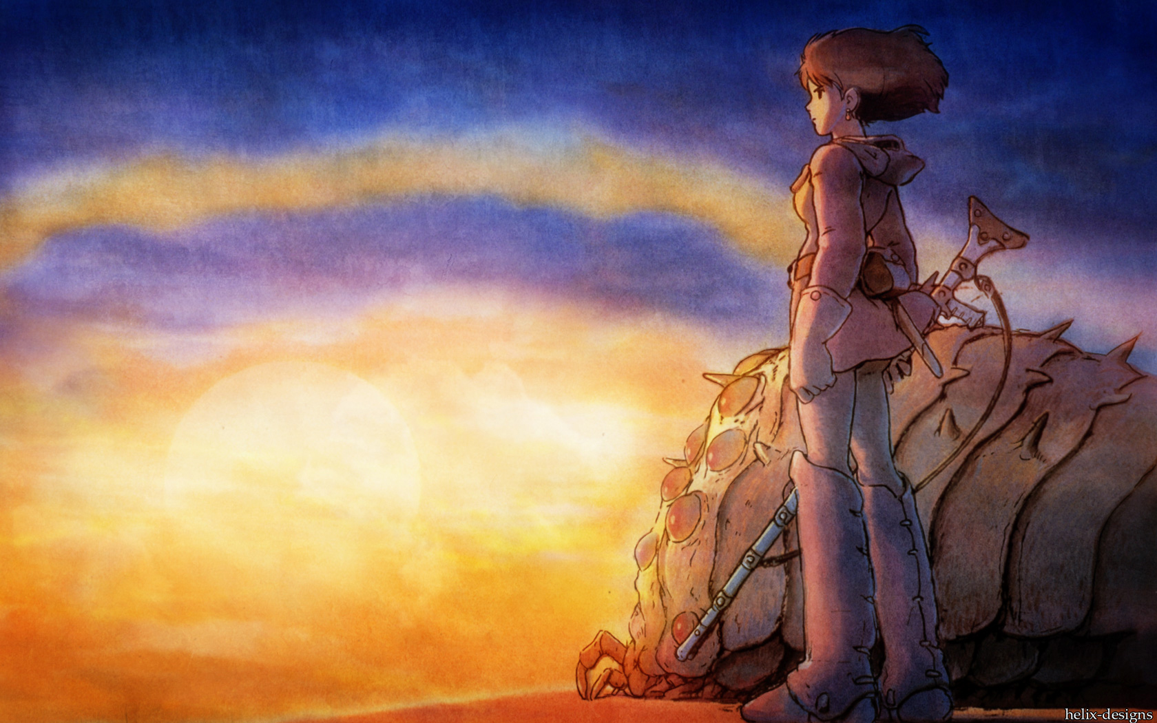
A post-apocalyptic fantasy adventure film written and directed by Hayao Miyazaki, the film is based on his own 1982 manga of the same name. The film tells the story of titular character Nausicaa, a young princess of the Valley of the Wind who gets involved in a struggle with Tolmekia, a kingdom that tries to use an ancient weapon to eradicate a jungle of mutant giant insects, it is up to the princess to stop them from enraging these creatures. 


While created before the Studio was founded, the film is considered to be the beginning of the studio and is often included as part of the Studio's works, and has since been included in several Studio Ghibli Collection DVDs and Blu-rays.


After a brief introduction by the narrator about the collapse of human civilization a thousand years prior to the events of the film, a rather sombre piece plays as the opening sequence finally begins, a series of interesting looking wall paintings shows the audience what appears to be a prophecy (Which is later on much better explained in the film) that already hints at the focus point of the entire story. 


Many of these images however cannot be clearly understood until the audience has at least watched through the entire film first,  it however does give us a taste of the setting and atmosphere of the film we will be watching. Some watchers might have instead thought that these images that are shown throughout the sequence are instead presenting what took place in the past (Seeing that wall paintings are used to record events throughout history) and what it was that had actually caused the world to be how it presently is in the film (Especially when one image seems to show various types of transport that might have been developed by them, giving an insight to how the human race has redeveloped itself in a seemingly ruined world), people with really low attention spans like me.


While a rather wide range of colors are used for these images, I can't help but take note of how they are still able to keep these images slightly desaturated (Not overly mind you until the beauty of the illustrations have gone completely to waste) so that the credits remain bright and clear enough for the audience to read, even the superimposed text remain readable on the more detailed areas of the images, there is no need to place them in the empty spaces of the drawings all the time (Which aren't that many as seen in the above images, it would anyway make the layout of the wall paintings seem unnatural if they attempt to put in some negative space for each image just so that they can superimpose the text on there).


Scenes of enigmatic looking creatures are shown in between these images, marching through cities that have been set ablaze and left to ruin. While obviously antagonistic in appearance, it  does perhaps hint at something more other than the identity of who or whom it might be that will be considered the villains of the film (And as we all know, Miyazaki has never really been a fan of traditional villains), it possibly also hints at another theme or subject matter that will be focused on in the film.


After that really brief montage (It might be brief to me since I had to keep pausing to look over small details while writing this analysis), we shift to a scene where we get our first look into the setting of the film (While we technically already did with the opening scene, this part of the world seems to show areas that are uninhabited by humans, with barely any ruins, and flora and fauna practically blanketing the entire area, and seeing as it was said before that most of human civilization has fallen, surely a very small bit of the population now occupies the planet, cluing in that the majority of the world looks like this)… 


We are also introduced to the heroine herself as she skillfully travels about in her wind glider, clearly seeming familiar with the alien looking world, already giving us insight as to what her personality might be (Strong and independent, that's whaaaat~).


Some other basic information about the opening sequence (Mainly for my reference) is that the duration for each credit tends to last for six seconds each (With the main title itself getting an extra second).


Castle in the Sky (1986)


Retitled Laputa: Castle in the Sky for the re-release in the United Kingdom and Australia (And Singapore, pft), Castle in the Sky is an adventure film and is also the first film produced and released by Studio Ghibli. The story follows a young boy and girl with a magic crystal that go on a journey to search for a legendary floating castle known as Laputa, the last remaining sky castle, while also dealing with pirates and agents along the way. This would be one of very few films directed by Hayao Miyazaki where more traditional villains are featured (I'm just saying… it's not like I have a deep fascination for them…).


After a rather exciting opening scene where sky pirates (Led by an interesting looking elderly woman) ambush an airship carrying a young girl, it would already seem that we are (Supposedly) introduced to two groups of villains as the girl is shown to be a held captive by the agents, while the pirates are attempting to steal her crystal amulet. Both groups have already shown that they could care less for her well being with the agents treating her like a typical captive (I mean their treatment towards her could be worse, but still) and the pirates throwing a tantrum when it seems that they have lost the crystal, ignoring the fact that the girl might have fallen to her death with it.


Compared to Nausicaa of the Valley of the Wind, the opening sequence for this film is noticeably lengthier, the word Laputa is nicely engraved into the background, with the main title appearing soon after, the font design for it nicely matching the style of the background. Fortunately their design and placement of the word Laputa works well for their new title during the re-release, it is interesting however to see that "Castle in the Sky" is downed considerably in quality, a plain white font being used instead of the other one they had used previously for the original release (Were they rushing when it came to this part? I don't think it would take too long to use the same design, they just need to rearrange and resize the words… there has to be another explanation)  Still, layout wise, I suppose it works.


Possibly the original design, before they added Laputa to the front of the title.

The re-released version.
The art style of the opening title sequence seems to be done in the style of wood carvings (With a little watercolors thrown in), the style and earthy color palette used gives off a very steam punk-ish feel, giving us a feel of the film's settings, it also helps that windmills, gears and airships are prominent things seen throughout the opening.
Again the lifestyles of the human population is shown here, with rather interesting forms of technology developed by them being displayed throughout, while the film is already shown to have a mystical feel to it, juxtaposing elements of steam punk are also mixed in.


While parts of the environments, interesting the characters remain quite stationary throughout,
save for some subtle movements of their clothing and hair.
Strangely enough, despite the choice of art style used,
the animation somehow doesn't look at all stiff.
In fact, it's pretty darn gorgeous... as always...


There are quite a few pan shots of really detailed looking castles and ships (Shown in a variety of states as well, some still looking gloriously majestic, while others are completely destroyed and have become nothing but ruins) presented throughout the sequence, which is a pretty obvious way of showing us this story's universe and of course letting us know that they will be some of many important elements in the film.


Trains I think?


This scene is once again used near the end, aside from how aesthetically
lovely it is, it might also be hinting at some important symbolism.
The main character from before is seen here in the final scene,
possibly hinting at her life prior to the events that take place in the film.
The durations for each credit remains pretty much the same, though it seems that one second has been taken off for each credit, the title remains on for six seconds while the credits stay on for five (It's probably common practice to give an extra one or two seconds to the title).

My Neighbor Totoro (1988)


A fantasy film that tells the story of two young girls of a professor and their interactions with various friendly wood sports in postwar rural Japan, My Neighbor Totoro helped bring Japanese animation into global spotlight and set its Hayao Miyazaki on the road to success. The film's central character, Totoro, has been very well received and is one of the studio's most recognizable characters (He is after all considered their mascot as well), making numerous cameos in many other medias aside from other Studio Ghibli films.


Unlike previous films where a short opening scene comes before the title sequence itself, this  film immediately starts with a more traditional opening title sequence (It also seems to follow a format that is used more often for television series than films), with an upbeat theme song playing and cartoony elements decorating the top and bottom of the frame, featuring objects that kids would normally be fascinated with (Creepy crawlies, junk that can be used as really crappy toys… wood, etc.), this sequence is pretty different compared to their previous ones (Which is not surprisingly really, this is after all a much more light-hearted film compared to the previous ones).


Aww that's kinda cu--
Oh sweet Jesus!
I'm sorry but they look like they are in pain…
Still, I have to admit that this is a clever use of typography.
The bright colors and cute elements used throughout the sequence already clues us in on how fluffy, sweet and 'kawaii' this film is going to be, portraying considerably serious subject matters in a more optimistic and heartwarming manner.

While it might seem that there are lesser details as compared to the previous opening sequences of other Ghibli films, not only do the bright colors makes up for it, but the constant motion of nearly everything that is seen on screen, it is only the normal credits that remains stationary, everything else including the main title as you can see in the previous screenshots are constantly wriggling and morphing about (The creepy crawlies seem pretty evil though, it almost looks as if they are trying to ambush her when they pop out from under the pieces of… wood, only missing each time).


Curiously only the younger of the two sisters is featured in this opening sequence, perhaps this is because Mei is the first to meet with these forest spirits as well as appears to have a much stronger bond with them… I am still not entirely sure as to why she is the only human character to be featured here, but it might be because she is the youngest and is hence the most innocent, once again signifying that she has the strongest bond out with these spirits.


Porco Rosso (1992)


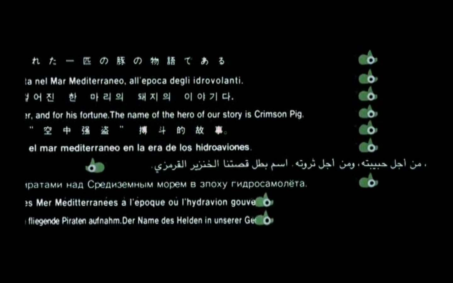
I suppose it doesn't count as an opening sequence but I feel that the short little bit at the beginning deserves a special mention, aside from giving us a brief introduction to the story and its main character, it is done in a rather simple but nonetheless cute and creative way.


From the very beginning, an introduction to the story is typed out for the audience to read, in 10 different languages mind you, cleverly mimicking the effects of a typewriter (Not just the sounds, but the movements and even the timing, as if someone was typing away at that introduction right then) while using little green piggies as stoppers for each line (Look at that lone piggie moving from right to left on his own for the Tamil version...).

They could have just done a much simpler and plainer introduction, but no they didn't, they did something that appears to look so simple at first glance, but actually has really adorable and clever little details put into it.


I just LOVE the tiny little details put into this bit.

This film deserves a longer write up in the future… it's honestly one of my favorite Miyazaki films.


Ponyo (2008)


Initially titled as Ponyo on the Cliff by the Sea, Ponyo is a fantasy film that centers around a magical goldfish that wishes to become human, upon wandering away from her father and her siblings, she encounters a five-year old human boy and befriends him.

To me, Ponyo always was one of the Studio's stranger films (But I think I'm beginning to understand its strange narrative…), and their choice of music for the title sequence did cause me to pause and consider for a moment… why was it that they had suddenly chosen such a soulful piece of music? Was it to capture the feeling of the ocean? It was just so unexpected, especially when people might have already watched the trailers where a much more upbeat theme song is playing, making them believe for a moment that the film might just have the same light hearted nature as My Neighbor Totoro, which it sort of has (It is still one of the more child-friendly Studio Ghibli films).


It was nice to see them feature a title sequence for this film, especially after not doing so for quite a few of their previous films (As you can see, I have skipped from 1992 to 2008) and simply going straight into the film itself.

Again, much like Nausicaa of the Valley of the Wind and Laputa Castle in the Sky, especially more so the latter, the images shown are done in a stylistic manner. As mentioned earlier with the music, they are clearly trying to create that ocean effect (By simply drawing in rather carefully done squiggly lines over everything… genius!), though it is done in a more creative manner where everything is cleverly simplified but remain recognizable to the audience (Such as the underwater creatures (Not going to say fish because I see whales, man, I see whales… and squids) and boats), you could say they are done in the style of children illustrations, once again making us feel that this really is meant to be a film for a younger audience.


If it hasn't already been made clear in the opening scene, the title sequence is practically screaming at us about what is the main focus of the entire film (Water, water, everywhere), every shot presented throughout are mainly of various parts of the ocean and the colorful creatures that inhabit it, while a few land elements are shown, they are normally taking up about 5% of the screen… well, I think we are getting a pretty obvious hint about what is probably going to happen in the story later on...


They clearly played around a lot with colors for this sequence, aside from the
usual shades of blues and greens, they even used out of the norm colors as seen here.


Did you know that 70% of the planet is covered in ocean? 


Like I said, the simple art style is a really nice idea, while also keeping everything in
constant motion.
I also think that it's this image that finally made us realize that Ponyo
actually is a fish… with hair.
It is most definitely the colors and animated lines that stand out in this sequence,
also note that not everything is flatly colored, some parts
have a very lovely but subtle gradient to them.
I would have to say that this title sequence combines various elements from the openings of Laputa Castle in the Sky and My Neighbour Totoro, a series of images are presented to us and give us a brief look into this film's universe, but are done in a simpler, more vibrant style that also remains in constant motion.