Wednesday 29 January 2014

Oskar Fischinger

I'm sure most of my classmates have written about this guy by now but he still makes for great reference when working on abstract sound/music animations! The man that started abstract musical animations decades for the appearance of computer graphics and music videos… Oskar Wilhelm Fischinger!


Unlike today where far more complex shapes can be created digitally for our music videos, very basic geometric shapes were used by Fischinger for his works, he however made further use of colors (That are also flatly colored) and sizes to create more interesting compositions, which I don't think I have yet to see in other abstract sound videos these days (There are some but they are not as effectively done to me).  And while he did try to keep the shapes that are in motion simple, sometimes the backgrounds would be more detailed with interesting textures and scribbles added in.

The movements of the shapes are simply wonderful too, instead of just making them pan in and out, at times it looks like they are dancing with one another, orbiting about like planets in a galaxy, or are positioned like the strings or buttons of an invisible instrument.

It is amazing to see how this entire video was able to synchronize so well with the music that played, especially since the entire animation is made of paper cut-outs and hung on invisible wires and shot one frame at a time. Simply inspiring work, especially for anyone interested in more abstract works.

Flow (Jenova Chen)

And now for something a little more relaxing…


"Flow" is an indie video game created by Jenova Chen, best known for being the designer behind "Flower" and "Journey". Originally the game was a free Flash game in 2006, to accompany Chen's master's thesis, but was later on reworked into a 2007 PlayStation 3 game by his development studio, Thatgamecompany.

In "Flow", the player navigates a series of 2D planes with an aquatic microorganism that evolves as it continues consuming other microorganisms. The game's design is based on Chen's research into dynamic difficulty adjustment, the process of automatically changing parameters, scenarios, and behaviors in a video game in real-time, based on the player's ability, in order to avoid them from becoming bored or frustrated. The goal of dynamic difficulty balancing is to keep the user interested from the beginning to end and to provide a good level of challenge for the user. It is also based on his research into psychologist Mihaly Csikszentmihalyi's theoretical concept of mental immersion and flow.

Many see Chen's games as forms of arts than games, no instructions are ever really given throughout the game, there are no words, no talking, only movements and colors, with one, very simple goal given from start till end. 

Glyphs are mainly used throughout the game to represent these microorganisms, with only the colors white, blue and red being used throughout, the colors aren't really used to distinguish the organisms apart, it is their size and length that shows whether they are aggressive or not, the background does get darker as you descend to lower planes, creating a slightly more intense atmosphere and a belief that more aggressive creatures are about.

Being filled with nothing but geometric shapes, the game uses simple ripples for when notable actions are accomplished, the controlled microorganisms also glows briefly when it has consumed something, or has a part of itself consumed by another, it is especially quite lovely to see the glow that travels down its even growing body when it has successfully caught something, there is even a rather melodious yet gentle tune that would go along with that movement.

I really liked how such simple shapes and lighting (And a very limited color palette) can still synchronize so well with the sound effects and music, though this is probably because the sounds and music used are incredibly soothing and gentle and remain quite constant. It's obviously a different story with more violent and loud noises...

Kanal von R. Hirata

Just a heads up, if you are wearing headphones, make sure your volume is properly adjusted, don't worry though, this video isn't exactly "Screamer" loud, but still the screeching sounds might cause you to cringe a bit.


I was looking around for 'mellow' psychedelia videos, instead I found this. Composed with electronic drums and sounds, A huge array of headache inducing colors with shuddery and frantic movements makes for a rather nightmarish looking abstract video.

The color and movements work really well and go in sync with the distorted sounds (There are some music clips in there that have been meshed up beyond recognition if you listen hard enough). The animation makes use of a lot of negative spacing, to effectively match the direction in which the sound tends to come from (As in, if you were to hear it more from the right, the animation would be positioned more to that side) and how soft or loud it tends to get (Smaller, thinner and almost slower movements for softer sounds and vice versa). 

I really do like how it starts off with framed box of sorts (And many times, other shapes are boxed inside it), almost as if trying to restrain the insanity within, only to break apart as the video progresses, while all the other shapes are practically twitching and twisting far more violently in comparison to it. The ripples seem so much gentler as compared to the other more solid shapes that are constantly cracking and breaking apart, they seem to be matching the distant, less distorted music clips in the video, which in a way symbolizes the weak grasp kept on any form of remaining sanity.

Overall I found this really helpful for my project, there are a wide range of shapes (Though there is also a larger focus on boxes) and colors, a huge variety of interesting movements that matches the sounds incredibly well.

Sadly not much is known about the composer and animator, she/he however does have a music channel on youtube and has posted quite a number of music/sound videos much like this one.

… maybe it wasn't a good idea to write about this while I'm feeling unwell…

Tuesday 28 January 2014

Sleeping Beauty (Walt Disney)

(All images you see in this post are screen shots by me.)

"Sleeping Beauty" is a 1959 American animated musical fantasy film produced by Walt Disney and based on "La Belle au bois dormant" (French for "The Beauty sleeping in the Wood") by Charles Perrault and based also on "Little Briar Rose" by the Brothers Grimm. This would the 16th film in the Walt Disney Animated Classics series, the third Disney Princess film (Because Alice and Wendy don't count) and the last Disney animated film as fairy tale for some years due to a disappointing box office gross. With "The Little Mermaid" making that return to the genre more than twenty years later.

We all pretty much know how the story goes so let's just get down to the setting designs and art direction...


Known to be the last Disney animation to use hand-inked cels, Walt Disney wanted the film to look like a living illustration, using medieval art as his main source of inspiration for the overall art direction, making it really different from the typical Disney style (Especially when compared to "Snow White and the Seven Dwarves" and "Cinderella"), and corresponding more to the time period the film was set in.


Though not as heavily stylized as "Secret of Kells", this would notably be one of Disney's more stylized films, especially when people by that time had already come to recognize the softer look that is used for their usual animation style prior. At the time, the backgrounds were especially detailed and would take much longer to complete (Each one would take seven to ten days to complete, while a typical animation background would take just one workday to complete). 


And while the characters were colored in a much simpler manner to the backgrounds (It's always been that way though for animations, backgrounds can be designed with more detailed textures and such while for the sake of animating, characters would be more flatly colored and simplified in design when possible, which is completely understandable), they were still drawn in that somewhat angular manner to match the style they were aiming for.


Despite Disney trying to stick as closely as possible to the tapestry style, to me, the lighting used was really realistic compared to the art style itself. It's interesting to see how the artists attempt to balance stylistic designs and more realistic light physics.


Anyway, they truly did do a fantastic job for the lighting and shadows, without taking out or showing too much to prevent any of the scenes from looking too busy (Especially since the backgrounds are already so detailed, that could be a problem), the main focus of the scene was always properly established and while now and then the main focus tends to be centralized, it is good to see how the artists use the rule of thirds most of the time.


This film had some really nice perspectives, it almost felt ahead of its time.

A lot of nice framing elements too, especially during this scene when
Princess Aurora and Prince Phillip meet for the first time as young adults.

Disney was always able to create amazing tension with their skilled usage of lighting (I will never forget that one scene when Lady Tremaine realizes that Cinderella was the mysterious beauty at the ball… she looked so terrifyingly badass), "Sleeping Beauty" however had some really memorable creepy moments (Thanks to Maleficent), particularly the spindle wheel scene. Instead of completely blacking out the entire background once the source of light has been extinguished, the colors are just ever so subtly darkened which just works so well (But to me takes so much more time to work on).


Even though there is no lighting in the room she was previously in,
it still looks really vibrantly colored (Albeit with a darker palette) if you take the time
to properly look at it, they had just done a fantastic job in creating the illusion
of an unlit room that you just never notice it.

As seen here, the use of negative spaces just makes the scene all the more intense. As compared to the scene prior, the backgrounds were not subtly darkened but instead had most of the areas near completely blackened out, perhaps to create a stronger focus point and to show the ever growing tension as Princess Aurora nears her 'end'.


It seemed to me that green was the established color scheme for evil and malevolent presences, and yet somehow it was used here where everyone was put into a magical slumber, though with some blue mixed into it (I suppose this green looks a lot more calming than the yellowish green one used in Maleficent's scenes). 


I really did like the change in color scheme here, in the earlier scene, everything still seemed quite festive (Albeit with a sad undertone as they are completely unaware of what had happened to their princess). And when the good fairies set off to carry out their rescue mission, the colors used when the sleeping spell was cast really did give off a strangely soothing look (As in "All will be right when you awaken, don't you worry your pretty heads and just sleep in the meantime until we get back.").

Come to think of it, the colors used reminds me of an aurora borealis (Whoa ho hoooo did I just make a little pun there?).


Again with the shadows… Poor guy never saw it coming...
See? Green is evil! … and purple.
After all that excitement...
The color scheme really begins to dull down.
RIP, yellowish green.
It is such a pity that this film hadn't initially done well in the box office, in my opinion this is still one of the most beautiful Disney classic movies (I also think Prince Phillips was the first Disney prince with any personality, until Prince Charming proves himself later on in "Cinderella III" DON'T JUDGE ME). I am glad though that during the years after, the film began to gain a huge following as it so deserved.

… I'm still grimacing over the upcoming "Maleficent" film, but I know I am still going to watch it eventually..

Monday 27 January 2014

Red Dead Redemption (Rockstar San Diego)

Something tells me that I'm going to write about every Rockstar game
if given the chance...
"Red Dead Redemption" is a universally acclaimed western action- adventure game set in an open world environment (And perhaps to this day, is still known as one of the best open world games out there), developed by Rockstar San Diego and published by Rockstar Games. It is the second title in the "Red Dead" franchise and a spiritual successor to the first title "Red Dead Revolver".

Set during the decline of the American Frontier in the far 1911, the game follows John Marston, a former outlaw whose wife and son is taken hostage by the government in ransom for his services as a bounty hunger. Having no choice, Marston sets out to kill three members of his former gang as he is ordered to.


As the game allows the player to interact with the game world at their leisure (Something a few other 'open world' games seem to have a mistake of not doing for some very strange reason (But that's okay "Mafia II" I still love you)), the player can take the time to take in every little detail of the environment they are in, from West United States to Mexico. This was probably the first game that would open my eyes to quality open world games (I was blown away by how much the game had to offer, what with all the side quests and random events that are featured alongside the main story mission), it was from then on, I had pretty high standards and expected quite a lot from other titles of that genre.

While I barely know anything about the Western genre (Especially Spaghetti Westerns), I was very eager to check out some of the films that had been of great inspiration to the game such as "The Proposition", "The Quick and the Dead", "Silverado", "The Wild Bunch",  "Shane" and of course "The Good, the Bad and the Ugly". Needless to say the game did an amazing job in showing the absolutely dark and gritty side of the game (And bless it for its dark humor too), it has given me a newfound respect for the genre (For its narrative themes, atmosphere, music, etc.), pushing me to look further into it when I have the time.


As vaguely mentioned before, I absolutely love the atmosphere for this game, I was so sure that I would be turned off by the warm color palette I was expected to see in all of their environment designs (I just kept expecting oodles and oodles of dusty towns and deserts, I'm sorry!) , but no, amazingly enough, all three main worlds (Especially the last one) differed incredibly from one another.


Every little detail was taken into account (They didn't just change the way the NPCs looked and the music used, those are just the basics!), weather patterns were different for starters, same goes for the flora and fauna (I was pathetically interested in how gorgeously golden the grass looked in West Elizabeth, while the grass in New Austin and Nuevo Paraiso just seemed a lot drier...), even the way the sun seemed to set felt different in each location, which in some ways made West Elizabeth feel so much colder than the other two (NOT because it had one small area that would snow constantly mind you)… 


… The way buildings were designed, placed and spread about in each location was different too (They really knew how to make some areas more deserted than others, and where to place the bustling little towns and cities, which were very few).


And of course, being a western game… "Red Dead Redemption" took full advantage of dramatic sun sets and rises, especially during the gun fights and bounty hunts… heck, even when John Marston is just strolling through town. I can see why Rockstar was able to easily make the first part of the game into a movie for non-gamers to watch, they already had all the needed camera controls and dramatic lighting required to turn it into one.

To me their usage of lighting was the main aspect that gave the game such a strong atmosphere, the sun would range from a warm glow to lazy one clouded by dust. Rockstar San Diego really outdid themselves when it came to this game, to me everything was just perfect (With so much more still to offer (Have you seen drunk Marston? Well you should!)).


Secret of Kells (Cartoon Saloon)


"Secret of Kells" is a 2009 Irish-French Belgian animated fantasy film by Cartoon Saloon, about a fictionalized account of the creation of the Book of Kells, an illuminated manuscript of the bible which has since become an Irish national treasure. Having done a few animation works prior, this would however be the studio's first feature film.

Founded in 1999, Cartoon Saloon is an Irish animation film and television studio based in Kilkenny which provides illustration, design, film and TV services. In 2007 to 2008, they developed the successful cartoon series "Skunk Fu!", which was nominated for a BAFTA Children's Award in October 2008.

Look, look!
You can see how incredibly stunning and unique the film's choice of style is, being styled after Celtic manuscript illumination, I especially found it amazing the amount of depth that can still be shown in the environmental designs for the film. 


Normally such a style would be used in very short sequences for animations (Not the best examples, but perhaps the dream sequence in "Prince of Egypt" and during Tiana's song "Almost There" in "The Princess and the Frog"). 


You could say the style might seem a little flat at first glance (Especially when looking at screen caps, they might make for gorgeous illustrations, but would it look just as good as an animation?) especially since they are trying to stick so close to the illustration style of the original Book of Kells (Which is a very beautiful book might I add), but once you actually watch the film, be prepared to have your breath taken away.


I still can't get over how unique and yet still effectively atmospheric their compositions are for every scene, and I am not just referring to their background designs (Despite it being one of the film's highlights), the character designs are so diverse (Save for the two young main characters, but hey, they are still children, so we can understand why they don't look too different from one another when it comes to their body shapes), an assortment of colors and distinct shapes (Some are really round and soft-looking, others are sharper and more angular) are used in a way that is so well done that it already indicates what their characters are are probably going to be like even before they actually speak.

But wait, I should be talking about the settings, looks like I got carried away there...
 As you can see from the numerous screen caps and gifs I have posted up to this point, "Secret of Kells" makes full use of incredibly detailed compositions with very vibrant and contrasting colors, it is interesting to note that traditional lighting is not often used in the film to set the mood of a certain scene, instead it is the choice of color palettes that sets the scene, which surprisingly works really well (Especially for that one scene where Abbot Cellach speaks to Brendan in a dark, cold-looking, bluish-grey tower room, contrasting deeply to the cheerfully humorous scene prior when Brendan and the brothers of the abbey were chasing after a goose through the village).


An interesting thing to note is how the film tends to centralize (I always remembered my photographer teacher hating that… ugh!) and frame the main focus of each scene, perhaps this isn't often advised for illustration designs, but I suppose as an animation, it works just fine (I mean it is so much easier for the viewer's eyes as well when watching it, instead of looking about to see where it is they actually need to focus on).

This is like the most beautiful book come to life (Though I have probably
said this way too many times with other animations).
A beautiful film with a unique style and rather different story to tell from your usual fantasy animations, do go watch it if you haven't yet. 

Thursday 23 January 2014

Environmental Story Telling - Finished Works

To give each place a unique feel and atmosphere to on another, different mediums were used for each set, seeing how dull a classroom setting can be, I decided to use a more vibrant color scheme as compared to the original (Noticing that the walls were a tad yellowish when I was rechecking some photographs I took), I decided to bring that out further in the drawings with a stronger shade of yellow, using a mixture of color pencils, water colors and markers. 

The first set could use more detailed rendering to create a stronger sense of depth, otherwise they all seem quite flat despite how most of them are still drawn from a few different perspectives. I suppose I could have thought more about compositions as well seeing as most of them are drawn as portraits here.


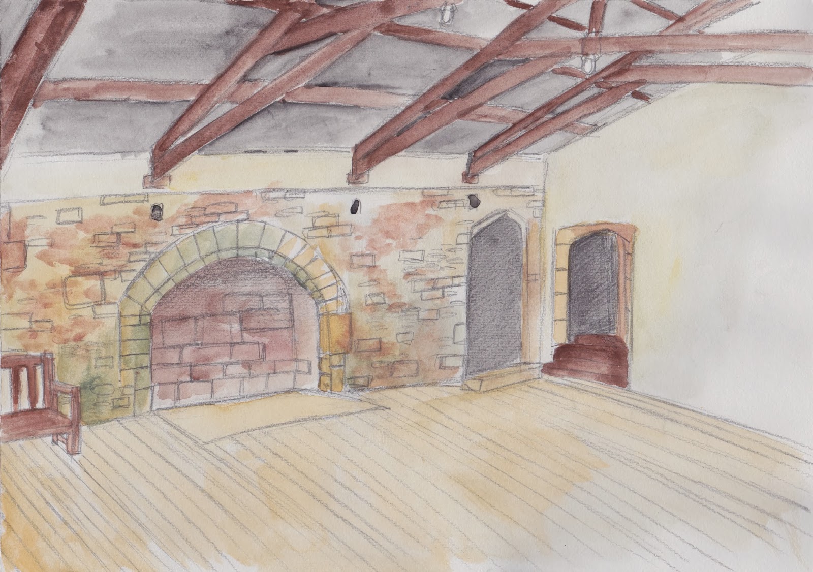
This second set of Skipton Castle took up the most time but to me, turned out the worst, perhaps I could polish them a bit more with some more shading and rendering, or perhaps I should draw up a few new ones when I have the time.


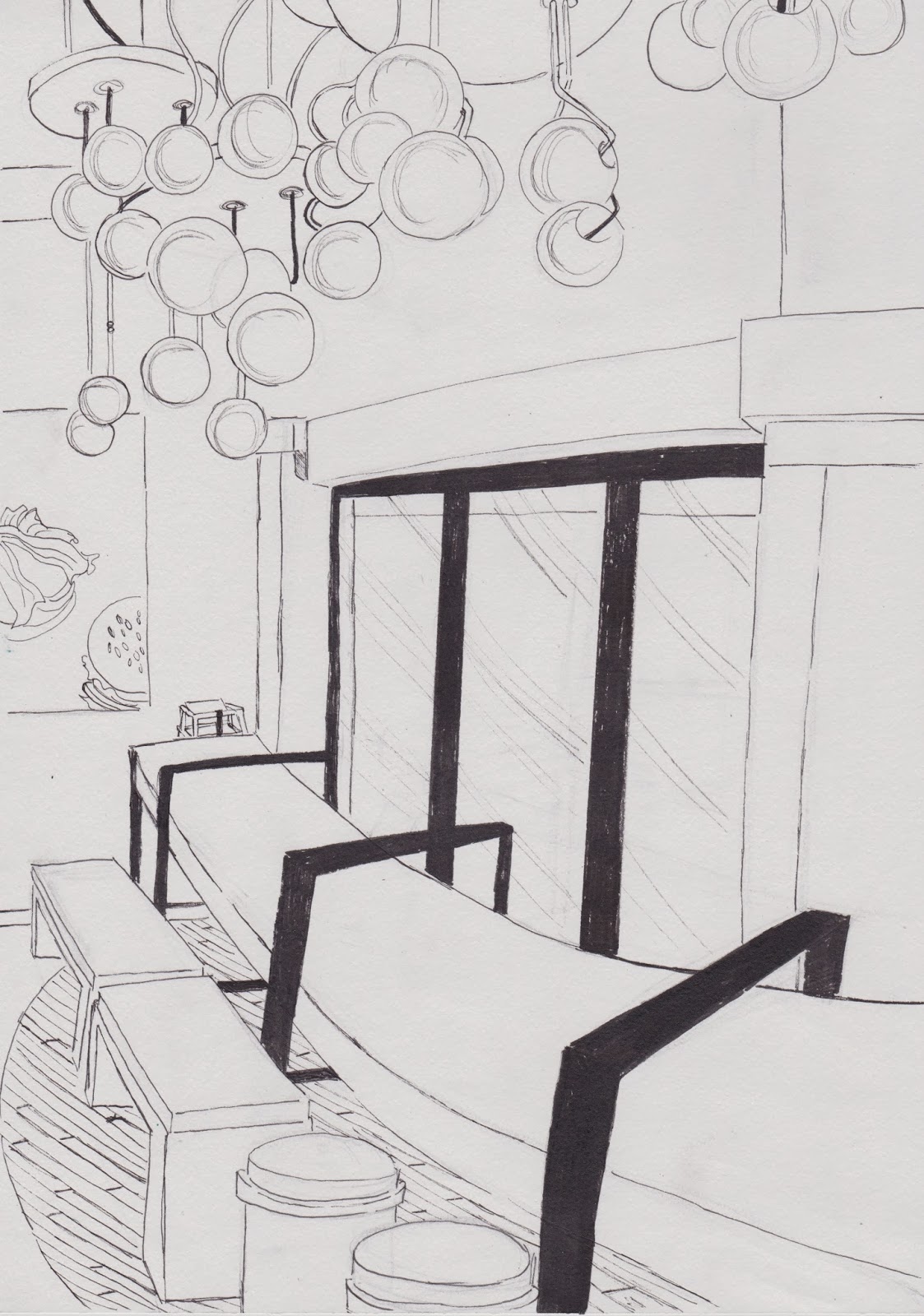
This surprisingly turned out to be the best set in the end (Various places in Singapore's Turf City), it was quite well received by the others (And I was so worried about how plain and clean the set looked at first), seeing that most of them have a sense of depth and interesting perspectives. 


I have to admit that the sketches I did before in my sketchbook looked a lot better than these 'refined' pieces (But it always feels that way with me). The best I can do is to add in some more detailed shading for some of them before submission time, and maybe just maybe I could redo one or two of the wonkier looking ones.