Wednesday 28 January 2015

Live Brief - Qwertee - Design 3

I won't be posting this design just yet, but at least I'm on a roll. I might have to stop for the time being so I can get on with other projects, but hey I probably just need to get 2 more done! At the present moment, the first design seems to be getting some decent response, though I cannot say the same for the second one, though I suppose I should just wait a little longer for that one to get around... I do hope people leave some comments if they want me to fix anything on either of them.

Anyway, for the third design, I thought there was a serious lack of Bomberman merchandise, especially ones based on one of the series' best instalments, "Saturn Bomberman", that game had one of the best gameplays, designs and music and someday I will find a decent emulator version of it to play on my laptop!

Old fanart
While I was initially going to do a design with just the main character in it, I also remembered that one of the highlights of the game were the adorable (And of course helpful) dinosaurs that you could get throughout. And so before I began sketching out the shirt design, I looked up various screenshots and watched a play through so that I could sketch out references for these dinosaurs and their three forms so I would have less trouble drawing them out later on, needless to say it was still pretty hard since they were just sprites in the game...

Forgot to add in the ears for the last one, though I probably mistook them
for a single horn on the head.
Once that was gone, I then began my rough sketch, it was at this stage I was trying to figure out what type of eyes to give the dinosaurs (Give them those Pokemon-ish ones that have both pupils scleras, or simply give them black sideway comma-shaped ones... I went with the latter in the end) and what body shape the Bombermans should have, I suppose I made them a little too fat, but I think that just adds to the cuteness factor.


I was going to use my usual painting style of just painting over a rough sketch, before thinking that it might look better if it stuck closer to the basic cel-shaded style used in most of the game's artwork. And so, despite how reluctant I was, I began creating a cleaner lineart from my rough sketch.


Once the characters in front were all inked, I then moved them closer together to get rid of the awkward looking gap between them, before lining the dinosaur at the back (It's a shame that his cross shaped belly button can't be seen).


It was here that I realised that I ended up using more than 6 colours (I say black and white counts as two colours), and so sadly I had to scrap the green... darn it Bomberman! Why do you have to be so colourful?!


While I ended up using existing colours that had only been used for the Bombermans (Yellow, blue and pink), I did change the shade of blue to a slightly lighter one to match the dinosaur's original shade of blue (Which was still much lighter)...


I really was not pleased with the colours used (It honestly looked like something used on those cheap merchandise you see in Chinese markets), and before finishing up, I messed around with the colour settings to see if anything better could come out of it, as well as threw some textures over to see if anything would look good.


In the end I went with a slightly retro looking colour scheme, and I think it looked pretty good once I applied it to the mock up. I will submit it in a few days time, and hopefully it will do better than the second one. Wish me luck!

Tuesday 27 January 2015

Live Brief - Qwertee - Design 2

This idea was based on a meme, which I don't think has really been illustrated yet in any sort of merchandise, and while there have been tons of gorgeous Street Fighter-based tee designs, I thought that this would be an amusing idea to execute.


I did waste some time trying to figure out a decent pose from him, while I had considered him to be drawn in a more patriotic pose or one where he looked a little more, shall we say, badass (With aviators on and a coat over his shoulder)? In the end I went with one of his more energetic victory poses.


The next issue was drawing a decent flag behind him, while I considered framing him in a circle with a part of the American flag showing in it, I rather liked this idea of the whole flag waving grandly behind him. Despite following the reference as closely as possible, it would look nowhere near as good unless I did a vector in Illustrator (Which I didn't want to waste to much time on)...


And so scrapping that idea after painting it 3-4 times, I instead used a royalty free image of the American flag and distorted it a little so that it looked like it was waving in the wind (Which was actually easier said that done since the Wave settings were very sensitive).


I quickly airbrushed in some shadows after that, before giving it a slightly pixelated look to match the main subject.


Upon placing the image into the mockup, I realised then that the Ipod could not been seen unless I switched it to the other one (Seeing as the flag is there as a background). So upon going back to fix that issue up, I was glad to see that his pose actually looked better this way, even without the Ipod in the left fist, it really looks like he is reacting enthusiastically to the song he is listening to, and had I stuck with the original pose, the right arm would look a little awkward.


After that was done, I decided to save a png version of this image before applying it to the mock up (So that the whites would actually show), before finally sending it for approval.

Live Brief - Qwertee - Design 1

I started by listing down a couple of series, regardless of whether they were obscure, popular or are presently trending heavily, what mattered was whether they had any merchandise made for them yet, and whether people would actually be interested if not. I then decided to start off with something simple and do a quick design based on the cult classic "System Shock 2", with my first design featuring the game's evil AI, SHODAN.

Ink sketch I did for Inktober.


Making sure I didn't lose too much of that sinister look the original had (Which I believe occurred with my Inktober sketch), I closely referred to a picture of her as I drew in the details on her face as well as her creepy leering eyes. And for the time being, everything was simply drawn in white.


While the pattern was pretty nice on its own, I felt that it wouldn't be as iconic without the glowing streaks of green that surrounded her face, and her piercing pupils (That I noticed were sadly removed in the upcoming remake). And so seeing as I have technically only used two colours (With five being the maximum on dark coloured shirts, I decided to go ahead and add in those green glowing streaks as well as some purple wires... and just colour her face in, I felt that it had an appealingly more 3D look after that.

I didn't want to draw in all the wires as I didn't want the design to look like an obvious square image on the tee itself. So to finish it off, I made the edges a little faded/textured so it didn't really seem that the lines ended abruptly.


Finally, I quickly did up a mock up and submitted it in (I might play around with the mockup layout for the other designs, but for now this first design is practically a try out as I familiarise myself with the process). Hopefully it gets accepted, but in the meantime I'd best work on the next design.

Sunday 25 January 2015

Live Brief - Qwertee - Brief Analysis

Who?
Qwertee is a site that focuses on selling various tee designs for a limited time, but at low prices. A
n interesting feature that Qwertee has is their "One Tee Shirt, One Day Only, One Incredible Price" offer, where shirt designs are made available for a limited amount of time before they are gone for good.

What?
Design a maximum of 5 shirts.

How?
Designs are limited to 5 colours on dark shirts and 6 on light shirts and a maximum print size of 30x40cm (12x15.75 inches).

When?
No Deadline, Submit Whenever

Why?
I didn't do very well for the Ohh Deer contest awhile back (Considering that it was more of a popularity contest), however the voting system for this one is somewhat different. While I am unsure what the outcome will be and what response I will get for my designs, I am sure that I will learn more about what sort of designs appeal to the masses. I will have to also consider my selection of colours for each design as there is a limit for each one.

It is suggested that I shouldn't upload all my designs at once, as my votes will be spread out among them, so it's normally better to submit one or two designs at a time and promote them to get more votes. So my plan is to either get all 5 done over the next week and slowly upload them over the next few weeks, or simply just get 1-2 done each week.

The most popular Qwertee designs seem to be based on existing medias (AKA, fanart), and you would probably have to be an incredibly experienced and well-known designer if you decide to put up an original piece. Fanart based shirt designs will definitely be easier to work on, especially during this short period of time.

Collaborative Practice - Choosing Briefs

While there were some surprisingly interesting briefs available on the D&AD website, being the cheapskate that I am (Seeing as we have to pay for our submissions), I also picked out a 2 more briefs from YCN (Be thankful, I originally chose 3 from there too!) just in case my partner and I decided not to get out any money from our wallets. I am not entirely sure if these D&AD briefs are suitable either for two people to work on... though I suppose we will be able to get this settled in the next session when we meet up with one another.


D&AD

1. Pantone - Reimagine your hometown through a new colour scheme.

It doesn't matter which one of our hometown's we decide to work on for this one, I believe both the UK (Or if we want to be more specific, York or Leeds) and Singapore have so much potential when it comes to being presented in a new light, the only thing is that the two are so incredibly different from one another, so we will have to choose carefully and see which one we will truly see all the way through. 

I was immediately appealed by the large focus on colours for this brief, and I will most definitely enjoy researching into colour usage as well as whichever hometown we decide to go with. This brief seems to accept digital interactive works, an area that my partner and I are still quite unfamiliar, and so it would be interesting to give it a try.

2. WWF - Inspire a new generation to understand that we all have an impact on our planet and an effect on its health.

I believe that my partner and I would be interested to work on something set by the WWF, considering its relations to the environment. My partner had also recently worked on something quite similar for her individual brief, so she might have more experience in this than I do. This maybe the most suitable brief for a collaboration, as it seems to have a more serious and formal creative challenge as compared to the other briefs.

This brief may have the biggest workload too (Including the supporting items that they allow), while the others require visual supporting items, this brief also happens to ask for audio and text submissions, the latter is where my partner will come in...

3. wetransfer - Create a print and online illustration to celebrate the person you'll be in 10 years' time. You can be whoever, whenever, however you want to be.

This one requires quite a bit of documentation (Aside from the usual research) on ourselves, and I am not entirely sure if my partner will be comfortable with this. But I do feel that it will be just as enjoyable as the Pantone brief, as there are so many ways we could go about this. I do question however over whether we should make two sets or just one, if we were to do two, perhaps we could switch and do each other instead?

This brief might seem fun and easy enough (As the challenge seems straight forward and there isn't much to submit in terms of the main deliverables), but I doubt it will be as it is so open, and I do find 'ourselves' to be a tougher subject to work on their our own hometowns.


YCN

4. Topdeck - Introduce and its products to a UK audience

This brief revolves around travelling promotions and wishes for entrants to figure our new ways that they could market their brand and replace the typical brochures. While I am not particularly interested in advertising, the content for this brief however has piqued my interest and should at least be interesting to research and work on.

This will be pretty challenging too as neither my partner and I have travelled around much, so there will be a lot of research needed for this one, into both the company and the various locations they offer to their customers, and of course research into examples of relation to the sort of thing they wish for us to design for them.

5. Fedrigoni - Design a marketing tool to promote out latest range of uncoated black papers and boards: Sirio Ultra Black

It probably seems dull at first that this briefs wishes for entrants to promote some kind of paper, but after looking at the other services this paper mill provides, I actually wouldn't mind looking further into this brief (I got such a "Office" vibe off it). It's also pretty different to the other briefs that desired to have their brands promoted in some way or form, seeing as they are willing to send us a student sample pack of their product to help us on the way, and are more than happy to let us visit them at their Studio in London.

I would like to see if my partner and I could actually design something suitable for this product if we decide to go with this brief.

Saturday 24 January 2015

Responsive Session 7

We had a briefing today for both Studio Brief 2 and 3, after what we have experienced with Studio Brief 1, I say we were a lot more prepared this time round for what we are suppose to do. The instructions seem a lot more straight forward this time, and I hope they are...

Studio Brief 2 - Collaborative Practice
Deadline: 23/4/2015 - 1pm

Pretty much what the title says, we are to choose a partner to collaborate with (They can be from a different major or in the same one as you), and pick a brief (Be it a YCN or D&AD brief) to work on together. For the next session, we should have picked 3 briefs each, as well as do a little write up for each of them as usual about why we chose them.

I have thankfully already picked my partner (Who I have wanted to work with for awhile now but never truly had the opportunity to), and so what we simply need to do next is pick our briefs and share it with one another in the next session.

Studio Brief 3 - Project Report
Deadline: 19/3/2015 - 1pm

This is where we put all the work that we have done into a proper report for our final submission, regardless of what software we use (Be it Photoshop, Microsoft Word, Indesign, Illustrator, Powerpoint, etc.), we just need to make sure that it is exported as a PDF.

What we should write about are:
  1. What was the brief about
  2. How we responded to it.
  3. The progress of that design
  4. What was the outcome (Successes and Problems)
  5. What we have learnt
  6. Evaluation (At the end about the entire module)
While we are still trying to finish up on our present Studio Briefs, we can still plan ahead on what layouts and typography to use for this report, and can at least begin writing for some of the briefs we have already managed to complete.

We were also made to fill out this sheet in the end:


Friday 23 January 2015

Machine Workshop

A lot of us probably felt really down when we learnt that we had to attend a full day workshop the very next day just after we met a deadline. But unexpectedly, this perhaps turned out to be one of my most favourite workshops to date. Roger Berry was just so infectiously cheerful that you couldn't help but feel comfortable in his presence, even as he tested you on questions.

Just giving a little introduction here, Roger Berry hails from Halifax and is an Electronic and Software design consultant. While he previously studied software design, he took a course in furniture building, and since graduation, has worked for the Eureka Children's Museum, where he has designed numerous exhibitions for them.  Also, the man is an honest to goodness gamer, who absolutely loves his classic games (Whoo!).

Anyway, we started off the day with David getting the sleeve of his coat stained with paint when he accidentally leaned on one of the wet doors. Thankfully however, it came right off with some white spirit. Once we introduced ourselves a little to him (And I really don't think I have met anyone who was so interested in what we had to share as him), we then headed into the workshop and went through some usual procedures such as getting briefed on health and safety and what we will be doing for the day.


Look at Leon, laughing at other people's misery.
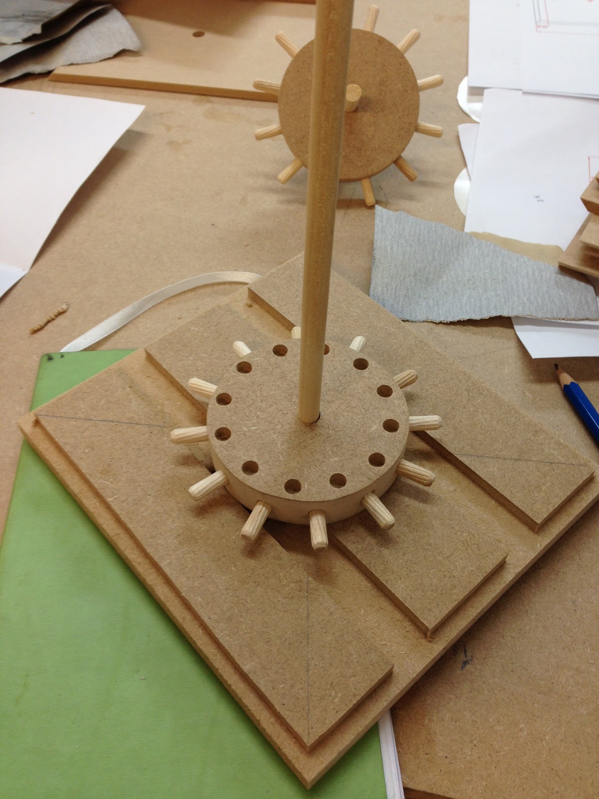
For this workshop, we were shown how to make a box... okay it probably sounds pretty dull when I say like that, but really, it wasn't. We were also made to build  a little piece of mechanism inside the box that would allow you to rotate a little object at the very top of the box... you could say that it is a very basic rotation device (As seen below, with his cute little golfing figure).

We were provided some blue prints on the parts that we would have to make before we began some calculations, much to the hilarious chagrin of my classmates. This would prove important once we finally started preparing our parts.


The first piece of machinery we were taught to use is the Alterndorf WA80, a dimension cutter that accurately cuts your material, all you need to do is enter in your desired length value and it will automatically be adjusted for you (Obviously better than those guillotines in the library). It also allows you to cut in the mitre joints for your components (That we did after our lunch break), though it would seem that the scale was a little off, so an extra 1mm had to be added to the overall value before you could actually start cutting.

Anyway... let's watch the first few demonstration videos.


I am so sorry about this, I had to downsize all of my videos so that I can actually post them on here (The original quality is much, much nicer), also be warned, you might want to lower your volume... it might be safer than trying to catch what he is saying:


After that, we were shown the band saw, and by that time, I was literally jumping with joy as I remembered using one of those back in Secondary school. I always remembered one of the first rules of using it is that each cut must go in one direction, so don't even think of trying to turn it half way through or trying to tilt it. This machine is just meant to cut out the large chunks, if you wish to smoothen that object, you will have to use another piece of machinery.

It was definitely still one of the most challenging tools to use, especially when I had to cut out a notch for one of the box walls (It felt like a puzzle really, and I am so bad at those).


Next up was the Disk Sander, said to be the most dangerous machine of all, but honestly it was the most fun one to use for some reason (And I don't file things often), this is where we smoothen the edges of our components, while taking great care to keep our hands away from that rapidly spinning disk, otherwise you are going to messily lose a few fingers in no time.


The drill press was another tool that I had used back in Secondary school, though I don't remember it as well as I didn't use it as often as I had with the Band Saw.  It pretty much does what its name says, and that's drilling holes. This was probably my least favourite tool, and I will tell you why in due time.


The last piece of machinery we were shown was the Overhead Router, this is where you create rebates into your components (Like a kitkat), it's pretty straight forward, but the one major rule is move your object from left to right as the drill is rotating in a clockwise position, so if you were to accidentally do it the other way round, everything is pretty much going to fly everywhere in a carnage of saw dust and wood chips... and maybe a little blood, and definitely splinters.


After we were shown how to use these tools, we then set off to make our components, though of course not without putting on some safety equipment. Thankfully, seeing as we were a small group, we were all actually able to complete our boxes by the end of the day, though there were still issues where we had to wait for one another when using the drill machine...


Did I mention how much saw dust there was? In due time, we ended up coughing a little, it was inevitable, even if you were wearing some form of protection (Though maybe I should have worn one of those masks instead of just pulling up my bandana).


With all of the pieces finally completed later that afternoon, we then began putting it all together. Some holes unfortunately turned out a little too small, and so Roger had to help us out by using a portable drill (I wanted to just say drill, but you probably know why I didn't). After some gluing and sanding (And some more drilling), we then used duct tape to put together our boxes.


I actually screwed up near the end when I was drilling the side holes into my gears, I didn't want to keep my classmates waiting, so I tried getting it done faster... and in the end, I accidentally didn't position the gear properly and so drilled one of the holes a little too close to the edge. Thankfully Roger had a spare one to let me use, so I did not have to go through the trouble of making another one. Aside from that issue, the reason I don't really like the drill machine is how tedious it is, even compared to some of the other tools (I didn't mind cutting numerous square pieces with the dimension cutter).

Also I screwed up a little when it came to some measurements, and accidentally took one of Sam's pieces instead (I'm so sorry!!!), but once again, there were thankfully some spare pieces that Roger was able to provide us with.
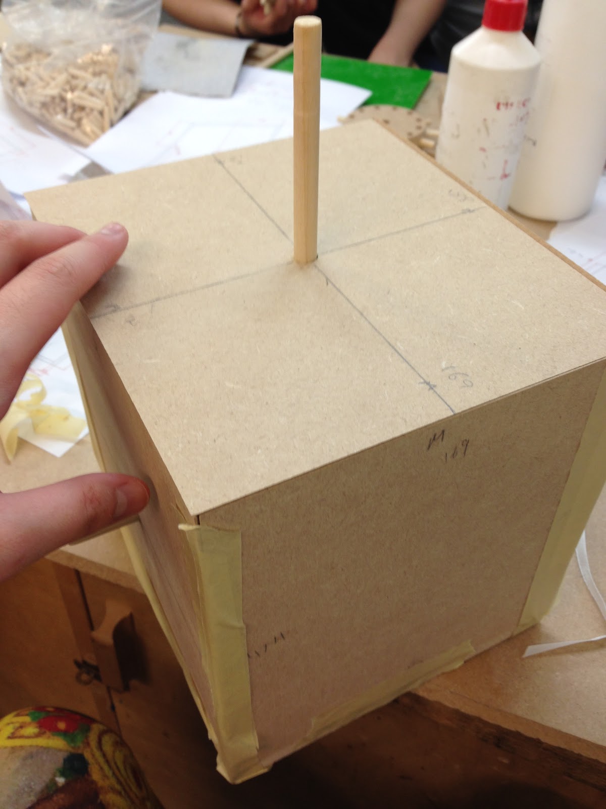
And here's my box.
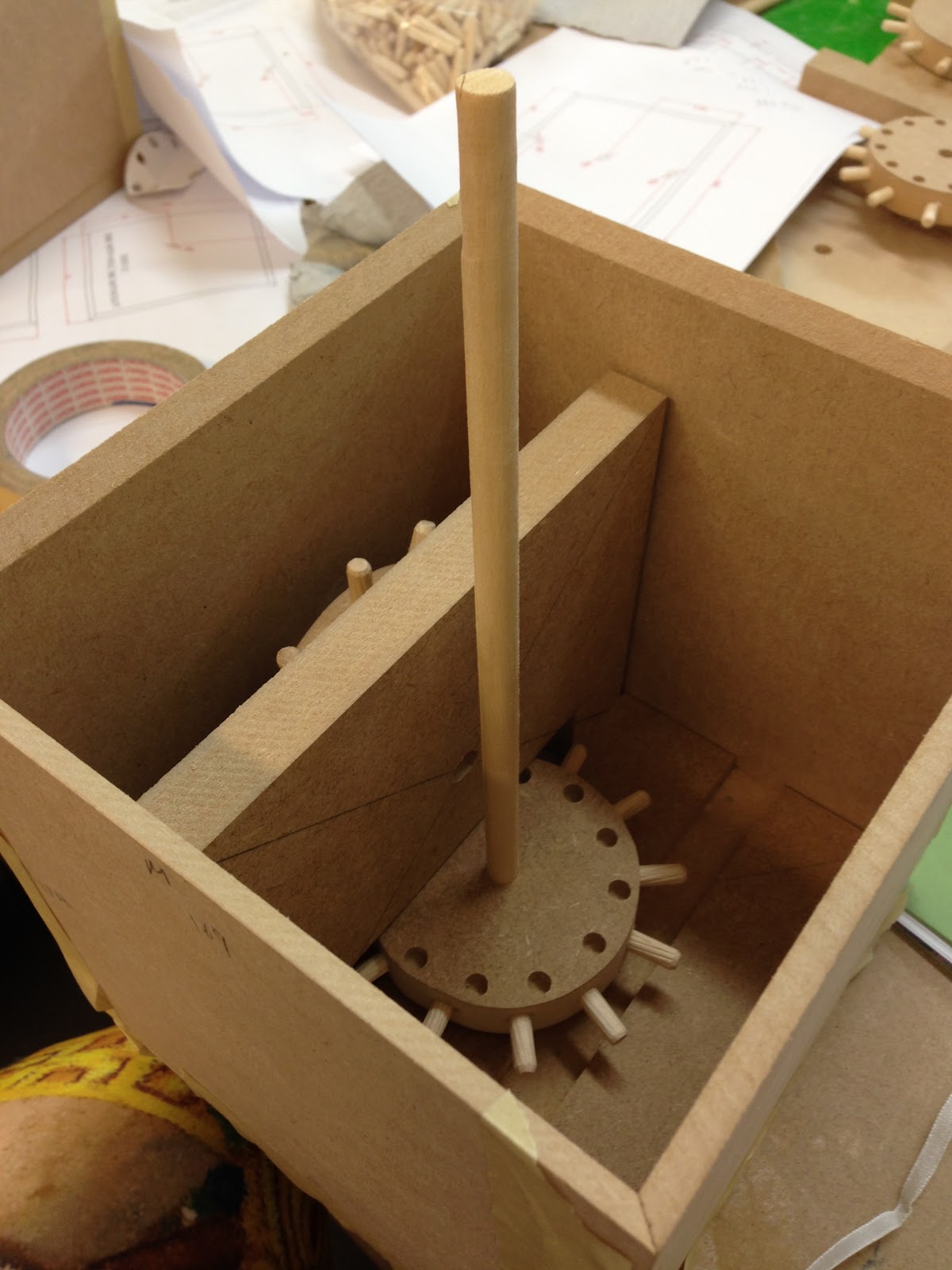
And here's how it looks inside.
And here's what happens when I turn the outside handle, I gotta do it slowly though, otherwise the gears will fall out of place:


I have since removed the duct tape and neatly replaced it with scotch tape, I am hoping to decorate it in the future... and while it's a little weighty, I do want to bring it back to Singapore if I can (Along with my armature and ceramic head).

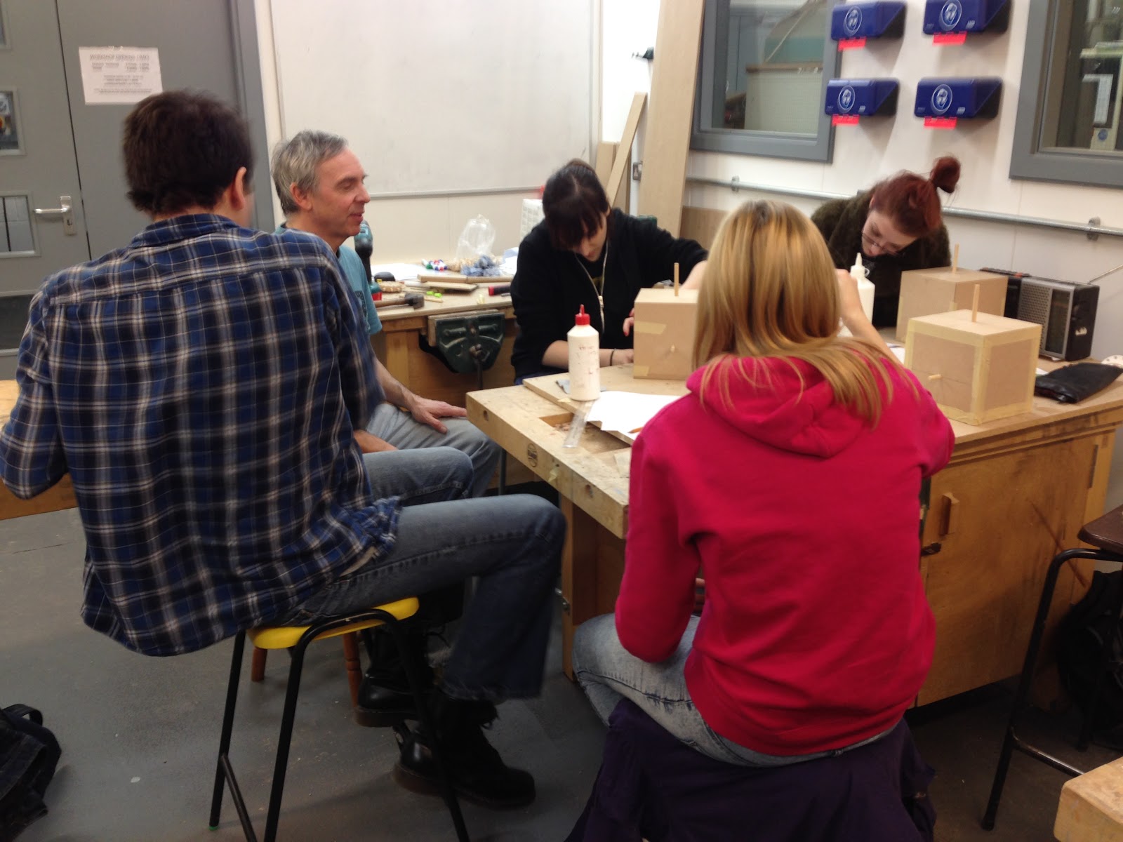
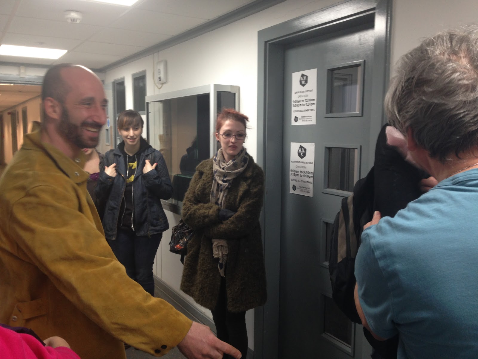
Here are some group shots that I took
just as this workshop came to a close. 

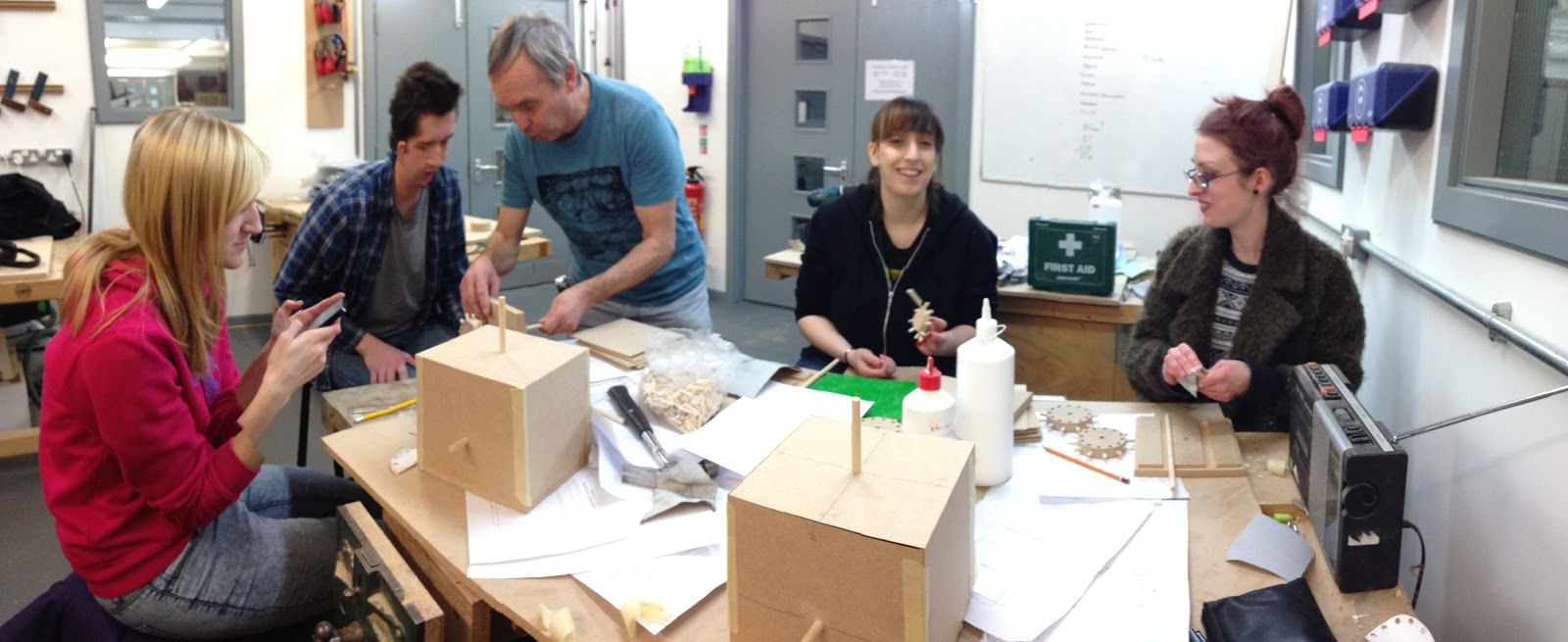
I also like this one.
As I said before, this really was one of the most enjoyable workshops that I have attended, I really liked the fact that we were properly shown to use to a few important pieces of machinery, instead of being briefed on how to use nearly all of them (Because there was so much to take in during the Metal Workshop). This day went by really fast to be honest, and it just felt like a nice little break before we dived back into finishing our other assignments.

Everyone is just so lovely here... nnghhhh...

Thursday 22 January 2015

Competition Brief - Macmillan Children's Books - Inspiration

While searching into scenes that I think would be interesting to illustrate, I also gathered some inspiration on what style to use for . While the brief pretty much states that their target audience is "the parents of girls aged 5-9" and "parents of boys aged 5-9", and "gift givers, such as grandparents, aunts, uncles, etc.", too properly translate, this should be aimed at the children, to make sure that the illustrations are suitable (For the sake of the parents) and eye-catching enough to draw their attention.


Most illustrations either had too much of a japanese influence to them (Too 'anime' that is), are overly detailed (Which probably won't actually be suitable for the young ones) or are just too sexualised, and so I tried extracting the best features from each of these examples in hopes of creating a unique enough style for my illustrations. So far, I have seen most of my peers going with a very simple and cute art style, such as the ones seen at the bottom of this board, and so I have to take this into consideration if I was to go in that direction, to perhaps give my own unique spin to it without taking away too much of the original material.

In the end, I went back to an old mood board I had made and referred to for a past project, as I felt that these illustrations had a much more suitable and unique feel to them for fantasy illustrations (As compared to the previous board, despite the fact that they are Alice illustrations), it definitely gave me a better idea on what drawing and colouring styles to experiment with as well.