Wednesday 29 April 2015

Sensory Overload (The Autism Project)


Some people with autism have difficulty processing intense, multiple sensory experiences at once. This animation gives the viewer a glimpse into sensory overload, and how often our sensory overload, and how often our sensory experiences intertwine in everyday life.

Sensory Overload was created as part of Mark Jonathan Harris' and Marhsa Kinder's Interacting with Autism, a three year transmedia project funded by the federal Agency for Health Research and Quality. University Professor Marsha Kinder, the Executive Director of the Labyrinth Project at USC, and Mark Harris are heading a team of filmmakers and artists working to build an interactive, video intensive website that will focus on the best available treatments for autism.

I found this to be an amazing if not insightful visual piece about what people with autism face each day, this was just so effectively done without there being any need for a wordy scripts or texts, and I don't think I was given a better understanding of what some of these folks face than what this animation piece has shown me.

While this is mainly a rotoscope animation (Much like A Scanner Darkly), the choices of colours and line art style was able to effectively convey how frightening even small actions can be to a person with autism. The splurges of aggressive colours disrupting an otherwise 'cleanly lined' universe really added to it all, that even a simply tapping of a pen against a soft notepad proves stressful to the subject. Of course, the harsh sounds was what truly show how scary most of these things appear to be, but once again, the visuals really went well with the cringing sound effects (I am honestly too afraid to watch similar videos now after accidentally chancing upon one that nearly made me deaf earlier today).

I absolutely had no idea how terrifying it can be for them (I am aware that this does not refer to all people with autism), especially when they are outside, trying to go about their lives just like everyone else, to think that this is what they have to deal with on most days... fills me with a deeper understanding for them. It really just goes to show how powerful visual pieces can be without having to do with too much talking. When done right, wordless visuals can convey a stronger message than any  piece of text can.

Mario


In an Italian playground, a song is sung that dates back to World War I. This paint on glass animation tells the dark tale of soldier who returns home from war to find that his girlfriend has left him.

Mario (Which actually translates as Everybody Calls Me Mario) absolutely fascinated me due to its manner of presentation when I first viewed it during the recent Bradford Animation Festival, and since then, I absolutely wanted to know more about it. For such a sweetly sung children's song, it is not long before you begin to notice the menacing undertones (Even a few notes already began to make my insides quiver as the short went on, and not just the rather specific lyrics) as you continue watching.

The visual style was decent enough, the animation was also fluid enough so that it flowed along with the song that was sung throughout. The paint on glass style definitely added to the seemingly innocent atmosphere at the beginning, and to the darker mood near the end.

Throughout the short, the audience sees everything through the eyes of the soldier, with his ex-girlfriend being his main focus. It is unclear as to what why it was that she had left him in the first place, seeing that everything is from the soldier's point of view, we never truly find out what her side of the story is. One could probably guess by then how warped the soldier's perspective might actually be (Especially when he saw that his ex was going out with four different people each time he returned) than what we initially believed.

The origins to this folk song remains mysterious, despite the summary provided, even Tess Martin, the creator of this short was unsure about whether this folk song started out in World War I or World War II. But it is however clear that the song references war and a specific battle, since then, this rather dark song has actually been sung by children in elementary schools (Getting some Ring Around the Rosie vibes here). And this one of many versions that Martin decided to use for her animation, making this song all the more mysterious.

I cannot necessarily say that this short was actually based on a true story (And from what I can see from the interview with Martin, this is pretty much a folk song that has continuously changed as time passed, with there being different lyrics and melodies depending on where you are), but it still feels like a powerful if not sad piece that shows what a soldier goes through during or after the war, it is not just on the battlefield where they will lose something precious, but also back at home which they once believed to be their only sanctuary...

The short could also be documenting the folk song itself, seeing as how children can be heard singing and how there is a show of clap games taking place now and then. Could this short also be referring to how unusually memorable these types of songs can be to children? They may remember the lyrics, but will never truly understand its meaning until much later (Much like Tess Martin did). It is almost haunting thinking how such sad tales can be passed down to children like this.

Tuesday 28 April 2015

Food for Thought - Production - Background Designing 3

And here are the backgrounds, I'm sure they will require some tweaking later on when there's time, but for now, I think they are good enough to include within the animation. I also quickly did up a greyscale and sepia version of the Industrial Revolution one for the others to see, if they prefer one of those two, I will quickly fix up a few things (Though I suppose the only issue I have with the monochromatic versions is the fact that it will be hard to see the bread and dough).

Other backgrounds that will probably need to do after this is the other side of the park, blue skies, and just some plain ones for the display of various pretty cakes that Cara and Anna will be illustrating later on, which is thankfully not that much.


Food for Thought - Production - Background Designing 2

While looking over our present storyboard, I started listing down the other backgrounds that I needed to design, aside for more minor backgrounds such as skies and perhaps the other side of the park, these are the other backgrounds that will be included in the animation. I tried to hold back on giving too much details, since they will each only appear for a very short period of time (And let's not forget that the entire thing only actually lasts for about 2 minutes).

Egyptian Background

To start off, I was pretty intent on giving each background a unique colour scheme to one another, this one was pretty easy seeing how most references I gathered have a warm, sandy colour scheme to their overall set ups. And so yellow and beige would be the main colours for the first background design.

Starting off with the base, I would then follow this floor level for the
other background designs.
And then next was the oven, while it's design will change for each setting,
its placement pretty much stays the same. The same goes for the baker
who will change in appearance, but will stay in the same place, doing
the same thing.

The fire will be animated in later on.
Not sure what those things are in the corner when I was looking
through references, they are either plates or stacks of dough... and I'm
leaning towards the latter.
Some plain pots and urns so to make the place less empty, the
simplification of certain elements is pretty much inspired by Scott Will's
own gorgeous background designs.
It won't look so empty once we throw Johnny and the baker in there.

Medieval Background

This one proved to be a lot more challenging, it took me awhile to figure out a decent enough colour scheme as compared to the Egyptian one. While not pictured here, I almost ended up going with a warm colour scheme similar to the Egyptian one, but I decided against it and started looking through more references.

I was actually already intent on using a more cool colour scheme for this one so that it would contrast to the first one, and so thankfully I was able to find some decent colour references from Disney's The Sword in the Stone, where a mixture of greys, blues, greens and purples was effectively (And beautifully might I add) used for some of their setting designs.

Pretty much the same process as the first one, painted the base, before
adding in the oven.
Only screenshot that shows when I almost went for a warmer colour scheme.
Did a number of things here, manly however I was painting in silhouettes for
a few items, such as the shelves and the dough trough.
Shelves of dough, sadly I decided to remove the trough since
there's no point really including it unless it was in full view.
I realise that the shelves took up way too much space, so
I shrank it before painting in some textures.
Oven's coming along nicely.
Decided to just go with a column, especially when considering the screen format
(Always include the least important things around the edges).
Table filled with way too many cups and bowls.
A basket to the side.
More baskets hanging on the walls.
And logs.

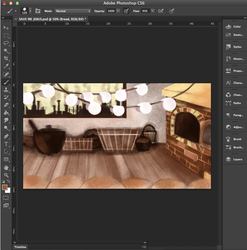
Industrial Revolution Background

There were several considerations for this one, even when the script was still being written months back. Seeing as the other backgrounds are actually fully coloured, it seemed like a no brainer that the same would be done with this background as well. But based on numerous illustration examples, my team mates and I actually considered making this setting monochromatic (This was mentioned in a much earlier post), it would be a cute little detail when Johnny briefly becomes grey or sepia-ish in terms of his colour scheme.

But it's also probably safer if we simply stuck to keeping everything fully coloured, what matters is that each setting is recognisable enough to the audience.

These actually got harder... took me awhile to figure out the
layout on the left side (Though a large window seems like the way
to go seeing that I already used tables and shelves for the other two).
The fully coloured version goes back to a warm colour scheme,
though this time the main colours used are brown and red,
which actually also works for the sepia colour scheme we considered.
One of the main elements that I was really set on including was
putting in a fairly simple silhouette of a smokey city at the back,
which really helps establish the setting itself.
Almost forgot to colour the background BEHIND that city though.
Wasted a lot of time trying to get these hanging doughs
to look right, in the end I erased it and drew painted it
with a cleaner brush. (FYI, I used only two brushes when
designing all the backgrounds)
Started adding in other things such as bread in front
and baskets and pots at the back (Seeing that the window
is too low to allow a table or chair).
The hanging dough looks a tiny bit better now... I will be saving that
and the bread in front as separate PNGs just in case.
MORE BREAD AND POTS.

Children of the Holocaust


While I may have written about this series a number of times now, I still believe that this series was what properly introduced me into the world of animated documentaries as well as the process (Well roughly at least) behind it.

Children of the Holocaust is an animated documentary series by Fettle Animation that was commissioned by BBC Learning, these shorts focused on the experiences of several different people who experienced the horrific genocide first hand. And so much like Going Equipped, these were actually animations that revolved around live interviews, the difference however was the fact that each short went all out in illustrating what it was that each interviewee actually experienced during their nightmarish ordeal, instead of simply animating the interviewee himself/herself.


Seeing that the documentary focuses on an incredibly dark period, it was interesting to see how Fettle Animation went about properly censoring the shorts so that they would be suitable for the children to view, aside from of course editing and cutting out hours and hours or recordings they had obtained from the interviews down to just 5 minutes each. 

While it is pretty much impossible to completely remove things such as weapons and dead bodies (Though that was only actually shown in just one short, plus they looked like little dollies than real human bodies), I believe that Fettle still did a really decent job in toning most of it down, I suppose it was also the rather cute art style that contributed to that (Truth be told, I found the music to be much more grim that what I actually saw on the screen).

Aside from that, the studio also needed to work alongside an expert when it came to double checking the accuracy of the historical facts that would be presented in the animated shorts, which is big job in itself. And so even before any animating could be done, a lot of editing and research of the source material had to be done first.


Children of the Holocaust as a whole, definitely gets its point across, which is to simply educate the younger generation about one of the world's darkest times, and just how much these people had gone through during then. It is interesting to see how the Holocaust was viewed from several different perspectives instead of one, regardless of how different each situation seemed, they had all lost so much and struggled with what they had as they fought to survive at such a young age.

Lip Synch: Going Equipped


Going Equipped directed by Peter Lord was one of five interview animated shorts commissioned by Channel 4 as part of the Lip Synch series by Aardman Animations (The others being Creature Comforts, Ident, Next and War Story), the short focuses on a young man in prison as he is interviewed (By British author Derek Robinson) about his life, how he got into prison and what it is actually like doing time in there.

For those  that are only familiar with Aardman's more children friendly works, this early piece might come as a bit of a surprise to them (Myself included), especially when considering how realistically animated everything is (While also successfully preventing such a realistically made character model from looking too creepy which I think tends to happen in other stop motion works). The little gestures he makes are just so realistically done, that seeing a plasticine model instead of the real person speak somehow makes it all the more interesting for the audience (If not poignant).

Aside from the incredibly well animated character, the overall cinematography effectively magnifies the deepness of the interviewee's words, without having to resort to the addition of extra characters (Even when he is talking about his family and his prison mates), there are a few shots of different settings to better present the description of the young man's life before and during prison life (Which both appear really bleak to be honest), and the different camera angles really adds to the overall atmosphere.

Sometimes, an animated adaptation of a documentary might prove to be more effective than a live one when it comes to catching the attention of the audience. There is also definitely that allowance in creating a stronger atmosphere than what is already present.

Persepolis


Persepolis (The title being a reference to the historic city of the same name) is a 2007 French-Iranian-American animated film based on Marjane Satrapi's autobiographical graphic novel of the same name (That was released in 2000), the story follows a young girl named Marji as she comes of age against the backdrop of the Iranian Revolution. 

While the first Persepolis novel depicts Satrapi's childhood in Iran, the second novel depicts her in her high school years in Vienna, Austria and eventually her return to Iran, where the author herself attended college, gets married and later divorced before moving to France, where she now presently lives. Hence, this series is not only a memoir, but a Bildungsroman (AKA, the coming of age literary genre that focuses on the psychological and moral growth of the protagonist from youth to adulthood).


Perhaps one of the most notable things about this animated adaptation is how the visual style follows that of the graphic novel itself, with the usage of high-contrast inking that is first seen in Satrapi's novels. The visual style definitely suits the autobiographical genre, especially when considering that this a painful recount of the author's fading memories. 

Needless to say, this is a beautifully done animated adaptation, especially during certain parts, where more textured ink blotches are used to portray the emotional intensity of certain scenes (And again that just suits the coming-of-age genre as the character clearly struggles with herself while being taken on a roller coaster of a ride through life, while also still trying to stay true to herself through it all).


"I had to remember many things that were extremely painful. Seeing my grandmother, who is dead, even in animation, walking- it's really something. So from a psychological point of view it was much more difficult to make Perspepolis. And it takes much longer. You have to be resistant." ~ Interview with Marjane Satrapi on Chicken with Plums 


To this day, autobiographical documentaries are most definitely one of the better known forms of documentary. Some however might consider this form of documentary to be a little bias (Seeing that the documentary itself is told through the eyes of one person, instead of being documented by someone who is not actually involved in anyway to the topic he or she is recording), and so there are definitely chances where certain events may be a little 'warped' than they actually appear to be. 

Still, that does not make this a completely inaccurate representation of what takes place during the Iranian Revolution. During her childhood years, Satrapi is particularly more focused upon how the Iranian Revolution actually affects her family (Which in turn affects her, especially when her western educated grandfather is imprisoned by the empire of the Shah for being a communist) as compared to what is truly happening outside. 

Despite being so young, she already begins to take a deep interest in revolutions and socialism, even though she is barred from attending protests due to her age. The first novel definitely focuses a lot more on how she begins to grow as a person, and how her communist beliefs begin to manifest and evolve as she interacts with her family.


As a documentary, Persepolis most definitely stands out as a poignant bildungsroman, seeing how easily invested the audience gets when it comes to watching how much Marji grows as she finds herself being taken from one place to another. While Persepolis is pretty much just one of many different perspectives when it comes to how the Iranian Revolution is viewed by those that have been involved in it in some way, it is definitely one of the most memorable and heartfelt recounts.

Tuesday 21 April 2015

Evaluation

This has been one of the most unpredictable if not craziest of college modules that I have taken in my two years here. While it has indeed been a rocky journey, it however does not necessarily mean that I got nothing out of the entire experience.

While I was made to enter one or two competitions back in my previous course in Singapore, I felt that I never actually made the effort to properly participate in any of them. I unfortunately did not put in enough effort when it came to the works that I had submitted in and was much more focused on simply trying to finish them and get them out of the way like I would any typical school assignment. This module, in a way, gave me the opportunity to rectify the wrongs that I have made in the past.

While it was not actually necessary to submit something in for all the briefs that I have chosen to work on for this module, I still felt that it would be most beneficial if I actually made a decent attempt in completing them all. It was a good way to practice my time management skills as well as allowed me to add new works to my portfolio and resume.

Another thing that I have learnt from this module is to consistently promote myself and get my name out there one way or another, I feel that the more competitions I attempt to take part in, the more recognition I will gain in due time. I believe that I have finally gained the courage to continuously promote myself and my work, while will definitely hold some form of advantage in the future as compared to simply staying quiet and remaining concealed.

While the module sessions were rather sparse, I felt that the peer critique sessions proved to be useful and eventually quite enjoyable, it definitely gave us the opportunity to interact as well as build up relations with students from other courses, which will most definitely be of use in the future. And most of the critiques I received were incredibly helpful, and while I could not actually apply all the suggested changes to my works (Due to the limited amount of time I had left before the deadlines), I still deeply appreciated what they had to say and took them all to heart.

The module was especially focused on brief analysing, more thorough analysing skills will definitely prove to be useful in the future, especially when I continue to take on various briefs from all sorts of clients. This module has given me that little push in better analysing briefs, to consider different factors that would allow me to approach that brief more effectively and efficiently instead of simply jumping right into it.

I chose the SYFY brief as my main brief for my individual practice, seeing how open it was as compared to the other available briefs, it gave me the opportunity to actually produce something that is much closer to my area of interest and studies, and it was possibly the only animation-related brief that I was able to uptake in the end.

Many changes were made over the course of this brief, many ideas were scrapped, many explanations were considered in hopes of convincing the judges of how strong my idea’s design concept was, and I honestly learnt from it all that sacrifices have to be made sometime, especially if you are to complete something in time. You will have to work smart, to choose the strongest points of your idea and focus on those instead of attempting to get everything done.

Responsive has given me a starting point to the development of my professionalism, the several briefs that I have completed has given me some experience on how should deal with certain situations in the future, particularly when it comes to difficult clients. I still have a long way to go, but I believe I have a slightly better idea now on how to write up a contract when working with a client or with another designer.

A large part of me struggled greatly with this module, as compared to any other modules in the past, but I always found myself reminding myself that to survive this module and its rather unpredictable curriculum and schedule, I needed to think and work smart (Very much like how we are meant to work around briefs and extract the points that matter the most). This was meant to be a considerably open module, and I suppose that was what made it so challenging in the first place.

Project Report

Individual Practice Pitch and Development Boards

Pitch Boards for SYFY:


Extra/Development Boards: 

Collaborative Practice Pitch and Development Boards

Original Pitch Boards:


Extra/Development Boards:

Wednesday 15 April 2015

Live Brief - WeLoveFine - Submission and After Thoughts


I was surprised to see that my designs were accepted so quickly (I actually found them about an hour after I submitted in the last one while attempting to navigate around the newly designed site), but it was only today did I receive an email confirmation. 


Before then, I had already begun to share my designs on whatever social media I normally used in hopes of getting a decent amount of ratings for each of them. Though in all honesty, I am actually more interested over what others will think of my designs, when seeing how each design is rated on WeLoveFine (And did I mentioned how strangely terrifying their rating system is?), it just makes me all the more curious about how my designs will be received to complete strangers. 

It would definitely be wonderful if one them gets a positive response, but I also wish to know which ones do not actually appeal to potential buyers (It would be lovely to get some proper feedback too, but from what I can see, no one really bothers to comment on this site).

With the experience gained from similar design briefs such as Ohh Deer and Qwertee, the designing process for this brief definitely went by a lot quicker and more efficiently than I could have hoped. Again however, this brief was focusing on a specific series, and so what I needed to focus on other areas such as style and concept. It also helped that this brief allows me to bulk upload, unlike Qwertee that tells us not to do so, and instead suggests that we spread out our submissions for their voting system.

As the real deadline/s is so far off, I suppose that this is as far as I can go with this brief. While I am not entirely sure if I have improved in efficiency when it came to designing for competitions, I do feel that I have finally grown accustom to the process of promoting my works online, I also have become quite familiar with doing up quick (And hopefully appealing enough) product mock ups of my designs for these types of competitions.

Overall, it has been a good experience entering these competitions, I never truly had the opportunity to do so until I started this module. It has given me a little more confidence in myself (I still hope that I can gain more supporters in due time) and I do feel that I can only get better from here on out when it comes to product designing.

Tuesday 14 April 2015

Live Brief - WeLoveFine - Design 4

My final design was based on an adorable japanese train station poster someone shared on Instagram, the characters are drawn in a simplistic manner with rather thick outlines, but it is the usage of colours that particularly stand out to me. And so, I wanted to do something similar for an otherwise typical design featuring the show's characters.


I did switch the cherry and temp bot around later on,
I actually tried to avoid including the otherworldly
characters aside from temp bot.
Line art... took awhile to clean up.
Again, clean line arts aren't my forte.
Started colouring.
As mentioned before, I switched temp bot and the cherry around.
Added in some highlights and shading, definitely started to look
pretty alright by then.
By this point, I was unsure about whether I should alter their outlines so that
it would go along with the beam of light behind them.


It doesn't seem too noticeable when I looked at it from a distance, so I went
with the unaltered one, though I did add in some light lines to the
falling objects behind them.


I definitely went all out with this last design, I even went so far
as to avoid using the painted style that I used for the first three and painstakingly
tried to get the line art to not look so sketchy. I'm pretty happy that
I forced myself to finish this design, it feels like a big finish to the entire thing.