Showing posts with label Bee and PuppyCat. Show all posts
Showing posts with label Bee and PuppyCat. Show all posts
Tuesday, 21 April 2015

Wednesday, 15 April 2015
Live Brief - WeLoveFine - Submission and After Thoughts


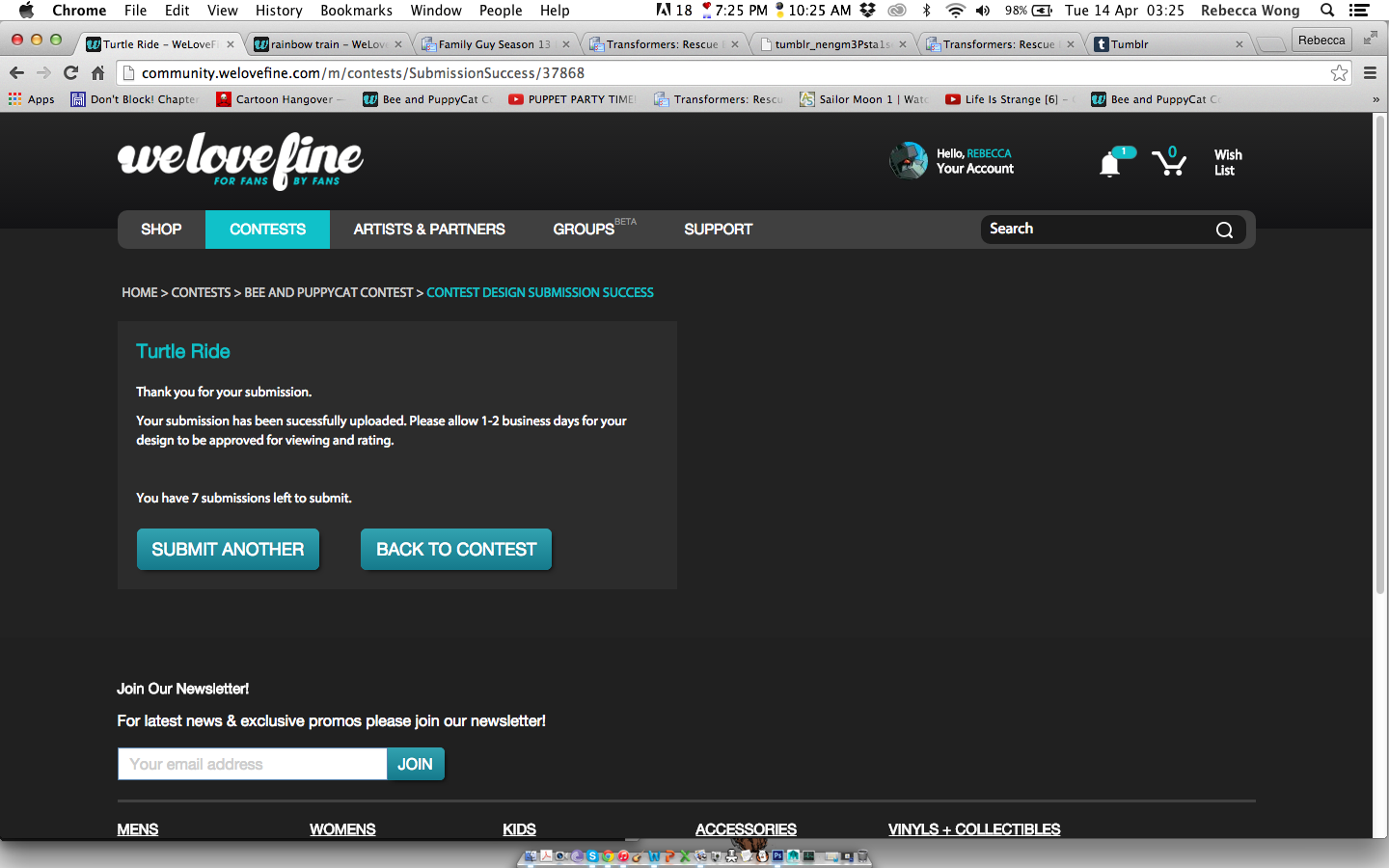
I was surprised to see that my designs were accepted so quickly (I actually found them about an hour after I submitted in the last one while attempting to navigate around the newly designed site), but it was only today did I receive an email confirmation.

Before then, I had already begun to share my designs on whatever social media I normally used in hopes of getting a decent amount of ratings for each of them. Though in all honesty, I am actually more interested over what others will think of my designs, when seeing how each design is rated on WeLoveFine (And did I mentioned how strangely terrifying their rating system is?), it just makes me all the more curious about how my designs will be received to complete strangers.
It would definitely be wonderful if one them gets a positive response, but I also wish to know which ones do not actually appeal to potential buyers (It would be lovely to get some proper feedback too, but from what I can see, no one really bothers to comment on this site).
With the experience gained from similar design briefs such as Ohh Deer and Qwertee, the designing process for this brief definitely went by a lot quicker and more efficiently than I could have hoped. Again however, this brief was focusing on a specific series, and so what I needed to focus on other areas such as style and concept. It also helped that this brief allows me to bulk upload, unlike Qwertee that tells us not to do so, and instead suggests that we spread out our submissions for their voting system.
As the real deadline/s is so far off, I suppose that this is as far as I can go with this brief. While I am not entirely sure if I have improved in efficiency when it came to designing for competitions, I do feel that I have finally grown accustom to the process of promoting my works online, I also have become quite familiar with doing up quick (And hopefully appealing enough) product mock ups of my designs for these types of competitions.
Overall, it has been a good experience entering these competitions, I never truly had the opportunity to do so until I started this module. It has given me a little more confidence in myself (I still hope that I can gain more supporters in due time) and I do feel that I can only get better from here on out when it comes to product designing.
Tuesday, 14 April 2015
Live Brief - WeLoveFine - Design 4
My final design was based on an adorable japanese train station poster someone shared on Instagram, the characters are drawn in a simplistic manner with rather thick outlines, but it is the usage of colours that particularly stand out to me. And so, I wanted to do something similar for an otherwise typical design featuring the show's characters.

 |
| I did switch the cherry and temp bot around later on, I actually tried to avoid including the otherworldly characters aside from temp bot. |
 |
| Line art... took awhile to clean up. |
 |
| Again, clean line arts aren't my forte. |
 |
| Started colouring. |
 |
| As mentioned before, I switched temp bot and the cherry around. |
 |
| Added in some highlights and shading, definitely started to look pretty alright by then. |
 |
| By this point, I was unsure about whether I should alter their outlines so that it would go along with the beam of light behind them. |
 |
| It doesn't seem too noticeable when I looked at it from a distance, so I went with the unaltered one, though I did add in some light lines to the falling objects behind them. |


 |
| I definitely went all out with this last design, I even went so far as to avoid using the painted style that I used for the first three and painstakingly tried to get the line art to not look so sketchy. I'm pretty happy that I forced myself to finish this design, it feels like a big finish to the entire thing. |
Live Brief - WeLoveFine - Design 3
While I can't say that it's a running joke (Like how temp bot's voice and appearance changes with each episode), turtles seem to be featured a couple of times throughout the show (Along with other things...), and so I thought this would be a cute element to focus on for my third design. I really was hoping to keep some of these designs as simple as possible, considering how most people tend to go for simpler designs than overly complex ones (This is also based on personal experience when I first started designing things for my Redbubble shop).

 |
| The sketch for this one was super quick and rough, and so I had to take some time to add in the proper details. I also had to change Puppycat's pose (Seeing that my sketch is practically just a blob). |
 |
| Clean line art isn't my forte. |
 |
| Repositioned his legs to make it seem as if he's actually moving. |
 |
| Starting colouring in, as well as added in that extra detail shown in the character sheet. |
 |
| I should have been done with this design by this point, but I frankly wasn't happy with how it looked... |
 |
| While I was planing to keep it flatly coloured, I once again thought that it looked too plain and so decided to go with a painted style, where it looks like the design is done out of chalk or crayons. |
 |
| Didn't seem right without some grounding either. |
 |
| I messed around with a plainer one before deciding to go with one that matched the textured style of the characters. |
 |
| Another cute and simple design, the style was based on the illustrations that were normally shown in the opening of each episode. |
Live Brief - WeLoveFine - Design 2
The next design was something a little simpler, I was actually inspired by a really old piece of concept art that was done for Disney's Cinderella film in 1950, where a particularly romantic scene between Prince Charming and Cinderella was so effectively presented with just a few simple brush strokes. I thought this look would especially suit the show's still rather mysterious Space Princess and Outlaw (That have only been mentioned in the pilot so far), considering the way they were first introduced in the pilot.
 |
| Ignore the bottom sketch. |
 |
| The process for this one was thankfully a lot faster than the last one. |
 |
| It was just figuring out the overall layout. |
 |
| So I know I said that I would avoid silhouette designs, but it's not necessarily a silhouette design when there's some extra colours and clothing details added in. |
 |
| When adding in the extra details, I did look up some of Natasha's concept art on her Tumblr. |
 |
| That giant star was simply a placeholder, until I got the rest of the design figured out. |
 |
| It took some time figuring out what to the add to the end of the swirls, but in the end I went with something really similar to my main source of inspiration. |
 |
| And finally a little rose to the top (Based on what I believe was official art from the show where the characters were framed by white roses), as well as some little stars to decorate the entire thing. |

 |
| Despite how simple this design is, I actually like it a lot more than I do the first design, it definitely has a stronger concept as compared to the princess pin up. |
Live Brief - WeLoveFine - Design 1
For my first design, I decided to start off with something simple, and so I chose to do a pin up of the series' titular characters, and based the look mainly on those dreamy pin-ups that are normally done as promotional works for most magical girl animes and mangas (Particularly Sailor Moon, because Naoko Takeuchi absolutely loved drawing dreamy illustrations of her Sailor girls, and we of course loved seeing them).
 |
| I always have trouble figuring out where to position the character's hands as seen in this sketch. |
 |
| While this is pretty much a slight alteration of Bee's dream dress, I was also considering whether I should also stick to the colour scheme used in the dream sequences, or instead stick to her normal colour scheme. In the end, I decided that the unique dreamy colours remained the more appealing choice, seeing that there was also a unique treatment of the line art itself instead of just plain old black. |
 |
| For her redesign, I was really aiming to give her a more princess-y feel (A side of her that is still not often as shown as I had hoped on the show), and so this redesign was inspired by various renaissance dresses. As you can see here, I was looking up various references of slashed sleeves. |

 |
| Almost considered adding in an extra colour her dress, but removed it later on and simply stuck to the colours that were already available in the reference. |
 |
| I decided to use my painting style for this particular design (I suppose you could say that I was inspired by some of the winning designs that used a similar art style for their works), as the dress would look a little too plain if I were to flatly colour it. |
 |
| I did have a bit of trouble figuring out the lighting and so experimented with several brushes for quite awhile. |
 |
| Yup, still trying to figure out what looks decent... |

 |
| Added a little lace to the bottom |
 |
| Though then again it's going to get hidden away by all the bubbles... I do however love how the bubbles magnify parts of the dresses, one of them even vaguely shows the lace detail. |
 |
| No, I didn't forget about Puppycat (I feel bad for leaving him last all the time though). |
 |
| Added in a few extra little colourless bubbles around them. |
 |
| I actually considered making her hand sweep through a stream of bubbles, but thought it looked too busy (Looking at it now though, it actually doesn't look too bad... doh). |
 |
| The submission process thankfully wasn't too troublesome (Though I was a little lost at first since the site was recently redesigned), fabulous thing is that there is an incredibly low character limit for the description section, so I didn't need to spend too much time filling that section out (I even went past the limit the first time). |
 |
| While it has been submitted in, I won't know whether my design will get accepted, it would seem that I would have to constantly check the page as I won't even get notified about it (This turned out surprisingly scary, especially after seeing their rather harsh rating system). |
 |
| And this was the mock up image I submitted in, it is sad to say that their submission kit isn't as impressive as Qwertee's... |
Subscribe to:
Posts (Atom)