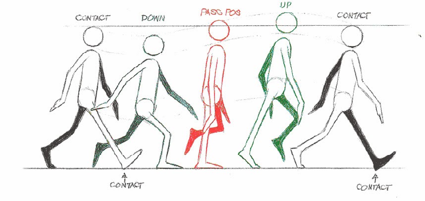
Showing posts with label Animation Skills. Show all posts

Thursday, 20 November 2014

Study Task 4 - What a Dope and Study Task 5 - Making Faces

Getting super annoyed over how exhausted and ill I have been feeling lately, because I really don't have time for this, especially when there's so much work that needs to be done. I ended up taking one day off this week from BAF to work on this Study Task so that I didn't have to worry about it next week (I was especially worried that I would mess up as I headed home early that day instead of getting some guidance from my lecturer to make sure that I was even doing it right).

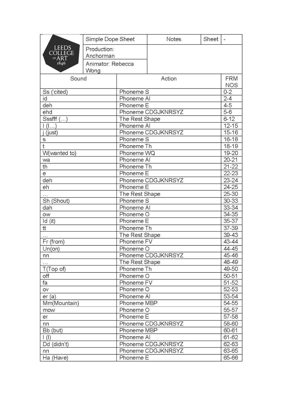
I almost messed this up completely when I nearly wrote down what I had heard backwards, thankfully I realised my mistake in time and quickly fixed it up on my Dope Sheet. Seeing that this was done in 12 frames per second, a lot of sounds were compressed together, so I had to pick out the most notable vowels and consonants I could hear from each one.


I was really focused on getting the mouth shapes right, and so I didn't focus on the rest of his expression until much later... I will admit that it didn't look as effective without the teeth, but man was I so stupidly determined not to ever have those teeth used in any of my Moom related assignments thus far...

You'd think that with such a simplified mouth, it would be so much easier wouldn't it? Well, not really, because I honestly found some shapes to look too similar with one another, especially when I can't use clenched teeth to distinguish one from the other. And so eventually I gave in and placed his teeth back in, and I suppose it wasn't so bad after that... Some sounds were a little harder to match to the chart I had, and so I ended up placing a small mirror beside me as reference.

For my first try, I don't think it turned out so badly, I wanted to give him a tiny bit of expression, so I messed around with a few frames after the lip syncing was done.


Friday, 31 October 2014

Study Task 2 - Animation Skills Pt 2

Had a brief discussion with my lecturer yesterday and figured out how to fix most of my animations (The only one I left alone is the Turntable animation since the lighting seems alright to me, it after all does show that it is the camera that moves not the object):

Bouncy Balls

I simply removed the deformer guides for the animation, but they are viewable in the working file.


Overlapping

I knew I missed something and that was altering the darn curves in the graph editor, I still have to get use to adjusting the tangents but as usual, I think I'm slowly getting the hang of it. Well, it should look better now...


Anticipation

Well, it's a lot better than the one I had done for the previous post, but I feel that I might have missed out on a few steps my lecturer showed me during class (I swear I should just videotape his demonstrations next time), at least it doesn't drift off like the other one anymore… also, I figured I'd give the red ball a quick animation so it isn't just laying there idle while the green ball is doing all the work.


Pendulum

Simply polished up the end a little for this one instead of letting it end abruptly like the last one I had posted.


Wednesday, 29 October 2014

Study Task 2 - Animation Skills Pt 1

So these took a little longer than expected to finish… I wasted a couple of days trying to find some proper tutorials and examples to check back on, and finally, it was today that I found this, anyway, here are my exercises, they aren't perfect but at least I gave it a try (And you know yada yada I will hopefully get better as I go along):

Turntable


After choosing your desired camera view, go to the view menu and select Create Camera from View, after that, go to the Animate Menu and select the little square to the right of Turntable, to check your direction (Clockwise or anti-clockwise) and number of frames this 360 degree rotation will last for. And there you go.


One thing I keep forgetting is that a turntable animation is actually the animation of the camera and not the object itself, and so several times when I was trying to adjust the speed of its rotation in the graph editor, I instead kept selecting the prop, hoping a graph of any sort would show up. Anyway, to change the speed of the rotation to a constant one, I simply selected the entire thing and changed it into a straight line.


Pendulum


This is where the graph editor gets more involved…


We were fortunate enough to be given a pre-prepared scene file, as all we have to do is to change the rotation values of the pendulum. At the moment, the speed of this pendulum's movement is still too constant, so you know what w-I have to do…


After messing around with the graph editor by stretching the curves a little more and curving the tangents (It's also here that I managed to remember how to use the pre and post infinity tools! Curves>Pre/Post Infinity>Cycle), we get something a little better than before:


Overlapping Action


Apparently this one was already made all ready for us, all we needed to do was rotate it, though I was still able to mess it up this one time… but nothing deleting all the keyframes and starting all over can't fix!


I wasn't sure if the top of the pendulum was allowed to swing along with the rest, and so I made two versions, one with a still top and another that moves along with the pendulum (This meant that I also had to save two scene files for this exercise):


Bouncy Balls


So I started out by putting the two balls into separating layers, so that I wouldn't get distracted and attempt to animate both of them together… after that, I decided to start with the solid ball.

Solid Ball


So a solid (Or ceramic) ball couldn't possibly squash and stretch considering the material it is made out of, nor can it bounce back up as high as the height it is dropped from, and so that was the main focus, to create a realistic enough landing animation for the red ball.


It was pretty tough figuring how to get it to dribble a few times after its first landing, I soon realise that adjusting it was much easier by first giving it a basic bounce, before adjusting the height, speed and acceleration in the graph editor.


Rubber Ball

I believe that this one was a little easier, I just needed to show how the rubber ball changes in shape as it bounces up and down, in the end I had to insert in two squash deformers, one at the bottom when it squashes, and another in the centre as it stretches, the centre deformer required some adjustments to the high and low bound values.

After chatting with my lecturer however, this appear to just be one of many techniques in animating a bouncing ball, a deformer can actually be inserted directly into the object, unlike the way I placed it, I shall look further into this during future exercises.

So we start off the same way with this ball like we did with the solid one.


The tangents at the bottom are then sharpened so that the ball will immediately
bounce back up.


Before playblasting the final video, I was having issues in removing the wireframe that covered the red ball, while it won't show in renders, it definitely still does in play blast animations. What I needed to do to remove it however was to select the object, go to Display>Polygons>Custom Polygon Display, and just set everything to 0.


I know it could still be done better, I will most definitely improve as I go along.

Anticipation


Why did I save the toughest one for last?


So I had initially tried to use Moom for this exercise, and everything was fine (Though a tad tedious) until I reached the jumping bit.


If I had more time, I might have tried to figure out what it was that I did wrong (Maybe he doesn't need to jump that high? That's why he still stays somewhat rooted to the ground? I'm sure Matt can help me out later on)  but as I don't have much time and needed to move onto the rest of my ever-growing workload this year, I decided to switch to a ball animation instead, and even that proved to be a pain in the aft for me… Thankfully I found this tutorial.


Apparently I had to key select a number of frames to keep the ball in place (It would always drift off if I didn't). Anyway let's just pretend that this is an animated orange as I really was more focused on animating the anticipation bit than anything else.
Tuesday, 12 November 2013

Final Animation for Animation Skills


Titled "Fear" (Of being interacting with others and being judged, mainly sociophobia), alternatively titled "That Escalated Quickly", enjoy!

Sunday, 10 November 2013

Pose to Pose and Frame by Frame Research

Most of the time these two factors tend to go hand in hand when it comes to animating (With the exception of straight ahead styled animations), I especially needed to use these two when I worked on both my photoshop (Frame by frame) and hand drawn (Pose to pose) animation studio tasks, so why not combine the two into one post?


By drawing in the key poses first, this works as a useful guide and gives you a proper idea on how you can draw out the rest of your animations from there as well as have better control over the animation's timing, especially when following a storyboard. You will probably notice the difference between an animation that uses the pose to pose technique and one that uses the straight ahead principle instead (The latter tends to look a lot more rubbery, and sometimes smoother than a planned animation).

Looney Tunes (Pose to Pose)
Bjork (Straight Ahead)

Once the key poses (Also called Extremes) are drawn in, it's time to smoothen out the animation by putting in the in-between frames it is also easier to decide from there how fast or slow you want an animation to move, by putting in less frames or by putting in more. Normally an arc guide is also used next to create the wanted flow of movement (And this pretty much applies to everything, even a finger raising to point at something).

The pendulum animation is a perfect example of how pose to pose and frame by frame is applied (Especially since, as I mentioned at the beginning, had to use them both for my digital and traditional pendulum animations) as well as the arc line guide .

While 12 frames are normally drawn for each second, you'd be surprised how smooth animations can be even with fewer frames, here is a great site that breaks down a variety of animations and show them as references for animation timing (Though if you have a Mac, you can open gif files in Preview and see how many frames one tends to contain, I tend to do that a lot):

http://framexframe.tumblr.com

Storyboard Progress 4 - Research


Storyboards are an important guide to not just animations, but to any other form of moving media (Music videos, live-action films, commercials, video game cutscenes, etc.), it only makes sense to always draw up one (No matter how rough, so long as you yourself can understand it) before commencing with creating the final product. While they are mostly used as rough guides, at times I see them as another form of sequential art, especially since I have come across so many highly detailed examples (Such as Seung Eun Kim's works, and no I will never stop talking about him). Storyboards are also drawn in many different ways, some might go into more detail while some… are a little harder to comprehend by those that aren't involved in the project.


Drawn by Bruce Timm and colored by Eric Radomski (1992-1995), the storyboard done for the title sequence of the ever loved Batman the Animated Series made use of various lighting (By showing how the backgrounds can still contrast properly to characters that are practically just silhouettes, the stark alley lights to create a proper focus point, and the dramatic flash of lightning at the very end) and camera movements, I find it to be a really good guide for the animators and shows exactly what Bruce Timm's vision was.


Turbo (2013)

This one focuses more on one small scene where two characters are conversing with one another, while it only takes place in the same setting the entire time and barely shows them moving, it does show the wide range of expressions that the two snails are suppose to display as they talk. It also works as a rough guide for animating the lip synching later on.

The Legend of Korra
While most frames are incredibly simplified and lack a huge amount of details, it makes sense as this is apparently for an epic, fast paced action scene. Only outlines are needed to show what it is that is suppose to occur in this scene, face details are only ever drawn when the character close enough to the camera. But I will be honest though, it was hard understanding this without screenshots of the finished animation being placed beside them for comparison. I believe however that this is a typical example of storyboards done for shows that already have episodes released and is still ongoing, so obviously deadlines are a whole lot tighter.

Far more detailed and polished storyboards are only done for when a show is being pitched or is still in the early stages of 

Disney's Frozen
One of the roughest examples I have seen that appears to be drawn directly from the script (Especially since they seem to be drawn on various scraps of paper), it still gets the scene across and clearly shows the important bits like the camera shots, and roughly the expressions the characters are suppose to convey, and I guess that's all that matters (Though I am sure they polished it later on).

Flip Book Research

Not often do you see flip books animations considering that it is a rather primitive form of animation as compared to the rest but if you do look hard enough, you will learn that numerous talented artists out there still create them, and for really unique purposes.

Etoilec1

This talented fellow has worked on numerous flip book replicating scenes from existing animations, music videos, video games and even sport events, I just find it amazing that he is able to closely and smoothly replicate all dynamic actions into a tiny little book, be they live-action or animated.

It's also a plus that his works are so cleanly done (While also managing to add in a decent amount of coloring details to each frame), he also does a great job in animating glowing lights, shooting beams and energy blasts (As seen in his Dragon Ball flip book series).


DispleasedEskimo (James (Jamie) Francis Bell

While the style of the animation shown below does not appear as appealing as Etoilec's works, its contents, length (Hundreds of pages must have been used!) and fluidity of it's humorously styled narrative more than makes up for it. The application of animation principles are more notable here especially, such as the exaggeration, timing, anticipation, and of course simply going straight ahead without the use of any key frames. It is overall a brilliantly done presentation of the "History of Pretty Much Everything".


Igviewty

A high speed recording was used when showing this crazily detailed (And realistically drawn to add) flip book animation, so to properly bring out certain scenes (Instead of simply drawing less or more frames in between)… though then again it was done for a mobile phone advertisement (Hence why the camera was used in the first place). It had some fantastically done camera angles and perspectives (Such as that fish eye view of Mona Lisa as the bullet zips by), it is all just so nicely animated and well drawn.


I remembered seeing a fantastic one that was used to present a logo design to a company, sadly I can't find it, but it just shows that flip books can be used for other means!

Saturday, 9 November 2013

Final Study Task - Progress 2

Accurate depiction of my present state
Alright, so I put my heart and soul into this final project, I nearly sprained my fingers and my back is killing me, but I think I finally got it done… though it could obviously have turned out a lot better.

Since there wasn't much time left, I felt that digitally animating my final project would be the most efficient way to go, as I could easily go back to any frame and edit them should they seem out of place, there also wouldn't be the issue of wasting time scanning in frames one by one.

I believe a bit more explaining is in order for my decision in my choice of animation style. Aside from time constraints, I actually believe that by using a limited color palette, certain details can be better enhanced to create a more dramatic feel, many examples of horror works tend to stick to such a coloring style (Such as the few that I had shown in my research post). And by using a spot/outstanding color for the gore, that will especially allow it to stand out more than fully coloring each frame for the animation.

Also to me a simple line art style would conceal the true intent and aim of the animation, so to allow me to surprise the viewer with what occurs later on (Why am I making it sound like my animation is a full length film?).


I had to sadly cut back on a number of details, otherwise I would have planned to render each frame like these two I did while I was experimenting:


… as well as go into more accurate detailing for the blood splatters and such… the best I could do was clean and thin the lines a bit more, as well as try to prevent the tentacles/tendrils/tendons from looking like a blood fountain show (And honestly it now looks like bacon to me). I also had to cut out the last scene as I was taking too long to smoothen out the animation (Though I placed the unfinished scene inside the development folder for submission).

Alternatively I am going to title this animation "That Escalated Quickly", for obvious reasons. Now I have to go back and polish my other works for submission, whew.

Also to my family, I promise I will work on cuter and prettier projects after this, I love you guys, mmkay?

Wednesday, 6 November 2013

Final Study Task - Research

When my laptop starts getting slow while I'm animating on Photoshop, it means it's time I do something else… so here are a few works I used for research and inspiration in my short little animation.

Junji Ito
One of my biggest inspirations when it comes to the horror and macabre (Aside from Silent Hill), the amazing amount of details used to enhance each gruesome black and white image was always astounding to me, there was never ever need to color the gore. While I am trying my best to simplify the art style I am using for this animation (Especially by already using a limited palette), I am still trying to pick out little details to enhance the more gorey (STOP AUTOCORRECTING THIS WORD TO COREY UGH) frames, though it will sadly nowhere be as horrifying as the images above.

Sachsen
Sachsen is also another fantastic artist I knew for awhile now, he is pretty well known in the community for his cutesy faced girls and unbelievably detailed mutants and creatures, most of the time combine these two creatively together. In this case, I was just trying to get some ideas in the mutation design and see if there is any way to improve it further, while still keeping in mind that it needs to stay fairly simple due to time constraints.

The Thing
You are probably figuring out by now on what I am aiming for, and so you know it makes sense that I am also getting some references from "The Thing". It is surprisingly hard finding good images from the original film, but I remembered how amazingly creative and terrifying their designs were, I even chanced upon some pretty freaky comic and novel covers in the past, so I kept them in mind while working on bits such as the eye gore and the head removal, you know, the cringe-worthy bits…


I was looking through Ace Attorney sprites for animation references, especially since they have some pretty amazing animations while still also managing to use a limited number of frames for them... particularly for when my character is laughing. It is a huge relief that not too much motion is required in portraying that action, only a few body parts really need to be focused on instead when animating the laughter motion.

Still I am having a little trouble when she is laughing with her head down, it seems a little stiff, but when I remove a few frames, it wounds up being far too fast for my liking. I will go back to that area after I finish the other frames that aren't causing me as much trouble...

Monday, 4 November 2013

Final Study Task - Progress

There wasn't much time given for this final assignment, so I am afraid I didn't get a chance to explore all the themes that were available in this assignment (Aside from the mind maps in the earlier post). I couldn't get much sketching done either, so I figured it was best to pick out one of the more outstanding ideas I had written down awhile back and quickly get to animating as I only have a week left.

Fear stood out to me the most, and not often do I get to work on something more horror-based (Even though I am quite a fan of that genre), and as the duration is pretty short, I feel that this if my chance to have some fun in animating something short, sweet, and gory.

I still have to try my best to keep it as simple as possible as this is practically my first major animation assignment (No, really).


Assignment Outline
Sketches

The idea is pretty much based on a nightmare I had a couple of weeks back, about a family that have horribly mutated and a girl that was hiding away from them in a tiny cabinet as they devoured something right on top of it (And to me that was the scariest part, they were eating cake, and blood was splattering everywhere). Obviously I can't animate the entire thing for this assignment so I separated it into several areas, as well as sketched out some more obvious types of fears/phobias (Darkness, clowns, dolls, etc.).

In terms of this depiction of fear however (Aside from the obvious physical manifestation of a terrifying monster) for the top sketches, I feel that it depicts the fear of the unknown as well as the fear of being negatively judged and mistreated by others (Hence the cruel laughter), be it peers or one of your siblings.


I would also consider this to be fitting of the Happiness theme.

My choice was quickly confirmed with my lecturer so the next thing was to sketch out key points to make the animation process a little easier, instead of simply diving right into it, even if it is a short animation. I decided to do it digitally as it would be faster (I won't have to waste time scanning in frames one by one) and perhaps cleaner, as the brief mentioned to keep the animation as simple as possible, I decided to at least settle with a simpler coloring style, black and white with red for the gore.

Saturday, 2 November 2013

Chinese Ghost Story: The Tsui Hark Animation


A Chinese Ghost Story: The Tsui Hark Animation would not only be the first (And possibly still the only one) Chinese Ghost Story animation adaptation, but would also be the first Chinese animated feature film from Hong Kong. 

Released in 1997, it was written and produced by Tsui Hark (A major figure in the Golden Age of Hong Kong cinema, from roughly early 1980s to mid 1990s) and his company, Film Workshop. The animated was produced by Japanese animation studio, Triangle Staff (That has unfortunately gone into defunct).

Loosely based on the short story Nie Xiaoqian from the ancient chinese literary work Strange Stories from a Chinese Studio by Pu Songling (1640-1715), the film centers around a rather dopey but lovable Tax Collecter named Ning, whom had recently lost his love to another man and is still grieving over it. One day however while traveling to a town to collect a debt, he instead finds himself in the ghost city, where his life takes a huge turn from then on, especially when his eyes fall upon a beautiful spirit named Shine.

There was a heavy amount of CGI used in this film (Which I hadn't really noticed as a child since I was more focused on the anime-styled characters and pretty songs), while certain scenes do look more breathtaking because of it, some scenes come off quite awkward, but it was apparent that they depended heavily on CGI for graphical enhancements, more so than they did on their hand drawn animation, that at times the latter was practically overshadowed by all the CGI that they threw in there.

Still for Hong Kong's first animated film, I believe they did a fantastic job, the CGI honestly didn't deter me all that much, in fact, I still enjoy this film as much as I did back when I was 5, I just have a chance now to properly notice details I hadn't before, such as how hilariously modern the ghost civilization was as compared to the living's (Traffic lights, mobile phones, etc.). I am also feeling pretty depressed that I lost the OST, because the film had a number of really catchy chinese songs that I had tried to learn back then but failed (I will find it dammit!).

There is a really detailed review on the film here:

http://teleport-city.com/2013/03/01/chinese-ghost-story-the-animation/

Friday, 1 November 2013

Hotel Transylvania (Genndy Tartakovsky)


Hotel Transylvania is a 2012 American Computer Animated Fantasy Comedy film produced by Sony Pictures Animation, and like more animated movies these days, it was also made in 3D. Directed by Genndy Tartakovsky (The creator of Samurai Jack and Dexter's Laboratory), this would be his feature film debut (Kind of surprising really seeing how long he has worked in the animation industry). The film also features the voices of Adam Sandler, Kevin James, Fran Drescher, Steve Buscemi and David Spade.

In an effort to protect his beloved daughter and the other creatures of the night from humans, Dracula decides to construct a hotel to be used as a safe haven for monsters around the world. However when his daughter reaches the age of 118, she shares her wishes to explore the outside world much to her father's dismay, at the same time, to make matters worse, a human accidentally arrives at the hotel…

The outstanding aspect about the film's animation is how 2D animation aesthetics are blended into an otherwise typical 3D  CGI animated film (That we have gotten so familiar with in the past years), the energy and exaggeration of 2D animation (Much like Tex Avery's works) is notable in several scenes.


Sure the film is pretty childish at times, but it was done so without being completely dumbed down for the younger audience, I think its nice to indulge in these types of animations once in awhile.

Silent Hill 2 and 3 (Team Silent)

And so the horror-themed blogging continues… until I run out of drafts.

Silent Hill 2


Released in 2001, Silent Hill 2 was published by Konami for the Playstation 2 and developed by Team Silent, the story follows James Sunderland as he travels to the town of Silent Hill, intent on finding his wife (Whom he had believed to be dead for many years) after receiving a letter from her, it is there were he encounters other troubled individuals as well as hostile creatures that inhabit the town inside and out.

Team Silent was a development group within Konami Computer Entertainment Tokyo that was responsible for the first four games in the Silent Hill franchise. According to video game music composer Akira Yamaoka, Team Silent consisted of staff members that had failed at other projects and originally intended to leave the company, before learning that the very first Silent Hill game would be a huge success, history was made. 

It was said by an artist of Silent Hill 5, that the team was later disbanded by Konami itself, as they had wanted Western developers to make the future installments from then on (Up to this day, fans continue to curse the western companies that took over and sorrowfully beg for the return of Team Silent).

Various members from the disbanded team are now working on separate projects,, some of the original members went onto the create the Siren series (As mentioned in the previous blog post), Akira Yamaoka continued composing music up until Silent Hill Shattered Memories before leaving Konami in 2009 and joining Grasshopper Manufacture (Another game development company that is quickly growing in popularity). I am just happy to see that most key members of the team are still continuing work on other projects instead of disappearing completely…

Interestingly enough the team did not resort to motion capture for the facial animation, believing that expressions then would be quite limited, more possibilities of more interesting and absurd expressions could be created manually instead. 

When working on the character designs, the team sketched human faces and various expressions, so to gain a better sense of the characters' facial structures, they drew the characters' profiles from various angles, before creating wire-frame models, each consisting of six thousand polygons, they then finish off the models with textures.

Body sequences were however still motion captured with the Autodesk Softimage program, an application known for producing 3D computer graphics, 3D modeling and computer animation, it known for being used in the film, video game and advertising industries for creating characters, objects and environments.


Silent Hill 3


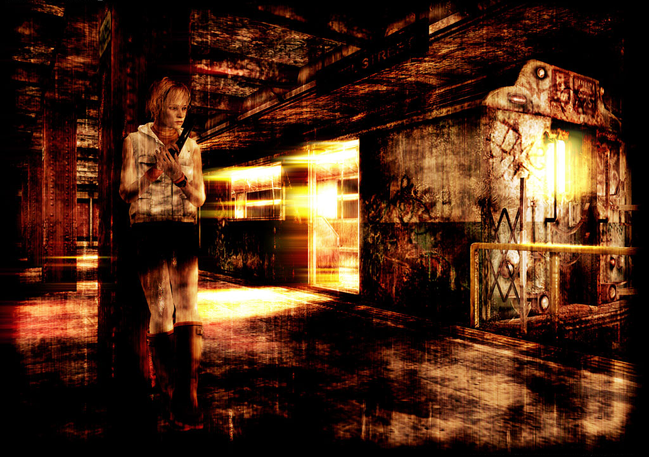
It would only be two years before the next installment came out, it would also be the direct sequel to the very first Silent Hill (Unlike Silent Hill 2), set seventeen years after the events of the first game, Silent Hill 3 focuses on Heather Mason, a teenage girl raised by Harry Mason (The protagonist of Silent Hill 1), one day she discovers that the cult of Silent Hill plans to use her to birth their god, and becomes caught in a conflict with them.

Development began right after the release of Silent Hill 2 in September 2001 (As well as the development of another title that would later on become Silent Hill 4: The Room), the development team for this installment however would be smaller as compared to the previous game. Aside from an improvement in graphics, the same methods were used in producing this game.

While Silent Hill 2 focused on a more quiet, psychological form of horror, the obvious changes made in Silent Hill 3 were its more shocking game visuals (Such as bleeding walls, or walls made completely of burning flesh) and far more hair-raising sound effects, and of course the more bloody color scheme. The graphics made another pretty big jump since its predecessor too, as cutscenes and in-games graphics finally looked really close to one another as compared to Silent Hill 2.


I also adore the acting done for this game, particularly Heather Mason (The main character of the game), while the voice acting might seem over the top to others, I found the original voices so much better as compared to the new voices in the HD collection later on.


Silent Hill 3 is still one of the scariest horror games I have ever played, and is still one of my most favorite games I keep close to my heart. I am also one of those idiots that considers Silent Hill: Revelations to be a guilty pleasure watch (Since Heather is in it).