Thursday 31 October 2013

Forbidden Siren Series (Project Siren)

Aaaaand Happy Halloween, friends!


We will be starting off with the Forbidden Siren series (Simple known as Siren in Japan), the obscure sister series to the Silent Hill series (And don't you worry, I will most definitely be writing about that series later on!).

The story of the first Forbidden Siren is a considerably confusing one (Though then again the second one is even more confusing...), the simplest way to summarize it is that a failed ritual drags an entire village into the other wold, it is there where a majority of its citizens are turned into Shibito (Translated as corpse people), where they are tasked (By the god whom they had attempted to carry out a ritual for) to build a nest to house their god's corporeal form once it is summoned, as well as to kill and convert any remaining survivors left in the village. The story takes place over three days and is told through the perspectives of several survivors.

Founded in 2004, the Team Siren  (Now renamed Team Gravity) is conducted by acclaimed game designer and director Keiichiro Yoyama (The creator of the very first Silent Hill, and an ex-member of Team Silent). People however will perhaps know this team better for later working on the Gravity Rush series (Hence their name change).


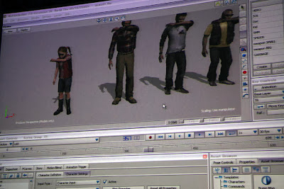
A rather interesting technique was used for the facial animations, rather than employing traditional facial animation methods with polygonal transformation, images of real human faces were captured from eight different angles and superimposed onto the character models. This effect is similar to projecting film onto the blank face of a mannequin, a technique that was used to animated a severed head in Disney's Haunted Mansion attraction (Which is honestly pretty dang creepy if you properly imagine it…).


While they honestly do look goofy in-game (Their heads look like balloons with faces printed on them to me!), they still looked pretty amazing at the time and somehow added to the creepiness factor of the game (The random grinning faces of the shibito still gives me the jitters). But still... the facial expressions the actors and actresses pulled at times just didn't cut it for me… as a matter of fact, I ended up laughing at that far more than the horrible dubbing. You can see I am a little torn about this technique, still I can't argue that it was a creative technique to use, especially for video game animating.

Also on the bright side, it looked a lot better by the second installment.


 It is only in Siren: Blood Curse (The re-imagining of the very first Forbidden Siren) do they decide to use more well known motion capturing techniques. 


And I have nothing against that! While the character's facial design may not appear as realistic, the graphics made a huge, huge improvement, the improvements/add ons made to the Shibito designs especially were really cool (They actually hired experienced dancers to help create their disturbing movements)…

Set, Series, Sequence - Stage 1 (Set)


This was Conceptual Illustration all over again for me in all honesty, though I suppose it's not as bad this time round. I had a strangely tough time finding any interesting alternative meanings, puns or slangs for cars (So my initial plan went quickly down the drain…), so instead I thought about the following while drawing out my set:

1. Types of cars
2. Other vehicles(Eg, Bus)
3. Other things that have wheels or motors in them (Eg, Bumper cars)
4. Other modes of transport (Eg, Bicycles, Carriages, Horses, etc.)
5. Different mediums and techniques (Eg, Ink, Collage, Watercolors, Color Pencils, Typography, pencils, highlighters, etc.)
6. Events associated with vehicles (Eg, Accidents, Racing, Traffic, etc.)
7. Other things associated with vehicles (Eg, Speed, Distance, Dogs, Noise, etc.)
8. Words associating with words associating with vehicles

It was my fault for rushing to get at least 32 drawings done, when I should have thought deeper about the meaning behind the word I was given, thankfully though I was still able to show that I could dish out more interesting stuff to show my lecturer during class time today instead of practically drawing the same thing in different shapes and colors... and so I am moving onto the next stage!

Next up, a series of 8 drawings from one of the 40+ drawing I did this week.

Tuesday 29 October 2013

A-Ha's "Take on Me" (Steve Barron and Michael Patterson)


Alright let's start with the obvious information as always… Take on Me is a song by the Norwegian synthpop band A-ha released in 1985, everyone who has heard of this song also knows about the award winning video that went with it, where pencil-sketch styled rotoscoping (A method that I mentioned awhile back in my post about A Scanner Darkly) was combined with live-action, approximately 3000 frames were rotoscoped, which took about 16 weeks to complete.

Featuring a romatic fantasy narrative, Take on Me's music video to me was one of the best depictions of Escapism, in a romanticized manner that is, where a girl is practically able to move between two worlds, and falls in love with a fictional character and lives happily ever after with him… or so they think (Hint hint, watch The Shine Always Shines on TV's music video). 

The rotoscoping method was able to create more fluid movements that allowed the characters to realistically move about in the comic world as they do in the real world, making it seem as both worlds were connecting and merging in some way, causing more confusion to the main character by the dilemma she is in.

Steve Barron was the director for this music video, an Irish film director, film producer and of course a music video director, he is also best known for directing the Teenage Mutant Ninja Turtles film in 1990 and Coneheads in 1993, and also the music video for Michael Jackson's Billie Jean.

Michael Patterson is an experimental film artist, teacher and a commercial film director specializing in TV spots and music videos. Currently he teaches animation at the Division of Animation and Digital Arts at the USC School of Cinematic Arts, his best known character is MC Skat Kat (Errm…) that was used in Paula Abdul's Opposites Attract music video.

I will be writing about horror/halloween-related animations tomorrow onwards, so hope you guys are looking forward to that!

Street Fighter II the Movie (Group TAC)

Next up I will talk about the Street Fighter movie...


NO, NOT THIS ONE. (I still like it though.)

This one.

Street Fighter II: The Animated Movie is a 1994 animated film adaptation based on the game series of the same name (Y'know… Street Fighter II, Street Fighter II: Champion Edition, Street Fighter II: Hyper Fighters, Super Street Fighter II - The New Challengers, Super Street Fighter II Turbo…), written by Kenichi Imai, directed by Gisaburo Sugii and animated by Group TAC, fight sequences in the film were choreographed by K-1 founder Kazuyoshi Ishii and professional fighter Andy Hug (Badass!).

The film focuses on the antagonist Bison, leader of the terrorist organization Shadowlaw as he desperately searches for the greatest fighter on the planet (AKA, Ryu), when he is not able to, he instead sets his attention on Ken Masters, Ryu's friend. Meanwhile, Major Guile and Chun-Li  team up in hopes of tracking down and apprehending Bison and stopping him once and for all. The movie serves as a basis for future Street Fighter games, such as back stories and character designs as well as character relations.

Group TAC was a Japanese animation and computer graphics studio founded in 1968 and located in Shibuya, Tokyo. They have worked on movies, videos, TV shows and commercials, contributing not only for the animation process, but also for planning, production, sound effects and so on. There were especially known for Manga Nippon Mukashibanashi and Touch. Sadly in September 2012, Group TAC filed for bankruptcy, their remaining animation projects were taken over by OLC, Inc. and XEBEC.

To me, this was one of the most amazingly done cel-shaded animations at the time, of course what was most outstanding about the film was its action sequences, that were realistically portrayed in comparison to other Street Fighter animations, and action anime in general (The 1998 Tekken anime also fell short when it came to that aspect), it just goes to show you, if you want to create something amazing, you will definitely have to get some proper references and help to do so.


Sadly I can't find any videos showing the behind the scenes look into this film, but I did manage to find one for Street Fighter Alpha: The Animation, the other Street Fighter animated film they had worked on in 1999:


Up till today, this film is still considered as one of the best video game to movie adaptations, and it's not surprising really since it remained amazingly faithful to the source material (Which was still lacking a lot at the time) and actually went through the effort in animating some proper, badass fight scenes (Which was a rarity for japanese animations). It also had some surprisingly adequate english dubbing done for it, and in my opinion, a fantastic western soundtrack that was a lot better than the original music used.

Bless my parents for getting this laser disc for my siblings and I back when I had the attention span of a gnat...

L.A Noire (Team Bondi)

L.A Noire is a 2011 Action-Adventure Crime video game developed by Team Bondi and published by Rockstar Games (Also known for the Grand Theft Auto Series, Max Payne series and Red Dead Redemption). Set in Los Angeles, 1947, the game centers around LAPD officer, Cole Phelps who progresses through the ranks and through different departments (Patrol, Traffic, Homicide, Vice and Arson), solving various (Super fantabulous extra spectacular) cases as he does.

Team Bondi was an Australian independent third-party game developer founded in 2003,   founder and former director Brendan McNamara also founded the sister company Depth Analysis, the company that would be responsible for the development of the award winning 3D motion capture technology known as MotionScan (More on that later). 

L.A Noire is considerably well known for the interrogation scenes, where the player gets to interrogate suspects and witnesses through the course of each case. The player will have to listen to his or her story while at the same time study their face and body language before deciding on whether they are telling the truth or not (Just be warned, Cole goes a little overboard should you choose "Doubt" or "Lie", so be extra sure in your choice)… this is also where MotionScan comes in…

Unlike other motion capture technologies, MotionScan relies on 32 high definition cameras, capturing the actor's facial expressions from every angle at 3o frames per second. As the interrogation mechanics in the game requires realistic and readable facial expressions and body language to allow proper judgement during gameplay, this new technology quickly became highly valued during the game's development.


More on MotionScan can also be read here:
http://electronics.howstuffworks.com/motionscan-technology.htm

With amazing mo-cap technology such as MotionScan, video games are practically one step closer to becoming live-action movies:


Despite the success of L.A Noire, the controversies of staff mistreatment surrounding the company prevented it from securing another game project from then on, Team Bondi was unfortunately placed into administration and was liquidated. In August 2011 however, the company was bought over by Kennedy Miller Mitchell, a Film, TV and Games production House famous for films such as Mad Max, Babe and Happy Feet. Team Bondi's present game project is titled Whore of the Orient, due for a 2015 release.

Up to this day, this still remains one of my most favorite video games, aside from the amazing graphics, it has an engaging story, enjoyable characters (I even loved the ones that I was meant to hate), great music and pretty fun gameplay. I can also appreciate the huge amount of effort that went into recreating the entirety of Los Angeles in 1947!

Final Study Task - Brainstorming 1

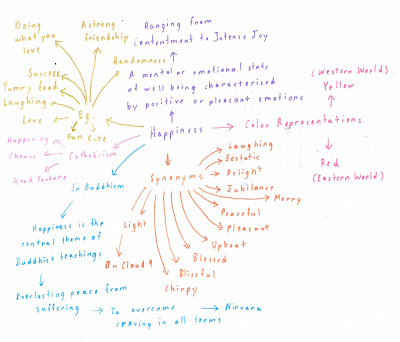
Whew, I can't believe 5 weeks have already gone by, I just spent the morning doing up some quick mind maps for my final Study Task, as you can see some are a lot smaller and half-assed as compared to the others, which makes it easier for me when it comes to choosing which themes I will start sketching concepts for…

Well back to work.


Friday 25 October 2013

Photography Induction 2

Warning, photo spamming up ahead, though it's still better than reading large blocks of texts I suppose...


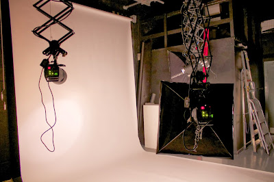
Unfortunately I was pretty brain dead for this class since I didn't sleep well the night before (I am so, so sorry Sam! I really was interested in what you shared with us today!) , but honestly I felt that we got to try out a lot more things this time round, messing around with the continuous shooting mode was especially fun:


Sadly I wounded up forgetting a couple of things, so for most of the induction I was messing around with my settings before taking each photo, hoping I would just get something good (I was really too embarrassed to ask Sam for help…).


I wasted a lot of time trying to remember what settings were for what...


And this is the best I got before I just gave up and moved on.


And a couple of photos turned out… green.


After awhile, a couple of us decided to start on our Study Task, several times I had to stop and delete a number of photos as the RAW format quickly took up a lot of memory, also I was a dunce and forgot to format the camera at the very beginning.


In the end though, I think I managed to get a couple of alright shots! And I think my friend and I have a little idea for a future pixilation project after messing around constantly with the items we brought for the photo taking (Hint hint, it involves the second last photo).

Pixilation Study Task - New Storyboard

I won't be posting the video here, so I decided to put up the next best thing, an updated storyboard that I quickly sketched out last night!

Reasons for changes:
1. It kept raining outside and we were running out of time.
2. We have limited resources (And again time) and so more complicated poses could not be made in the end for the prop.
3. I didn't want to get my friends fatally wounded or killed during the shooting.


Though after drawing this out, I found it to be a tad unnecessary since a lot of the scenes remained the same… oh well.

I will also be adding in a few little extra things into the video before handing it up, just to make it more presentable and even more enjoyable to watch later on. Also I might be taking out some frame, some scenes need to be a lot faste.

Thursday 24 October 2013

Set, Series, Sequence - The Beginning

This week's Visual Language class involved a considerably rigorous drawing exercise, which is a good change of pace from all the writing tasks that have been thrown at us over the past few weeks (Though then again I am still writing about drawing right now aren't I?). Right at the very start, we were made to draw at least 32 representations of a word randomly handed to us by our lecturer, and oh was I ever so fortunate enough to be given a word that I was not entirely familiar with, and no, just a heads up, this exercise does not stop at 32 drawings, but I will get to that part in the next VL blog post.

However, even though you are all probably hearing a whiny voice writing all of this out, I honestly find this to be a really good exercise, one that allows me to draw out larger amounts ideas in a shorter period of time, and it is not like we weren't allowed to do some research on the word… I am still presently researching into alternative meanings, slang and wordplays on my given word, but from what I could find so far, I believe that I have no need to worry about not being able to fill up the 32 spaces on the large piece of paper that is now sitting right next to me, besides, I am already more than halfway there!

A challenge is always good, it also allows you to break out from your comfort area and just try new things, you can't always be handed everything on a silver platter.

Wednesday 23 October 2013

Animatrix - A Detective Story (Kazuto Nakazawa and Shinichiro Watanabe)


It has been ages since I watched this (Though I did do a write up on The Second Renaissance a couple of years back), but I did remember this particular short to be one of my favorites from the compilation.

But to start off, The Animatrix was an animated anthology film that came out in 2003, shortly before The Matrix Reloaded was shown in theaters. It comprises of 9 different stories (Also animated and directed by different people) detailing the backstory of the Matrix universe, such as how it came to be when war broke out between man and machine.

The storyline for A Detective Story focuses on a detective trying to make end's meet and so unknowingly accepts a case given to him by one of the Agents to find the hacker known as Trinity, things obviously do not end well once he succeeds in finding her though…


Now… you are going to hate me for this part, when I had first watched this as a kid, I had liked it for pretty shallow reasons, such as how much more attractive and realistic the characters (I mean look at Trinity for crying out loud!) looked as compared to the characters in the other shorts. And possibly the worst part was the fact that I hadn't even known about Shinichiro Watanabe at the time, or what the noir genre even was. I had liked this short simply for its hot characters when I was young.

On the bright side however, as I grew older, I did come to appreciate this short a whole lot more (Along with the other shorts, that had originally terrified me when I first watched them), the style was still incredibly stylish and gorgeous to me (A mixture of art deco and other Thirties art styles) and I still really liked how they blended old and modern technology together in various parts of the short, so to still give this considerably traditional noir styled short a modern feel (Like the computer-typewriter and the phone with the rotary dial system), that's Watanabe for you!


And of course there is the animation, done by Kazuto Nakazawa, known for working on the animation sequence for Kill Bill 1 and Linkin Park's Breaking the Habit music video, Nakazawa was the man who worked on the key animations for this short as well as Kid's Story (Another Animatrix short), there was always something about his animation style that I really liked, it felt like an odd mixture of fluidity and a very, very slight bit of rigidness (Am I making sense here?), it felt pretty unique to me, and I just found it highly appealing, especially when I see it used on more realistically drawn animations.


This will always be one of my favorites, because it was definitely one of the better animated and designed shorts alongside The Second Renaissance and Beyond.

Samurai Jack (Genndy Tartakovsky)

Art from comic book adaptation.
An animated series that started in 2001 and ended in 2004 on an unfortunate cliffhanger, Samurai Jack was an action/adventure animated series created by Genndy Tartakovsky (Known alongside Lauren Faust, Craig McCracken and Rob Rezentti for working on some of Cartoon Network's best cartoons back in the 90s), and was one of the few animated series at the time that displayed a wide variety of genres in its episodes, such as Chanbara, Science Fiction, Cyberpunk, Western, Comedy, Fantasy, Horror, etc.

The series follows the journey of titular character Samurai Jack, who is teleported by the evil wizard Aku into a dystopian future ruled by the latter. From then on, he seeks to defeat the demonic wizard as well as find a way back home, while also attempting to survive a strange new world filled with technologically advanced inhabitants as well as supernatural beings, thankfully though he is able to hold his own pretty well...

Genndy Tartakovsky is a Soviet-born animator, director and producer who moved to the US at a very young age. He is best known for working on 2 Stupid Dogs, Tiny Toon Adventures, The Powerpuff Girls, Dexter's Laboratory, The Grim Adventures of Billy and Mandy and many more. Having studied Animation at the California Institute of the Arts (AKA the Disney university) with his friend Rob Renzentti (Another favorite of mine), it is there that he directed and animated two student films, one which would later on become the basis for Dexter's Laboratory. He later on got a job in Spain, working on Batman: The Animated Series and The Critic, while quickly beginning to gain work experience from then on in that area.

While Samurai Jack was another cel-shaded animation like most cartoons at the time, it was perhaps one of the first mainstream American animations that utilized lineless characters, allowing them to blend in better with the backgrounds and making them seem more part of that world. It is also notable for its gorgeous backgrounds that are abstract in style, while also bearing reminiscent to ukiyo-e paintings in terms of brush strokes and textures. Another memorable aspect about the series is how comic book-like screen framing is used throughout, from widescreen shots to split screen action captures, these shots being used to establish a better mood or change in pace with the storyline.

This series has been a huge inspiration to me over the years, it's style was unique, the designs were beautiful in their abstract simplicity, there was a huge variety of inspirations, influences and homages to many comics, mangas, animes, TV shows and movies (Such as The Lone Wold and Cub, 300, Ronin, Kung Fu, etc.), and I absolutely adored the colorful mixture of different genres (Especially when certain episodes would take on their own style).


I am still hoping that a proper art book will be published for this series in the near future.