Thursday, 14 May 2015

Food for Thought - Distribution - A Mixture of Things 4

I volunteered to draw up some new portraits for the crew biography, and once again, as there wasn't much time left and I still needed to continue animating after, I had to scrap the pixel portrait idea (And scrap the idea of even fully colouring them) and instead did these really quick sketches for each of us (As you can see I sort of gave up on my own portrait). But anyway these work better than the original doodle I did at the very beginning of this team up, seeing that all of us are sort of facing forward this time round.


Last night, Cara and Anna started working on our promotional items, seen here are the poster concepts, which I initially mistook for the DVD cover. As mentioned before, those textured backgrounds I had quickly painted up for the title cards can also be applied here. So while it appears that it looks like there is a lot of negative space now, particularly on Johnny's side, it will look fine once some textures are applied (Just call me the Texture Queen...).


And here is the gorgeous DVD cover Cara did, I was admiring it for far too long last night when she had sent it over to me for my opinion... While black might be a tiny bit dull for the text, I believe it remains the best choice for the sake of readability and clarity. Other than that, all she will have to do later on is simply replace some of the images on the backside of the cover, and we all should be able to print them out by tomorrow for our submission!
And here is the crew biography page, we decided to add silly descriptions below our names and roles to go with the overall silly and playful tone we already have for our overall project. Seeing that we all practically played key roles, I believe none of us specifically took on the role of the director, and so that role was not listed for any of us.


Later on, I will be putting together a little concept art booklet where most of our developmental work will be featured in, which would go great along with all the other promotional items for our animation.

Food for Thought - Production and Distribution - A Mixture of Things 3

After the designs for the title cards were confirmed, Cara started working on the credits next, we decided to keep things simple and simply listed down our most major roles (So not to make matters too complicated). And seeing that were wasn't much time left, all three character voices were credited to our dear voice actor, James Wood. It was a good thing that I had asked him to voice Johnny just in case I did not have the time to do it myself.


One of the changes made was the sizing of the test to create a slightly better hierarchy and to allow the names to stand out more (Much like the title card examples I looked into), other than that, not many changes were made.


Fiona was doing up a promotional poster for all of our animations about two nights back, after much consideration, and despite the funny pun-filled titles that was suggested to us, we decided to go with something simple for our animation so that our audience would understand straight what our animated documentary is actually about, and so we decided to go with "A History of Cake" ("Brief" was taken out as it made it too long).


Fiona later on mentioned that our characters looked incredibly thin as compared to the rest (Which would throw off the balance of the entire layout), and so quickly, I sent in one of the close up shots that we did for our animation of Johnny where he presses his face up against the glass, which I think looks much more interesting and fills up the slot so much better.


While Cara started working on our promotional materials yesterday afternoon, I was asked to at least write a synopsis for it as well as think up of a tagline, and so this was what I came up with (I thought up of tagline after realising a possible running gag should this short continue as a series):

Synopsis:
When taking a bite out of an oh so sweet slice of cake during teatime or whenever, have you ever wondered, just for a brief moment, when and where these lovely things actually first originated from? Join Johnny as he gets taken on an incredibly brief but interesting trip through time to learn about the history of cake, with an overly enthusiastic cake salesman as his guide. But oh, you want more? Do not despair then, as this is just the first of many adventures that Johnny gets dragged along on… without getting any ‘samples’ whatsoever.

Tag Line:
Just let him eat cake.

Food for Thought - Production - A Mixture of Things 2

About two days back, Cara started working on more polished up title cards to replace the ones that I had quickly done up for the final critique session. I was fine with the layout and adored the colour choices and adorable illustrations, but I felt that one thing was missing...


When I suggested that textures of sorts could help make these title cards stand out a little more, Cara said that she would need my assistance in that area (Seeing that she does not have as much experience in creating messy works as me), and so, quickly as possible, I messed around with a few brushes within my arsenal and created this textured background and a pink version of it.


With some alterations that Cara did (By making the colours a little less dark and saturated), I honestly thought that it looked better now, especially since it matches the rest of the animation! I was also actually thinking of using the same background for a later scene that showcases all the beautiful cakes, so that it actually links to these title cards.


In the end, we decided to go with the pink one, we might however use the blue background for one of the animation scenes later on.


Anna stepped in to polish it up a bit more.
For a close up scene, Cara did up these adorable gingerbread man illustrations, while I once again suggested giving them a painted look (Much like those detailed still/close up shots you see in shows such as Ren and Stimpy and Spongebob Squarepants), Cara once again was unfamiliar in using such a style, and seeing as we didn't have much time left, decided to leave it as it is for our module submission.


I did however quickly do up a table texture that will be use for the icing scene later on as Cara ever so sweetly asked me to (Seriously though, Cara is the biggest sweetheart to work with, and I'm still giggling over the fact how we both constantly apologise to one another as we worked).

Food for Thought - Production - Animation Progress 2

As the deadline draws near, I know that I needed to work smart, and the first thing I did before I got on with the rest of the animation sketches was to relook through Cara's storyboard and unfortunately... simplify as many scenes as possible.

I worked a little out of order and decided to work on one of the first lip sync scenes so to see just how difficult it would and how much time is required to animate such scenes later on. While I initially struggled a little as the timing for the dope sheets seem to be a little off (They also were recorded based on time and not frames, so that made things a tiny bit trickier), I soon got use to it, and actually started to enjoy it. Sure it took a little time trying to figure out how long some frames would last and so on, but I was giggling to myself later on when animating mouths that required... tongue.


I felt that I was spending far too much time trying to animate the falling out of tree scene, and so sacrifices once again had to be made so that I would have enough time to animate more key scenes for the final submission. If I had more time, I obviously would have liked to finish properly animating the entire thing, but for now, I believe the present scene of him simply sticking his leg out of the tree still allows a smooth enough transition into the next scene (That I have also simplified based on Cara's storyboards).


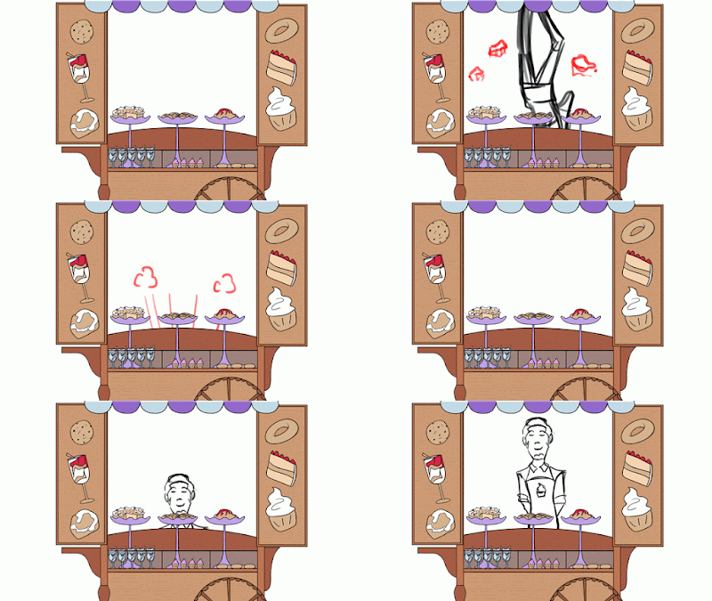
There was a more complicated shot where we see Cake Man falling through the roof of the cart from above, this was once again changed so that both scenes would directly connect to one another. There was also a slight contradiction when it came to design details, as the storyboard shows the cart having a wooden roof, when our cart designer Anna states that the top of the cart is simply a cloth canopy.

The first few frames actually shows some torn bits of the canopy
as he falls through.
I finally went back to finishing up this scene (This was actually the first lip sync scene) which you will see in another Animation Progress post, Anna thought that it would have been possible to finish cleaning up what was presently available for the final crit session. Needless to say, some hilarious hijinks ensued...


Aside from that, I quickly tried to correct how the Cake Man's body should look for the side, as my initial sketch was too messy for Anna to see and clean up.

Food for Thought - Production - Cel Shaded Animation on Painted Backgrounds


This was an issue that has been addressed numerous times by our peers throughout the past critique sessions during this module, there is a constant doubt that our flatly coloured characters and props would not blend well with the textured backgrounds/settings that I had designed and painted. And while I agree that simple shadows beneath their feet (And below the cart as seen here) could be added, I really do think that the contrast will not be a problem, especially once things begin to move on screen.

But first, let us take a look at some animated examples that have particularly inspired our group to go with such a look in the first place:


Sleeping Beauty is definitely known as one of Disney's most stylised films, a lot of time was clearly put into the background designs (Quite a few years in fact) and as you can see in this gif example, despite how heavily textured these beautiful painted settings are, the more basically coloured characters and props are still able to blend in quite decently. 

Some thought was definitely still put into the lighting however, as it makes sense to make the characters and objects in front just a little bit brighter as compared to the back, as seen here. While not seen here, the characters still manage to remain rather flatly coloured, even in more complex lighting, such as during the scene when Aurora touches the enchanted spinning wheel, that casts an incredibly eerie green glow throughout an otherwise dark room.


Dexter's Laboratory in its later seasons noticeably uses more textured backgrounds as compared to the earlier seasons (As well as some rather major alterations to its art style). Again, while the characters and interactive props are flatly coloured (Interestingly the props do not have strong outlines like the characters), the lighting still works here, despite how it appears that 3/4 of the room (At least the walls) is made to look as if most of the room is dimly lit. This is perhaps due to the consideration of colours that are used, you could say that the vibrancy levels for everything are made to be really close to one another (So that the characters do not look too vibrant as compared to the backgrounds or vice versa).


Paul Rudish's new Mickey Mouse series (Which I am still trying to find all the episodes for) uses a much looser style as compared to past Mickey Mouse series (Particularly the ones that came out after 1935), with its more organic looking outlines that look as if they were done with brushes, it creates a rather unique contrast to the more sketchy (But nonetheless beautiful) environment designs.

As seen here, the animated characters and props are made to stand out a lot more as compared to the background (Which our animation bears similar qualities to), also, a really simple shadow is given below the scooter Mickey rides on here, which we also plan to do for our own characters and props.


Ren and Stimpy was always known for their incredibly detailed backgrounds (And still shots) to enhance the overall gross or disturbing aspects of that scene (Something which Spongebob Squarepants also does). Again, colour choices are once again carefully considered so that the characters and background are able to go with one another without blending together too much.


My Life as Teenage Robot honestly uses a more subtle colour palette for their art deco inspired environment designs, which allows their characters to stand out all the more. As seen here, the two characters do have a much bright colour palette that contrasts a little more to the painted backgrounds, but not so much that they appear to be from two completely different sources.


Samurai Jack might be a slightly more different case, considering the lack of outlines (Or perhaps its usage of really thin outlines) for its characters, it allows them to blend in so much more with the backgrounds (As compared to the previous examples) which as you can see, while textured, are not given heavily lined details, it does make these shots look so much more like beautiful paintings then typical animation stills.

This however provides a challenge where much more outstanding animation has to be done for the characters so to allow them to better stand out from the environment, which this series has always managed to successfully do.

The blending of different styles in an animation will always prove to be a challenge, some important aspects to always consider however (Aside from how heavily textured something might be to the other), are the colour palettes used and perhaps the outlines. These aspects can truly make a difference as seen in these examples.

Friday, 8 May 2015

Title Sequence Research

This might be a very random selection of title sequences to write about so, sorry about that.

Coraline


As an adaptation that was aimed at a fairly young audience, I understood why they needed to tone down the scarier scenes from the book (And needed to make the titular character appear 'less crazy' by having an original character to share her thoughts with), they were thankfully still able to retain a creepy and disturbing enough atmosphere as seen in this opening sequence.

The sequence starts off with a few rather basic title cards that introduces the studios involved and the voice cast. Following that, a rather fluid stop motion scene plays where the dismantling and reconstruction of a doll takes place. Even I felt a little uneasy seeing how the doll was taken apart, the cinematography was just so well done that it almost felt as if a real life human body was being horribly torn apart (Even the removal of the doll's yarn hair seemed painful for some reason, haha...).

While I do not particularly enjoy the choice of audio used, I suppose it fits the scene and overall tone of the entire film and establishes the mood, it does give this film a very ominous beginning, as it should.

The Last of Us


The critically acclaimed The Last of Us has been regarded by many as one of the most unique post apocalyptic survival horror (Well it's not necessarily scary but there are many moments where it gets the player's heart pumping) out there. While it might be a little overrated considering all the attention that it still gets up to this day, there really is no denying how well put together this game actually was, in terms of its gameplay, art direction, writing and so on so forth, music isn't half bad either.

I will admit that the game's opening is practically on the same level as most HBO series openings we see these days (This game is already close to being a movie as it is). As several recordings play in this prologue, what is simply seen on screen are what appears to be human cells as they are infected and overwhelmed by the Cordyceps Brain Infection (Which by the way is a really interesting concept based on a documentary that show an ant dying horribly by Ophicordyceps unilateralis)

The music played a really big part in this too, while it didn't necessarily have the most exciting soundtrack, Gustavo Santaolalla was able to achieve the right amount of poignancy that this game is clearly trying to go for (Films like 28 Days Later comes to mind when it came to this execution of a post apocalyptic story).

I can always appreciate these rather stylised opening sequences, there is never a need to heavily decorate these type of things, but you still however need to consider carefully what is required to make your sequence impactful enough to the audience.

True Detective (Season 1)


As mentioned earlier, HBO has some of the most stylish opening credits for their original series, and while I haven't yet had the chance to watch this series, this opening makes me want to do so as soon as possible (I am seriously starting to develop a soft spot for crime dramas here...). And again, these HBO series also seem to have a knack for composing amazing 'theme songs'.

Interestingly enough, the designs had first read the scripts for the first three episodes before even considering the visual execution of the title. It just shows how deeply thought out some of these sequences are, the sequence has to at least connect to the story in some way to make it effective.

In an interview with Creative Director Patrick Clair, the visuals for this sequence was inspired by photographic double exposures. "Fragmented portraits, created by using human figures as windows into partial landscapes, served as a great way to show characters that are marginalised or internally divided. It made sense for the titles to feature portraits of the lead characters built out the place they lived. This became a graphic way of doing what the show does in the drama: reveal character through location."

Mad Men


Mad Men is another series that I really need to finish watching, to this day, it's opening remains one of my absolute favourites. I am starting to believe that most of the best sequences have a really graphic approach to them. Considering the setting of this show, the art direction for this opening clearly pays homage to photographs and illustrations from the 50s and 60s.

I was pretty amazed that the process in creating this opening lasted for nearly 4 months and went through so many changes. But it was really interesting to see where they first started when it came to the concepts up to the award winning piece that they now have, and it's not surprising to see that this sequence had a huge Saul Bass influence to it.

True be told, the falling figure made me think of those suicides during the Wall Street Crash in 1929, but only just a little. This character's fall however is perhaps trying to convey the world that he himself is tumbling through as he tries to make it, a world of seemingly glamorous advertising and the supposed sacrifices that are made to showcase those "diamond rings, happy families and gorgeous women in pantyhose".


I really do love the visual execution of this, it was interesting to note how most of it was done in After Effects, while the skyscrapers were done in After Effects 3D and the falling figure in Softimage. And "Beautiful Mine" by the amazing RJD2 still remains one of my most favourite tracks to this day, there is just such an intense, if not dramatic feel to that made it sync so perfectly with the title Mad Men.

Thursday, 7 May 2015

Food for Thought - Production - A Mixture of Things 1

I did quite a few things over the past two days, and so I believe another little progress report is in order. I will however try to keep things as brief as possible seeing that there are surely many more write ups to come. I needed to adjust the park background for Cara, seeing that it would not repeat itself properly on After Effects, needless to say it took a little while trying to get it look anywhere near right (At least 3-5 attempts), and so I will definitely have to be more careful next time when designing such grounds or walls for future 2D animations.


While Cara and Anna were colouring and cleaning up as many scenes as they possibly could before putting together the final animatic, I continued with sketching out the rest of the animating. I found myself doing a lot of organising too so that we wouldn't get too confused over all the animation files that we shared through our Dropbox accounts (Once Anna had finished cleaning up a scene, I would quickly remove the original file, I am even numbering so that the scenes are all in order).

Having cut out and simplified numerous scenes, I do pray that I will be able to finish sketching out the animations in time and given my mates enough time to clean and colour them all (Again, I will be more than happy to help colour anything later on).


I had a really rough idea on how the title cards would look like (Well at least when it comes to the colour scheme), and so I quickly threw out something to go with the animatic. I am sure a lot of changes will be made later on, but for now, we at least have a starting point that we can easily improve on as we progress.

It's suppose to be CLAPRW but eh, no one will notice.

Animation progress will be written about in a separate post, so see you then!

Title Cards Research

From the very beginning, seeing as our animation short is inspired mainly by cartoons from around the 1990s (Though I suppose we are also including inspiration from works that date all the way back to the 50s), we felt that title cards was the way to go about in opening and ending our short, as opposed to lengthier title sequences (Though perhaps the only real difference is whether they will be animated or not).

While I believe that I did some fairly similar research for the last Applied Animation module, here is my brief research on title cards, which I believe will allow us to better develop our own for our "animated documentary".

Each episode tends to get their very own unique title card, aside from an illustrated piece that connects to the plot itself, the designers tend to play around with colours, art style, layouts and of course typography, as you look at the examples below, you will notice that they tend to avoid using the same type of font for each title card, and would specially design them so that it would suit their respective episodes.

Tom And Jerry


One of the earliest examples that came to mind was from the Tom and Jerry series, while the Chuck Jones era remains one of my most favourite T&J eras, it was definitely the Hanna Barbera era that had the loveliest title cards for their episodes. As mentioned earlier, the designers would play around with the designs, making sure to keep these designs simple enough so that they were not too busy, while still remaining appealing enough to keep the audience interested.

I especially liked the designs that would feature silhouettes of the two main characters (Such as the ones above), 

The Fairly Odd Parents


For the earlier episodes featured in Oh Yeah! Cartoons, the title cards for the Fairly Odd Parents were actually given some simply animations (Such as a wand sparking or a character simply floating up and down), when the series was picked up however, one of the lesser known changes made to the original formula were the now stationary title cards used (Which is honestly understandable since it was not the most important of aspects within the series), this isn't to say however that it makes them any duller.

Much like the rest of the show, these title cards have always used incredibly bright and vibrant colour palettes. While their title designs do change now and then to fit the illustrations, they all do seem a a bit closer to one another in terms of style as compared to the titles used in the Tom and Jerry shorts. There is always a whacky and warped sort of structure when it came to their typography to match the overall cartoony tone of the show.

Adventure Time


Possibly the most recent example out of all of these (Seeing that these cards are also done in an era catering specifically to HD formats) , the Adventure Time series has always been known for their deeply thought out title card designs, with various well known artists being hired over the years to illustrate them. As compared to other present shows (Like Regular Show and Steven Universe, that tends to reuse the same sequence with some minor adjustments made to them now and then), Adventure Time is one of the few shows at the moment that still uses different cards for each episode.

I also felt that the painted style that is so often used for these cards relates to our choice of art style for our own title cards (And backgrounds), though it is not to say that Adventure Time was the only series that uses such a style for their title cards. Shows such as Ren and Stimpy, Ed, Eddy and Eddy and Rocko's Modern Life tend to take advantage of such a style for their stills, and it is notable that the supposedly more detailed and painted style is used and making something just a little more dramatic (Eg, Spongebob Squarepants). 

And seeing that these are normally done for stills, it would make sense to take advantage in adding in more details and making a more complex sort of illustration for the audience. Aside from that however, the tone tends to vary from one card to the other, much like the show and it's incredibly random and varied tone in storytelling. As you can see above, some have a much more fantasy-ish tone to them while others are done in more muted if not monochromatic colours, such as this one:


Things just tend to vary a lot when it comes to this series.

Dexter's Laboratory


Much like The Fairly Odd Parents, Dexter's Laboratory also had a couple of title cards with simple animations, but were only ever done for a few episodes in the earlier seasons (The dodge ball episode especially is one of the most memorable episodes within the series). 

The styles use tend to vary for this series, some title cards are done in a more painted style, while others are done in the same style as the rest of the show, one thing they all tend to have in common however is the simplicity of their designs. They are still able to present a fairly strong concept without having to throw into much details as Adventure Time does with their own title cards. And for that, I really do like these simpler title cards as compared to far more detailed one (Especially when you also consider the duration for how long these cards tend to be shown).

My Life as a Teenage Robot


I always found My Life As A Teenage Robot series to be one of the most aesthetically pleasing of cartoons, and not surprisingly, I also found myself holding a deep appreciation for their title cards.  They honestly look like something done by graphic designers as compared to illustrators (Don't get subjective with me here...), as the characters presented in them are incredibly stylised. Namely, the designers seem to play around a lot more with silhouettes and lines (Much like Tom and Jerry), with art deco seeming to be one of their main influences in terms of the overall art direction.

The title cards for this series have a stylishly retro look about them (As mentioned before), that frankly matches the overall style that is used for the rest of the series, even the colours used are slightly muted and does with this retro-ish style (I also get some rather Jessica Hische vibes with some of these cards).