Vignetting
I hilariously wasted most of this morning trying to figure out how this word was spelt (DON'T. JUDGE. ME), before chancing upon it in iMovie's video effects option while editing my animation for the umpteenth time, still I suppose my first spelling of it wasn't completely wrong… fft, vinyard… (Vignette is another word for vineyard, so there)

A vignette is a term used for a unique type of framing used in both graphic design and photography, originally it was known as a unique form for a frame to an image (Normally composing of vine-leaves and tendrils, no surprise there), as well as a decorative piece for title-pages, headpieces or tailpieces.
 |
| Vignettes tempt you into buying fancy writing paper you don't really need. |
In photography, the word is used for photographic portraits which are clear in the center, but fades off in the edges. While it is often an unintended and undesired effect caused by camera settings or lens limitations, it is sometimes deliberately introduced for creative effect, so to draw better attention to the center of the frame.
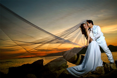 |
| Apparently these are overused in wedding photos, not that I have anything against it. |
To give a stronger focus point to my animation, my lecturer suggested inserting in a very light vignette, one that is so subtle that people won't really notice it at first glance, but also allows them to actually focus better on what goes on in the center of the video (Where most of the scenes take place anyway). It also gives the entire thing a more ethereal feel (Once again focusing on the aspect of memories and reminisce).
Flooring
It wasn't really something that bothered me (Since I have seen a lot of anime openings and closings doing something similar) but I can understand that it would bother others a little when there are some scenes with backgrounds and some completely without.
It would take a lot more time to give each character a shadow that would move realistically along with them, so I simply decided to add in some flooring so that it at least doesn't look as if they are suspended in mid-air.
While I had initially (And lazily) threw in a flatly colored yellow ground, I later on went back and added in a bit more texturing to the ground as shown in the gifs below, to give the effect that the characters actually had shadows while also trying to get all the backgrounds to match one another, by giving it a washed textured look, it would match the style of the more detailed backgrounds that had been done for the window and train scenes.


I honestly felt that it was unnecessary to add in a more detailed background for this scene (Seeing that it's a flat side-angle shot much like the dog scene, attempting to add in a background with a sense of depth seemed… odd?), and so I decided to just add in some flooring. I thought that by adding in a couple of props (Such as the chair, desk and chalkboard which are necessary anyway for the characters' interaction), it was enough to show where this scene was taking place.
 |
| I had to color in their feet once I added in the floor, I had only colored in their clothes originally. |
No comments:
Post a Comment