
Much like Studio Ghibli, Pixar pretty much follows the same format when it comes to the presentation of their films
There are a couple of Pixar films that simply place the credits into the closing title instead, most of the time only the title of the film and the name of the studio is presented in the opening scene. It does make sense though, not often do you see films where an equal amount of effort is put into both the opening and closing titles, you should just choose one over the other, if the opening scene is already enough to properly introduce the set up to the audience, then opening title sequences might be a little pointless.
Monsters, Inc. (2001)

Monsters, Inc. is the forth film to be released by Pixar Animation Studios, the story centers around two monsters named Sulley and Mike, employed at the titular company where its employees generate their city's power by targeting and scaring children, ironically however they themselves are afraid of their targets, believing that they would be contaminated by them if they ever came in contact with them… things take a huge turn then when one child enters their world and it is up to Sulley and Mike to get her back to her world before panic and chaos ensues.
I believe Monsters, Inc. was the first Pixar feature film that actually featured a graphic-esque title sequence for its opening (It might be in fact be the only one so far). It was said that due to the seemingly dark tone of the opening scene that follows, they hence decided to add in something cute and colorful before that scene (It's just a rumor I heard, I'm still trying to search for some proof that this was actually said…).

Throughout the entire sequence, only two elements are actually used to give us an idea on what the film is about, that being monsters and doors (And the screams of children, hah), with the most gorgeous, fun looking color palette I have ever seen used, the quirky music helps too. I absolutely adore the collage-ish style used for this sequence and I think this really was the start of something wonderful for Pixar when it comes to titles sequences.

They also do notably play around a lot with the text, considering how stylishly done the doors and monsters are in this 2D sequence, it only makes sense to get some more unique looking typography designed to go with it (Plain looking white text, such as the ones normally used for Ghibli films definitely won't work for sequences like these). From the very start, we are already shown just how fun and unique this film is going to be, and of course, despite the scary elements (Come on this is a film about monsters), how light hearted they still want it to be.


The Incredibles (2004)
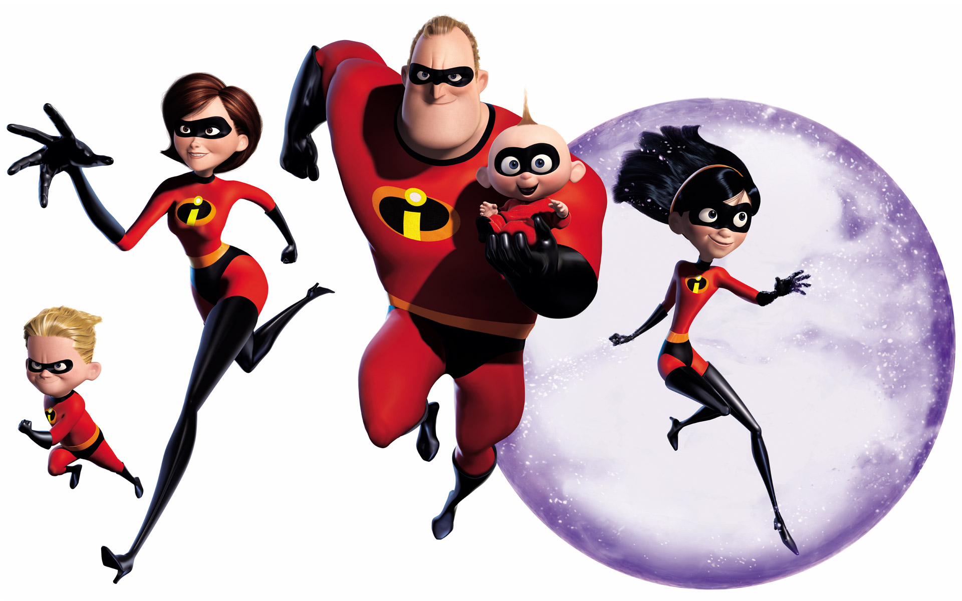
A comedy superhero film written by Brad Bird (Known for directing The Iron Giant), the film focuses on a family of superheroes who are forced to hide their powers and live a quiet suburban life, of course things do not remain as they are when Mr Incredible is one day given the chance to relive his glory days by a mysterious woman known as Mirage.
As the film is a clear homage to 1960s comics and films (It always helps when a film has a pretty fixed setting, or at least a really solid inspiration behind it), it probably wasn't all that difficult figuring out the design for the title sequence, dynamic is one way to put it, awesomely retro is another way to put it.
While one font seems to be used throughout, it is played around a lot in terms of colors, effects and of course sizing. The style that is used is based on the graphic style that emerged at the beginning of the 50s, it also almost looks pop-artish in a way, with the modern and slick elements used. While the vector style might seem plain to some, it especially works and matches the setting and tone of the film, in fact such a style seems to make it seem all the more dynamic than a more detailed art style would.
The colors used are positively fiery and exciting (While not as colorful as the ones used for Monsters, Inc.), matching well with the retro style that is used throughout the film, really strong shades of red and blue are used to contrast deeply with the solid black used for most of the figures shown in the sequence (The characters tend to be shown as silhouettes most of the time, and if not, only one or two extra colors are added in for details such as the hair or clothing).


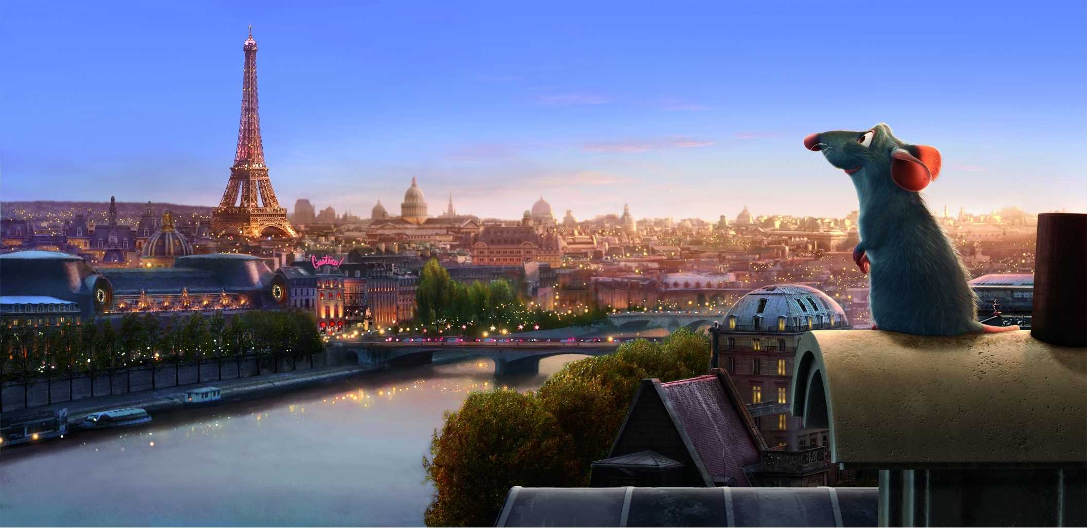
Ratatouille (2007)
The film centers around an anthropomorphic rat named Remy who happens to have a passion for cooking. Inspired by his idol, the recently decease chef Auguste Gusteau, Remy dreams of becoming a chef himself (Despite the fact that it seems impossible considering what he is), from then on he tries to achieve his goal by forming an alliance with a young garbage boy named Linguini.
While the designs are absolutely gorgeous and it is clear that a lot of thought was put into it (There are 22 considerably detailed scenes done for the sequence before the rest of the credits actually start rolling), it would seem this sequence was merely done for the entertainment of the audience (Not that there's anything wrong with that), we don't exactly get anything particularly important out of the contents we see, only that the rats are now living the life.
What is notable however is that compared to the sequences for Monsters, Inc. and The Incredibles, only two fonts are actually used for the credits with the same color and sizing, this is perhaps due to the lengthier duration of the sequence and the fact that a consistent art style and layout for the scenes is used throughout for the sequence (This sequence really looks like something out of one of those stylish storybook adaptations), this sequence does not need to be as zany as Monsters, Inc.'s, and so it makes sense to use a simpler set of fonts for the credits (Seeing as it already goes so well with the animation).


Wall-E (2008)

There are just some films that need a stronger conclusion, Wall-E just so happens to be one of those films (As quoted by end title sequence director Jim Capobianca: "The main goal of the credits was to finish the story"), the animation is notably done in a variety of styles ranging from stone age cave paintings to impressionists paintings (With 8-bit sprites ironically popping up on the sides of the credits after, seeing that it is considered the most primitive sort of computer graphics), to obviously showcase how human civilization is able to start all over again as they work together to restore Earth and its environment.
While I am well aware of how many people have stated their dislike for the environmental message the film is practically trying to shove into their heads (I kid you not, I have been hearing about this even when the film first came out 6 years back), you cannot deny the warm feeling you will get inside for the optimistically presented title sequence at the end (And it is so clear how much was put into it as well).
The idea behind the sequence's presentation was to make it seem like one of those enormous art history books, while the starting might have been easy, naturally the issue was what art to show (I remembered dealing with the same issue when working on my Context in Practice animation…), and so a timeline had to be planned since everything expectedly became all over the place, there was also the issue about how certain kinds of art was associated with particular artists.
A lot of consideration was taken into the design of this title as the animation team had also worried about the audience questioning their choices in art styles, especially when it comes to the Renaissance (Jim Capobianca quotes:"Are we saying that the Axiom Humans had another Da Vinci?"), and so they had to start referring to each section as a period and had to find an iconic style to represent that time in art which inevitably became associated with a famous artist of that time.
Reasons for why they decided to use 2D animation instead of 3D for the closing sequence are also quite interesting, aside from the fact that it is apparently cheaper to execute, the graphic nature of the text seemingly works better with more 2D features, and the distinct change from the film's 3D animation to 2D is supposedly able to keep around a few more people in their seats even after the credits are rolling.
In my opinion however, the switch to a 2D style is able to better present the epilogue (Again with the clever usage of various kinds of art styles we have grown to be familiar with throughout history), it is most certainly more eye catching for the audience as well with the switch in style.
Quite a few questions have been raised from the interview with Jim Capobianca and Alexander Woo, such as why is it that 2D animated titles are so highly regarded even in this day and age. Alexander Woo quotes: "My guess is that it's coming more from a place of a love for the art form and the aesthetic that 2D brings." and thank goodness for that. An interesting thing to note is that titles really tend to be added in at the last minute, as quoted by Jim Capobianca "The titles are such an after thought… It is the nature of the beast, no one wants to think about the titles, they are too involved in getting a film done to attach to the credits."
No comments:
Post a Comment