While looking over our present storyboard, I started listing down the other backgrounds that I needed to design, aside for more minor backgrounds such as skies and perhaps the other side of the park, these are the other backgrounds that will be included in the animation. I tried to hold back on giving too much details, since they will each only appear for a very short period of time (And let's not forget that the entire thing only actually lasts for about 2 minutes).
Egyptian Background
To start off, I was pretty intent on giving each background a unique colour scheme to one another, this one was pretty easy seeing how most references I gathered have a warm, sandy colour scheme to their overall set ups. And so yellow and beige would be the main colours for the first background design.
 |
| Starting off with the base, I would then follow this floor level for the other background designs. |
 |
| And then next was the oven, while it's design will change for each setting, its placement pretty much stays the same. The same goes for the baker who will change in appearance, but will stay in the same place, doing the same thing. |

 |
| The fire will be animated in later on. |
 |
| Not sure what those things are in the corner when I was looking through references, they are either plates or stacks of dough... and I'm leaning towards the latter. |
 |
| Some plain pots and urns so to make the place less empty, the simplification of certain elements is pretty much inspired by Scott Will's own gorgeous background designs. |
 |
| It won't look so empty once we throw Johnny and the baker in there. |
Medieval Background
This one proved to be a lot more challenging, it took me awhile to figure out a decent enough colour scheme as compared to the Egyptian one. While not pictured here, I almost ended up going with a warm colour scheme similar to the Egyptian one, but I decided against it and started looking through more references.
I was actually already intent on using a more cool colour scheme for this one so that it would contrast to the first one, and so thankfully I was able to find some decent colour references from Disney's The Sword in the Stone, where a mixture of greys, blues, greens and purples was effectively (And beautifully might I add) used for some of their setting designs.
 |
| Pretty much the same process as the first one, painted the base, before adding in the oven. |
 |
| Only screenshot that shows when I almost went for a warmer colour scheme. |
 |
| Did a number of things here, manly however I was painting in silhouettes for a few items, such as the shelves and the dough trough. |
 |
| Shelves of dough, sadly I decided to remove the trough since there's no point really including it unless it was in full view. |
 |
| I realise that the shelves took up way too much space, so I shrank it before painting in some textures. |
 |
| Oven's coming along nicely. |
 |
| Decided to just go with a column, especially when considering the screen format (Always include the least important things around the edges). |
 |
| Table filled with way too many cups and bowls. |
 |
| A basket to the side. |
 |
| More baskets hanging on the walls. |
 |
| And logs. |
Industrial Revolution Background
There were several considerations for this one, even when the script was still being written months back. Seeing as the other backgrounds are actually fully coloured, it seemed like a no brainer that the same would be done with this background as well. But based on numerous illustration examples, my team mates and I actually considered making this setting monochromatic (This was mentioned in a much earlier post), it would be a cute little detail when Johnny briefly becomes grey or sepia-ish in terms of his colour scheme.
But it's also probably safer if we simply stuck to keeping everything fully coloured, what matters is that each setting is recognisable enough to the audience.
 |
| These actually got harder... took me awhile to figure out the layout on the left side (Though a large window seems like the way to go seeing that I already used tables and shelves for the other two). |
 |
| The fully coloured version goes back to a warm colour scheme, though this time the main colours used are brown and red, which actually also works for the sepia colour scheme we considered. |
 |
| One of the main elements that I was really set on including was putting in a fairly simple silhouette of a smokey city at the back, which really helps establish the setting itself. |
 |
| Almost forgot to colour the background BEHIND that city though. |
 |
| Wasted a lot of time trying to get these hanging doughs to look right, in the end I erased it and drew painted it with a cleaner brush. (FYI, I used only two brushes when designing all the backgrounds) |
 |
| Started adding in other things such as bread in front and baskets and pots at the back (Seeing that the window is too low to allow a table or chair). |
 |
| The hanging dough looks a tiny bit better now... I will be saving that and the bread in front as separate PNGs just in case. |
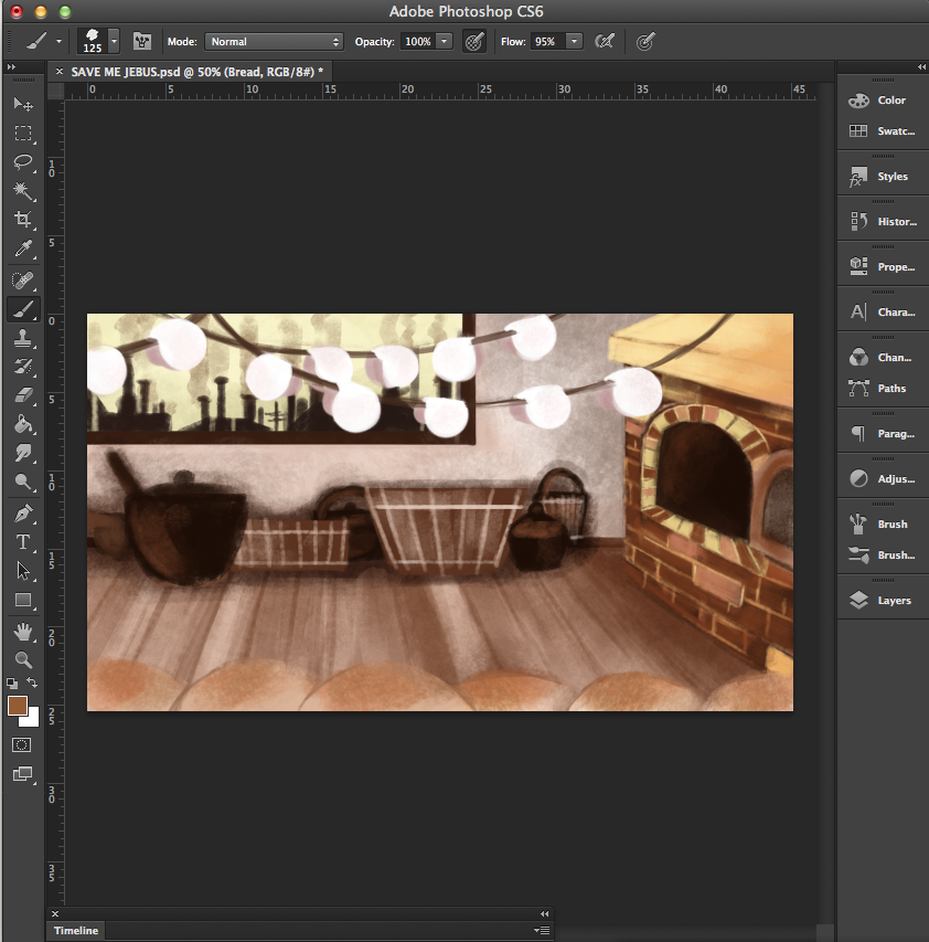 |
| MORE BREAD AND POTS. |
No comments:
Post a Comment